CSS应用到页面的方式
<link rel="stylesheet" type="text/css" href="css/demo.css">
<style type="text/css"></style>
<div style=”color:#f00;”></div>
CSS特性
1、 继承性(给父级添加属性 可以被子级继承); 2、 层叠性(样式合并); 3、 Media type(媒介类型); 4、 权重(优先级); 5、 盒模型(box-sizing:content-box,border-box <margin,border,padding,content-box>) 6、 简写 7、 Has layout 8、 单位(px,em,%,rem) PC端:px,em,%,rem 移动端:em,rem,vw,vh,vm 9、 颜色 1) HEX:#RRGGBB;#333 2) Color name:red 3) RGB/RGBA:rgb(r,g,b);rgb(255,255,255)/rgba(r,g,b,a) a=[0~1] 4) Hsl/Hsla(色调,饱和度,亮度):hsl(360,100%,100%)
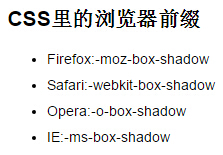
10、 浏览器兼容
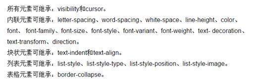
1、继承性 链接
3.Media type响应式布局 链接
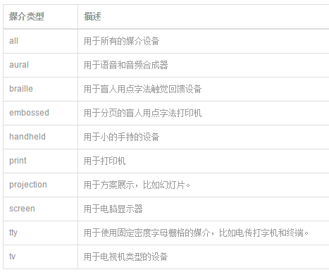
media query能够获取哪些值?
设备的宽和高device-width,device-heigth显示屏幕/触觉设备。
渲染窗口的宽和高width,heigth显示屏幕/触觉设备。
设备的手持方向,横向还是竖向orientation(portrait|lanscape)和打印机等。
画面比例aspect-ratio点阵打印机等。
设备比例device-aspect-ratio-点阵打印机等。
对象颜色或颜色列表color,color-index显示屏幕。
设备的分辨率resolution。

语法结构及用法
@media 设备名 only (选取条件) not (选取条件) and(设备选取条件),设备二{sRules}
示例一:在link中使用@media:
<link rel=“stylesheet” type=“text/css” media=“only screen and (max-width: 480px),only screen and (max-device-width: 480px)” href=“link.css”/>
上面使用中only可省略,限定于计算机显示器,第一个条件max-width是指渲染界面最大宽度,第二个条件max-device-width是指设备最大宽度。

示例二:在样式表中内嵌@media:
@media (min-device-1024px) and (max-989px),screen and (max-device-480px),(max-device-480px) and (orientation:landscape),(min-device-480px) and (max-device-1024px) and (orientation:portrait) {srules}
4、权重
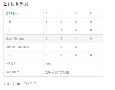
上图中*{}选择符权重应该大于继承
!important权重最高(除了继承)
#content{color:#f00 !important;}
H3{color:#0f0;}
.div{color:#f00 !important; font:12px “微软雅黑” !important;}
比内联元素权重还要高  每个(属性:属性值 !important;)
属性值后面都要加个important
6、简写 链接
Border(border-width、border-style、border-color)
轮廓Outline(outline-width、outline-style、outline-color) 不会影响盒模型
Background(background-color、background-image、backgroun-position:x y、background-attachment<属性设置背景图像是否固定或者随着页面的其余部分滚动。>)
Font
list-style(list-style-type、list-style-position<设置在何处放置列表项标记>、list-style-image)


border-radius(0  0  0 0<左上角-右上角-右下角-左下角>)

8、单位
em(随着父元素而改变大小) 父级字体大小为10px 子级大小1.5em=10*1.5=15px
rem(随着html而改变大小)<html><head></head><boder></boder></html>
10、浏览器兼容
11、CSS编写顺序
0)float,position,z-index
1)display:block,inline,inline-block,none;
2)盒模型相关属性
3)background:color url(../images/xx.jpg) repeat attachment position (size clip origin)
4)字体属性font(family,size,weight,style),text(align,transform,indent),word(letter)-spacing word-break,word-wrap
5)CSS3 border-radius(圆角边框),opacity,text-shadow(文本阴影),box-shadow(盒阴影),linear-gradient(线性渐变),background-size(clip,origin)图像的尺寸,trasition,tranfrom,animation