今日知识点整理
复习内容
 * 1. 定位
 *    1.为了实现页面中特殊的样式结构或是效果  比如轮播图中的左右按钮
 *    2.为了让元素在页面中灵活的进行移动
 *
 * 2. 定位分四种
 *    static     任何元素都有静态定位
 *    relative
 *    absolute
 *    fixed
 *
 * 3. static的特点
 *    1. 任何元素其实都有一个静态定位
 *    2. 不脱离标准流,占据原来标准流的位置
 *    3. 不能够通过边偏移进行位置的移动
 *
 * 4. relative的特点
 *    1. 不脱离标准流的控制,占据原来标准流的位置
 *    2. 可以通过边偏移来进行位置的移动
 *    3. 是相对于自身原来的位置进行的移动
 *
 * 5. 绝对定位的特点
 *    1. 脱离标准流的控制,不占据原来标准流的位置
 *    2. 可以通过边偏移进行位置的移动
 *    3. 如果只有一个元素,而且是绝对定位,是以页面为参考进行移动
 *    4. 如果元素有多层嵌套的话,如果子元素是绝对定位,则参考点是以离自身最近的具有非静态定位的父级元素
 *    5. 可以改变元素的显示方式(定位了的行内元素具有行内块的特性,可以设置宽高)
 *
 * 6. 固定定位的特点
 *    1. 脱离标准流的控制,不占据原来标准流的位置
 *    2. 可以通过边偏移进行位置的移动
 *    3. 参考浏览器可视区进行的边偏移移动
 *    4. 可以改变元素的显示方式(具有固定定位的行内元素,也会有行内块的特性,可以设置宽高)
 *
 * 7. 层级z-index
 *    定位(非静态定位)了的元素都有一个层级的概念,默认的层级是0
 *    如果定位了的元素,在页面中的显示有重合的话,后面的元素会盖住前面的元素
 *    如果不想被别的后面的元素所盖住,需要设置z-index的值
 *    只有非静态定位的元素才会有层级的概念。
今日学习任务
 *    能够说出display:none与 visibility:hidden隐藏元素的区别
 *    能够说出CSS精灵技术产生的目的(解决什么问题)  减少请求的次数,提高页面渲染的效率
 *    能够使用精灵图设置背景图片
 *    能够写出滑动门微信案例
 *    能够写出3中常见的鼠标样式(cursor)  pointer  move  text  help
 *    能够写出溢出文字显示省略号的代码
 *    能够使用字体图标


<!DOCTYPE html>
<html lang="en">
<head>
  <meta charset="UTF-8">
  <meta name="viewport" content="width=device-width, initial-scale=1.0">
  <meta http-equiv="X-UA-Compatible" content="ie=edge">
  <title>绝对定位</title>
  <style>
    * {
      margin: 0;
      padding: 0;
    }
    .box {
      width: 300px;
      height: 300px;
      position: absolute;
      background-color: orange;
      right: 0;
    }
  </style>
</head>
<body>
  <div class="box"></div>
</body>
</html>
<!DOCTYPE html>
<html lang="en">
<head>
  <meta charset="UTF-8">
  <meta name="viewport" content="width=device-width, initial-scale=1.0">
  <meta http-equiv="X-UA-Compatible" content="ie=edge">
  <title>绝对定位</title>
  <style>
    * {
      margin:0;
      padding: 0;
    }
    .demo {
      width: 300px;
      height: 300px;
      border: 1px solid blue;
      margin: 200px 0 0 160px;
      position: relative;
    }
    .box {
      width: 200px;
      height: 200px;
      border: 1px solid red;
      /* position: relative; */
      position: absolute;
      left:60px;
      top: 70px;
    }
    .one {
      width: 100px;
      height: 100px;
      background-color: orangered;
      position: absolute;
      left: 20px;
      top: 30px;
    }
  </style>
</head>
<body>
  <div class="demo">
  <div class="box">
    <div class="one"></div>
  </div>
  </div>
</body>
</html>
<!DOCTYPE html>
<html lang="en">
<head>
  <meta charset="UTF-8">
  <meta name="viewport" content="width=device-width, initial-scale=1.0">
  <meta http-equiv="X-UA-Compatible" content="ie=edge">
  <title>z-index</title>
  <style>
    * {
      margin: 0px;
      padding: 0px;
    }
    .box {
      width: 300px;
      height: 300px;
      background-color: green;
      position: absolute;
    }
    .box:hover {
      cursor: pointer;
      z-index: 1;
    }
    .box2 {
      width: 300px;
      height: 300px;
      background-color: yellow;
      position: absolute;
      left: 150px;
      top: 150px;
      /* 默认是.box2覆盖.box1,如果想让box1覆盖box2就需要给box1设置z-index */
    }
  </style>
</head>
<body>
  <div class="box"></div>
  <div class="box2"></div>
</body>
</html>
<!DOCTYPE html>
<html lang="en">
<head>
  <meta charset="UTF-8">
  <meta name="viewport" content="width=device-width, initial-scale=1.0">
  <meta http-equiv="X-UA-Compatible" content="ie=edge">
  <title>定位与浮动</title>
  <style>
    * {
      margin:0;
      padding: 0;
    }
    div {
      width: 300px;
      height: 300px;
    }
    .demo {
      background-color: red;
      position: absolute;
      top: 100px;
      left: 100px;
    }
    .box {
      background-color: blue;
      float: left;
      /* z-index: 1px;  无效 */
    }

    /* 只有非静态定位的元素才有层级的概念,默认的层级是0,即使层级为0,也会盖住非定位的元素 */
  </style>
</head>
<body>
  <div class="box"></div>
  <div class="demo"></div>
</body>
</html>
01-元素的隐藏和溢出
display:none/block
visibility:hidden/visible
两者的区别:
display:none的元素,不占原来标准流的位置了,在页面是也看不到了,但是源码中还有对应的标签。
visibility:hidden的元素,占据原来的标准流位置,在页面中看不到,源码中有对应的标签。
<!DOCTYPE html>
<html lang="en">
<head>
  <meta charset="UTF-8">
  <meta name="viewport" content="width=device-width, initial-scale=1.0">
  <meta http-equiv="X-UA-Compatible" content="ie=edge">
  <title>Document</title>
  <style>
    * {
      margin: 0px;
      padding: 0px;
    }
    .box {
      width: 600px;
      height: 600px;
      border: 1px solid blue;
    }
    .one {
      width: 200px;
      height: 200px;
      border: 1px solid green;
      /* display: none;    不占原来的位置 */
      background-color: green;
      visibility: hidden;   /* 占原来的位置 */
    }
    .two {
      width: 100px;
      height: 100px;
      border: 1px solid lightgreen;
      background-color: green;
    }
    .box:hover .one {
      visibility: visible;
    }
  </style>
</head>
<body>
  <div class="box">
    <div class="one"></div>
    <div class="two"></div>
  </div>
</body>
</html>
02-元素内容的溢出隐藏
<!DOCTYPE html>
<html lang="en">
<head>
  <meta charset="UTF-8">
  <meta name="viewport" content="width=device-width, initial-scale=1.0">
  <meta http-equiv="X-UA-Compatible" content="ie=edge">
  <title>元素内容溢出的隐藏</title>
  <style>
    * {
      margin: 0px;
      padding: 0px;
    }
    .box {
      width: 300px;
      height: 100px;
      background-color: lightpink;
      /* overflow: hidden;   隐藏超出的内容 */
      /* overflow: visible;    不隐藏超出的内容,默认属性 */
      overflow: auto;   /* 超出的内容会隐藏,但通过下拉框的方式查看 */


    }
  </style>
</head>
<body>
  <div class="box">
    天下事有难易乎,为之,则难者亦易矣,不为,则易者亦难矣;天下事有难易乎,为之,则难者亦易矣,不为,则易者亦难矣天下事有难易乎,为之,则难者亦易矣,不为,则易者亦难矣天下事有难易乎,为之,则难者亦易矣,不为,则易者亦难矣天下事有难易乎,为之,则难者亦易矣,不为,则易者亦难矣
  </div>
</body>
</html>
溢出省略
三个属性:overflow,white-space,text-overflow缺一不可
<!DOCTYPE html>
<html lang="en">
<head>
  <meta charset="UTF-8">
  <meta name="viewport" content="width=device-width, initial-scale=1.0">
  <meta http-equiv="X-UA-Compatible" content="ie=edge">
  <title>Document</title>
  <style>
    * {
      margin: 0;
      padding: 0;
    }
    .box1 {
      width: 200px;
      height: 100px;
      background-color: pink;
      border: 1px solid pink;
      overflow: hidden;
      white-space: nowrap;    /* 将文字内容设置为不换行 */
      text-overflow: ellipsis;  /* ellipsis是省略的意思,也就是省略溢出的文本 */
    }
    .box2 {
      width: 200px;
      height: 100px;
      background-color: orange;
      border: 1px solid orange;
       overflow: hidden;
       white-space: nowrap; /* 将文字内容设置为不换行 */
       text-overflow: ellipsis; /* ellipsis是省略的意思,也就是省略溢出的文本 */
    }
  </style>
</head>
<body>
  <div class="box1">
    天下事有难易乎,为之,则难者亦易矣,不为,则易者亦难矣;天下事有难易乎,为之,则难者亦易矣,不为,则易者亦难矣;
    天下事有难易乎,为之,则难者亦易矣,不为,则易者亦难矣;天下事有难易乎,为之,则难者亦易矣,不为,则易者亦难矣;
  </div>
  <div class="box2">this is a test...this is a test...this is a test...this is a test...this is a test...this is a
    test...this is a test...</div>
</body>
</html>
03-光标的样式
cursor: default 默认 | pointer 小手 | move 移动 | text 文本 | help 帮助
最最常用的是 pointer,move;
<!DOCTYPE html>
<html lang="en">
<head>
  <meta charset="UTF-8">
  <meta name="viewport" content="width=device-width, initial-scale=1.0">
  <meta http-equiv="X-UA-Compatible" content="ie=edge">
  <title>鼠标光标样式</title>
  <style>
    * {
      margin: 0px;
      padding: 0px;
    }
    .box {
      width: 300px;
      height: 300px;
      margin: 0 auto;
      background-color: deeppink;
    }
    .box:hover {
      /* cursor: default;   默认鼠标样式 */
      /* cursor: pointer;    小手样式 */
      /* cursor: move;   光标样式 */
      /* cursor: help;   帮助样式 */
      /* cursor: text;   文本样式 */
    }
  </style>
</head>
<body>
  <div class="box"></div>
</body>
</html>
去掉文本框或是文本域的环绕线
outline:none
<!DOCTYPE html>
<html lang="en">
<head>
  <meta charset="UTF-8">
  <meta name="viewport" content="width=device-width, initial-scale=1.0">
  <meta http-equiv="X-UA-Compatible" content="ie=edge">
  <title>Document</title>
  <style>
    .demo {
      width: 600px;
      height: 100px;
      outline: none;    /* 去掉点击时蓝色的环绕线 */
      /* outline是个复合属性,和font、background这类属性类似 */
      /* outline: 10px solid red; */
      /* outline: 10px dotted red; */
      /* outline: 10px dashed red; */
    }
  </style>
</head>
<body>
  <input type="text" class="demo">
</body>
</html>
<!DOCTYPE html>
<html lang="en">
<head>
  <meta charset="UTF-8">
  <meta name="viewport" content="width=device-width, initial-scale=1.0">
  <meta http-equiv="X-UA-Compatible" content="ie=edge">
  <title>Document</title>
  <style>
    textarea {
      resize: none;   /* 禁止拖拽大小,以免造成布局混乱 */
      outline: none;  /* 取消环绕线 */
    }
  </style>
</head>
<body>
  <textarea name="" id="" cols="30" rows="10">说点什么吧...</textarea>
</body>
</html>
04-图片和文字的对齐方式
vertical-align: baseline | top | middle | bottom
一般用middle让图片和文字在垂直方向都居中。
还可以使用top,middle,bottom将图片与盒子底部的默认间距给清除。
将图片与盒子底部的默认间距清除掉的方式:
vertical-align:top|middle|bottom 还可以将图片设置为块级元素 display:block
<!DOCTYPE html>
<html lang="en">
<head>
  <meta charset="UTF-8">
  <meta name="viewport" content="width=device-width, initial-scale=1.0">
  <meta http-equiv="X-UA-Compatible" content="ie=edge">
  <title>图片的对齐方式</title>
  <style>
    * {
      margin: 0px;
      padding: 0px;
    }
    .box {
      border: 1px solid red;

    }
    .one {
      width: 100px;
      height: 100px;
      background-color: pink;
    }
    .box img {
      /* display: block; */
      /* vertical-align: middle;   中线对齐 */
      /* vertical-align: top;    顶线对齐 */
      /* vertical-align: bottom;   底线对齐 */
      /* 上面的四种方法都可以去除间隙问题 */
    }
  </style>
</head>
<body>
  <div class="box">
    <img src="./images/3.jpg" title="楚乔传">楚乔传
    <!-- <div class="one"></div>  注释掉后盒子和文字会以基线(baseline)方式对齐,导致盒子和底边框之间有空隙
    1.通过vertical-align的top,middle,bottom其中任意参数就能解决
    2.将img转换为块级标签 -->
  </div>
  <input type="checkbox" name="hejiu" />喝酒
</body>
</html>
05-精灵图
-
为了降低向服务器发送请求的次数
-
提高页面的加载速度
2.什么是精灵图
CSS 精灵其实是将网页中的一些背景图像整合到一张大图中(精灵图),然而,各个网页元素通常只需要精灵图中不同位置的某个小图,要想精确定位到精灵图中的某个小图,就需要使用CSS的background-image、background-repeat和background-position属性进行背景定位,其中最关键的是使用background-position属性精确地定位。
3.精灵图使用本质
利用背景图片的位置属性进行设置
<!DOCTYPE html>
<html lang="en">
<head>
  <meta charset="UTF-8">
  <meta name="viewport" content="width=device-width, initial-scale=1.0">
  <meta http-equiv="X-UA-Compatible" content="ie=edge">
  <title>精灵图应用</title>
  <style>
    * {
      margin: 0;
      padding: 0;
    }
    .box a {
      width: 90px;
      height: 28px;
      line-height: 28px;
      margin: 200px auto;
      background: url(./img/jd.png) no-repeat 0 -65px;
      border: 1px solid red;
      display: block;
      color: purple;
      padding-left: 22px;
      text-decoration: none;
    }
    .box a:hover {
      background: url(./img/jd.png) no-repeat 0 -380px;
    }

  </style>
</head>
<body>
  <div class="box">
    <a href="#">京东购物车</a>
  </div>
</body>
</html>
<!DOCTYPE html>
<html lang="en">
<head>
  <meta charset="UTF-8">
  <meta name="viewport" content="width=device-width, initial-scale=1.0">
  <meta http-equiv="X-UA-Compatible" content="ie=edge">
  <title>精灵图应用2</title>
  <style>
    * {
      margin: 0px;
      padding: 0px;
    }
    i {
      font-style: none;
    }
    .box {
      width: 248px;
      height: 208px;
      border: 1px solid red;
      margin: 100px auto;
      overflow: hidden;
    }
    ul {
      list-style: none;
      /* li不设置宽度的话,默认是和父元素的宽度一样 */
      width: 252px;
    }
    ul li {
      float: left;
    }
    ul li a {
      width: 62px;
      height: 26px;
      text-align: center;
      padding-top: 44px;
      display: block;
      border-right: 1px solid red;
      border-bottom: 1px solid red;
      position: relative;
    }
    .box li a i {
      width: 24px;
      height: 24px;
      background-color: blue;
      position: absolute;
      left: 17px;
      top: 13px;
      background: url(./img/icons.png) no-repeat;
    }
    .box li:first-child a i {
      background-position: -18px -16px;
    }
    .box li:nth-child(2) a i {
      background-position: -80px -16px;
    }
    .box li:nth-child(3) a i {
      background-position: -142px -16px;
    }
    .box li:nth-child(4) a i {
      background-position: -206px -16px;
    }
    .box li:nth-child(5) a i {
      background-position: -18px -88px;
    }
    .box li:nth-child(6) a i {
    background-position: -80px -88px;
    }
    .box li:nth-child(7) a i {
    background-position: -142px -88px;
    }
    .box li:nth-child(8) a i {
    background-position: -206px -88px;
    }
    .box li:nth-child(9) a i {
      background-position: -18px -158px;
    }
    .box li:nth-child(10) a i {
    background-position: -80px -158px;
    }
    .box li:nth-child(11) a i {
    background-position: -142px -158px;
    }
    .box li:nth-child(12) a i {
    background-position: -206px -158px;
    }
  </style>
</head>
<body>
  <div class="box">
    <ul>
      <li><a href="#">话费<i></i></a></li>
      <li><a href="#">话费<i></i></a></li>
      <li><a href="#">话费<i></i></a></li>
      <li><a href="#">话费<i></i></a></li>
      <li><a href="#">话费<i></i></a></li>
      <li><a href="#">话费<i></i></a></li>
      <li><a href="#">话费<i></i></a></li>
      <li><a href="#">话费<i></i></a></li>
      <li><a href="#">话费<i></i></a></li>
      <li><a href="#">话费<i></i></a></li>
      <li><a href="#">话费<i></i></a></li>
      <li><a href="#">话费<i></i></a></li>
    </ul>
  </div>
</body>
</html>
06-字体图标
1.精灵图的缺点
1.额外的增加总文件的大小,因为精灵图本质上还是图片
2.会额外的增加http请求次数
3.缩放会失真
2.字体图标的优点:
1.可以做出跟图片一样可以做的事情,改变透明度、旋转度,等..
2.但是本质其实是文字,可以很随意的改变颜色、产生阴影、透明效果等等...
3.本身体积更小,但携带的信息并没有削减。
4.几乎支持所有的浏览器
5.移动端设备必备良药...
<!DOCTYPE html>
<html lang="en">
<head>
  <meta charset="UTF-8">
  <meta name="viewport" content="width=device-width, initial-scale=1.0">
  <meta http-equiv="X-UA-Compatible" content="ie=edge">
  <title>字体图标的使用</title>
  <link rel="stylesheet" href="./font/iconfont.css">
  <style>
    .icon-shengriliwu {
      font-size: 30px;
      /* color: red; */
    }
    .icon-bingxiang {
      font-size: 30px;
      /* color: cyan; */
      /* font-family: "隶书"; */
    }
  </style>
</head>
<body>
  <span class="iconfont icon-shengriliwu"></span>
  <span class="iconfont icon-bingxiang"></span>
</body>
</html>
<!DOCTYPE html> <html lang="en"> <head> <meta charset="UTF-8"> <meta name="viewport" content="width=device-width, initial-scale=1.0"> <meta http-equiv="X-UA-Compatible" content="ie=edge"> <title>unicode方式的字体图标</title> <style> @font-face { font-family: 'qianduan'; src: url('./font/iconfont.eot'); src: url('./font/iconfont.eot?#iefix') format('embedded-opentype'), url('./font/iconfont.woff2') format('woff2'), url('./font/iconfont.woff') format('woff'), url('./font/iconfont.ttf') format('truetype'), url('./font/iconfont.svg#iconfont') format('svg'); } .iconfont { font-family: "qianduan" !important; font-size: 86px; font-style: normal; -webkit-font-smoothing: antialiased; -moz-osx-font-smoothing: grayscale; color: gold; } </style> </head> <body> <div class="iconfont">㑎</div> </body> </html>
<!DOCTYPE html>
<html lang="en">
<head>
  <meta charset="UTF-8">
  <meta name="viewport" content="width=device-width, initial-scale=1.0">
  <meta http-equiv="X-UA-Compatible" content="ie=edge">
  <title>Symbol的做字体图标</title>
  <script src="./font/iconfont.js"></script>
  <style>
    .icon {
      width: 10em;
      height: 10em;
      vertical-align: -0.15em;
      fill: currentColor;
      overflow: hidden;
      color: red;
    }
  </style>
</head>
<body>
  <svg class="icon" aria-hidden="true">
    <use xlink:href="#icon-yiguanzhu"></use>
  </svg>
</body>
</html>
07-过渡
<!DOCTYPE html>
<html lang="en">
<head>
  <meta charset="UTF-8">
  <meta name="viewport" content="width=device-width, initial-scale=1.0">
  <meta http-equiv="X-UA-Compatible" content="ie=edge">
  <title>过渡</title>
  <style>
    .box {
      width: 200px;
      height: 200px;
      background-color: blue;
      /* 谁要变化就给谁添加过渡属性 */
      /* transition-property: width;
      transition-property: height;
      transition-duration: 2s;
      transition-timing-function:ease-in-out; */
      /* 由快到慢 */
      transition: all 1s;
      /* 设置所有的属性,时间为1s */
    }
    .box:hover {
      width: 1600px;
      height: 600px;
    }
    .demo {
      width: 450px;
      height: 300px;
      background: url(./images/1.jpg) no-repeat;
      transition: all 4s;
    }
    .demo:hover {
      background-image: url(./images/2.jpg);
    }
  </style>
</head>
<body>
  <div class="box"></div>
  <div class="demo"></div>
</body>
</html>
<!DOCTYPE html>
<html lang="en">
<head>
  <meta charset="UTF-8">
  <meta name="viewport" content="width=device-width, initial-scale=1.0">
  <meta http-equiv="X-UA-Compatible" content="ie=edge">
  <title>transform的使用</title>
  <style>
    .box {
      width: 200px;
      height: 200px;
      background-color: orangered;
      transition: all 1s;
      border-radius: 50%;
    }
    .box:hover {
      /* transform: translate(100px,100px); */
      /* transform: translateX(300px); */
      transform: translateY(600px);
    }
  </style>
</head>
<body>
  <div class="box"></div>
</body>
</html>
<!DOCTYPE html>
<html lang="en">
<head>
  <meta charset="UTF-8">
  <meta name="viewport" content="width=device-width, initial-scale=1.0">
  <meta http-equiv="X-UA-Compatible" content="ie=edge">
  <title>让盒子垂直水平居中对齐</title>
  <style>
    * {
      margin: 0;
      padding: 0;
    }
    .box {
      width: 200px;
      height: 200px;
      background-color: orange;
      position: absolute;
      /* 方法1:使用定位,缺点是宽度高度改变了之后marign-top和marig-left的值也必须跟着改 */
      /* left: 50%;
      top: 50%;
      margin-top: -100px;
      margin-left: -100px; */
      /*方法2:使用transform的translate位置参数设置百分比实现垂直水平居中 */
      left: 50%;
      top: 50%;
      transform: translate(-50%,-50%);  /* 水平,垂直 */
    }
  </style>
</head>
<body>
  <div class="box">
  </div>
</body>
</html>
<!DOCTYPE html>
<html lang="en">
<head>
  <meta charset="UTF-8">
  <meta name="viewport" content="width=device-width, initial-scale=1.0">
  <meta http-equiv="X-UA-Compatible" content="ie=edge">
  <title>变形中的缩放</title>
  <style>
    .box {
      width: 200px;
      height: 200px;
      background-color: orange;
      margin: 100px auto;
      transition: all 1s;   /* 过渡 */
    }
    .box:hover {
      transform: scale(1.2);
      transform: scaleX(2);
      transform: scaleY(2);
      transform: scale(.5); /* 缩小 */
    }
  </style>
</head>
<body>
  <div class="box"></div>
</body>
</html>
<!DOCTYPE html>
<html lang="en">
<head>
  <meta charset="UTF-8">
  <meta name="viewport" content="width=device-width, initial-scale=1.0">
  <meta http-equiv="X-UA-Compatible" content="ie=edge">
  <title>变形之旋转</title>
  <style>
    * {
      margin: 0;
      padding: 0;
    }
    .box {
      width: 300px;
      height: 300px;
      background-color: orangered;
      margin: 100px auto;
      transition: all 1s;
    }
    .box:hover {
      transform: rotate(360deg);
    }
  </style>
</head>
<body>
  <div class="box"></div>
</body>
</html>
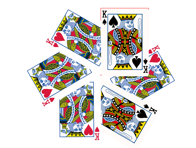
<!DOCTYPE html>
<html lang="en">
<head>
  <meta charset="UTF-8">
  <meta name="viewport" content="width=device-width, initial-scale=1.0">
  <meta http-equiv="X-UA-Compatible" content="ie=edge">
  <title>旋转的扑克牌</title>
  <style>
    * {
      margin: 0;
      padding: 0;
    }
    .box {
      margin: 100px auto;
      width: 310px;
      height: 438px;
      position: relative;
      /* 设置相对定位 */
      border: 1px solid red;
    }
    .box img {
      position: absolute;
      left: 0;
      left: 0;
      transition: all 2s; /* 添加过渡属性 */
      transform-origin: left bottom;
      /* 设置旋转的圆点 */
    }
    .box:hover img:first-child {
      transform: rotate(60deg);
    }
    .box:hover img:nth-child(2) {
      transform: rotate(120deg);
    }
    .box:hover img:nth-child(3) {
    transform: rotate(180deg);
    }
    .box:hover img:nth-child(4) {
    transform: rotate(240deg);
    }
    .box:hover img:nth-child(5) {
    transform: rotate(300deg);
    }
    .box:hover img:nth-child(6) {
    transform: rotate(360deg);
    }
  </style>
</head>
<body>
  <div class="box">
    <img src="./images/pk1.png" alt="">
    <img src="./images/pk2.png" alt="">
    <img src="./images/pk1.png" alt="">
    <img src="./images/pk1.png" alt="">
    <img src="./images/pk1.png" alt="">
    <img src="./images/pk2.png" alt="">
  </div>
</body>
</html>
案例效果:
<!DOCTYPE html>
<html lang="en">
<head>
  <meta charset="UTF-8">
  <meta name="viewport" content="width=device-width, initial-scale=1.0">
  <meta http-equiv="X-UA-Compatible" content="ie=edge">
  <title>倾斜</title>
  <style>
    * {
      margin: 0;
      padding: 0;
    }
    .box img {
      transition: all 2s;
    }
    .box:hover img {
      transform: skew(45deg,45deg);
    }
  </style>
</head>
<body>
  <div class="box">
    <img src="./images/s.png" alt="">
  </div>
</body>
</html>
<!DOCTYPE html>
<html lang="en">
<head>
  <meta charset="UTF-8">
  <meta name="viewport" content="width=device-width, initial-scale=1.0">
  <meta http-equiv="X-UA-Compatible" content="ie=edge">
  <title>泡泡</title>
  <style>
    .box {
      width: 343px;
      height: 100px;
      border: 1px solid blue;
      margin: 100px auto;
      background: url(./img/paopao.png) no-repeat left top,
      url(./img/paopao.png) no-repeat right bottom
      #02f;
      transition: all 0.3s;
    }
    .box:hover {
      background: url(./img/paopao.png) no-repeat right bottom,
      url(./img/paopao.png) no-repeat left top
      #02f;
    }
  </style>
</head>
<body>
  <div class="box"></div>
</body>
</html>
<!DOCTYPE html>
<html lang="en">
<head>
  <meta charset="UTF-8">
  <meta name="viewport" content="width=device-width, initial-scale=1.0">
  <meta http-equiv="X-UA-Compatible" content="ie=edge">
  <title>旋转图片</title>
  <style>
    .box {
      width: 767px;
      height: 620px;
      margin: 100px auto;
    }
    .box img {
      width: 100%;
      transition: all 2s;
    }
    .box:hover img {
      transform: rotateY(180deg);
    }
  </style>
</head>
<body>
  <div class="box">
    <img src="./images/s.png" alt="">
  </div>
</body>
</html>
今天学习非常充实,下午上课有点走神了,看来每天睡5个小时并不适合我这种瘦弱的身体,很累,睡了。