布局大致划分为以下几种,
- 浮动布局:float:left/right
- 定位布局:position:relative/absolute/fixed
- 表格布局:table
- 弹性布局:display:flex/inline-flex
- 栅格布局:display:grid/inline-grid
- 响应式布局:em/rem/vw/vh/vmin/vmax、媒体查询
在这诸多的布局中,比较喜欢和实用的是浮动布局、定位布局和弹性布局,表格布局实用较少,因为稍有改动就会引起整个table的回流,对于栅格布局目前兼容性不是很好。后面主要介绍常见的实用的布局如居中布局、整页布局、多列布局、圣杯布局和双飞翼布局,下面就开始上代码,大快朵颐吧!
居中布局:要求水平居中和垂直居中
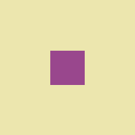
案例1:已知外层盒宽高和内层盒宽高
<div class="outer">
    <div class="center"></div>
</div>
方法一:使用margin间距
 1  <style>
 2       .outer{
 3           width: 200px;
 4           height: 200px;
 5           background: #ece6ae;
 6           overflow: hidden;
 7       }
 8         .center{
 9             width: 50px;
10             height: 50px;
11             background: #99478d;
12             margin: 75px auto;
13         }
14 </style>
方法2:使用行内块元素属性text-algin:center,line-height
 1   <style>
 2       .outer{
 3           width: 200px;
 4           height: 200px;
 5           background: #ece6ae;
 6           text-align: center;//水平居中
 7           line-height: 200px;//垂直居中
 8           font-size: 0;//消除居中差异
 9       }
10         .center{
11             display: inline-block;//将子元素变为行内款元素
12             width: 50px;
13             height: 50px;
14             vertical-align: middle;//调整垂直居中
15             background: #99478d;
16         }
17     </style>
方法三:将内层元素变为表格元素,使用属性 vertical-align: middle;
 1     .outer{
 2           width: 200px;
 3           height: 200px;
 4           background: #ece6ae;
 5           display: table-cell;
 6           vertical-align: middle;
 7       }
 8         .center{
 9             width: 50px;
10             height: 50px;
11             background: #99478d;
12             margin: 0 auto;
13         }
方法三:定位position
 1 .outer{
 2           width: 200px;
 3           height: 200px;
 4           background: #ece6ae;
 5           position: relative;
 6       }
 7         .center{
 8             width: 50px;
 9             height: 50px;
10             background: #99478d;
11             position: absolute;
12             left: 50%;
13             top: 50%;
14             margin: -50px 0 0 -50px;
15         }
方法四:使用flex最简洁的代码来了
 1  .outer{
 2           width: 200px;
 3           height: 200px;
 4           background: #ece6ae;
 5           display: flex;
 6           justify-content: center;
 7           align-items: center;
 8       }
 9         .center{
10             width: 50px;
11             height: 50px;
12             background: #99478d;
13         }
除去宽高背景色代码,最最简洁的代码,有木有!!!
1  .outer{
2       display: flex;
3    }
4  .center{
5      margin: auto;
6    }
案例2:已知外层盒宽高,内层盒为行内元素且宽高不详,上面的方法一二三统统不能实现了,喔豁!!!
别急不是还有方法四flex的两种写法来救场嘛,开始表演

<div class="outer">
    <span class="center">哈哈哈</span>
</div>
.outer{
          width: 200px;
          height: 200px;
          background: #ece6ae;
          display: flex;
      }
 .center{
            margin: auto;
            background: #997890;
 }
.outer{
    width: 200px;
    height: 200px;
    background: #ece6ae;
    display: flex;
    justify-content: center;
    align-items: center;
 }
.center{
   background: #997890;
}
整页即全屏布局:分为上中下,顶部、底部、主体三部分,三部分占满全屏,顶部和底部固定主体自适应。

方法一:使用calc属性计算(注意块元素宽高的继承)


 1 <style>
 2         body,html{
 3             width: 100%;
 4             height: 100%;
 5         }
 6         header{
 7             height: 50px;
 8             background: #8e5b8c;
 9         }
10         main{
11             height: calc(100% - 100px);
12             background: aquamarine;
13         }
14         footer{
15             height: 50px;
16             background: #721e8e;
17         }
18 </style>
19 <body>
20     <header></header>
21     <main></main>
22     <footer></footer>
23 </body>
方法二:使用position定位
<style>
        body,html{
           position: relative;
        }
        header{
            position: absolute;
            top: 0;
            height: 50px;
            width: 100%;
            background: #8e5b8c;
        }
        main{
            position: absolute;
            top: 50px;
            bottom: 50px;
            width: 100%;
            background: aquamarine;
        }
        footer{
            position: absolute;
            bottom: 50px;
            width: 100%;
            height: 50px;
            background: #721e8e;
        }
</style>
<body>
    <header></header>
    <main></main>
    <footer></footer>
</body>
方法三:使用flex
<style>
        .full{
            display: flex;
            flex-direction: column;
            width: 300px;
            height: 300px;
        }
        header {
            height: 50px;
            background-color: #f66;
        }
        footer {
            height: 50px;
            background-color: #66f;
        }
        main {
            flex: 1;
            background-color: #3c9;
        }
</style>
<div class="full">
    <header></header>
    <main></main>
    <footer></footer>
</div>
多列布局:两列布局,一侧固定宽度,另一侧宽度自适应;三列布局,分为左中右,中间内容自适应,两侧固定宽度;其他均等宽度多列布局等;
两列布局

方法一:使用间距和浮动
<style>
        .two-column{
          width: 300px;
            height: 300px;
        }
        .left{
            width: 50px;
            height: 100%;
            float: left;
            background: aquamarine;
        }
        .right{
            height: 100%;
            margin-left: 50px;
            background: #994197;
        }
 </style>
<div class="two-column">
    <div class="left"></div>
    <div class="right"></div>
</div>
方法二:BFC不会与float box重叠原理,使用float、overflow
 1 <style>
 2         *{
 3             margin: 0;
 4             padding: 0;
 5         }
 6         .two-column{
 7           width: 300px;
 8             height: 300px;
 9         }
10         .left{
11             width: 50px;
12             height: 100%;
13             float: left;
14             background: aquamarine;
15         }
16         .right{
17             overflow: hidden;
18             height: 100%;
19             background: #994197;
20         }
21 </style>
22 <div class="two-column">
23     <div class="left"></div>
24     <div class="right"></div>
25 </div>
方法三:使用flex,代码更为简洁
 1  <style>
 2         .two-column{
 3             display: flex;
 4             width: 300px;
 5             height: 300px;
 6         }
 7         .left {
 8             width: 50px;
 9             background-color: #f66;
10         }
11         .right {
12             flex: 1;
13             background-color: #66f;
14         }
15 </style>
16 <div class="two-column">
17     <div class="left"></div>
18     <div class="right"></div>
19 </div>
三列和两列的布局是一个道理的,这里也不多赘述了,贴贴多列并且均列的布局

方法一:使用flex
 <style>
        .more-column{
            display: flex;
            width: 300px;
            height: 300px;
        }
        .column{
            flex: 1;
        }
        .column:nth-child(1){
            background: aquamarine;
        }
        .column:nth-child(2){
            background: aqua;
        }
        .column:nth-child(3){
            background: olivedrab;
        }
        .column:nth-child(4){
            background: #3a806b;
        }
    </style>
<div class="more-column">
    <div class="column"></div>
    <div class="column"></div>
    <div class="column"></div>
    <div class="column"></div>
</div>
方法二:将块元素变为行内元素
<style>
        .more-column{
            width: 300px;
            height: 300px;
        }
        .column{
            width: 25%;
            height: 100%;
            display: inline-block;
            margin-left: -5px;
        }

</style>
<div class="more-column">
    <div class="column"></div>
    <div class="column"></div>
    <div class="column"></div>
    <div class="column"></div>
</div>
方法三:使用浮动
 1 <style>
 2         .more-column{
 3             width: 300px;
 4             height: 300px;
 5             overflow: hidden;
 6         }
 7         .column{
 8             float: left;
 9             width:calc(100% / 4);
10             height: 100%;
11         }
12     </style>
13
14 <div class="more-column">
15     <div class="column"></div>
16     <div class="column"></div>
17     <div class="column"></div>
18     <div class="column"></div>
19 </div>
圣杯和双飞翼是一个布局,只是名字叫法不一样,哈哈被套路了吧!
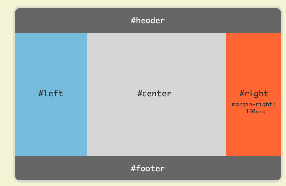
 1 <style>
 2         body{
 3             display: flex;
 4             min-height: 100vh;
 5             flex-direction: column;
 6         }
 7         header, footer {
 8             flex: 1;
 9         }
10         .main{
11             display: flex;
12             flex: 1;
13         }
14         .center{
15             flex: 1;
16         }
17         .left,.right{
18             flex: 0 0 12em;
19         }
20 </style>
21 <body>
22 <header>header</header>
23 <div class="main">
24     <div class="left">left</div>
25     <div class="center">center</div>
26     <div class="right">right</div>
27 </div>
28 <footer>footer</footer>
29 </body>