background是我们前端写样式最常用的属性之一,它有一个大家庭,包含很多子属性
background-color、background-image、background-repeat、background-position、background-size、background-clip等等的属性,这些子属性可拆开声明也可合并声明,看个人编码习惯。连写顺序:background: color image repeat attachment position/size
 1 /* 分别声明 */
 2 .elem {
 3     background-color: #eee;
 4     background-image: url("./logo.png");
 5     background-repeat: no-repeat;
 6     background-position: center;
 7     background-size: 100% auto;
 8 }
 9 /* 合并声明 */
10 .elem {
11     background: #eee url("./logo.png") no-repeat center/100% atuo;
12 }
属性值
background-color:transparent / keyword / hex / rgb / rgba / hsl / hsla ;
background-image:none / url()
background-repeat:repeat / no-repeat / repeat-y / repeat-x / space(图像以相同间距平铺且填空整个节点) / round(图像自动缩放知道适应且填充整个节点)
background-attachment:scroll(图像随着页面滚动而移动) / fixed(图像不随页面滚动而移动)
background-position(图像的起始位置):position(可用任何长度单位,第二个位置Y轴不声明默认是50%(默认0% 0%)) / keyword(位置关键字left/right/top/bottom/center,可单双使用,第二个关键字不声明默认是center)
background-size(图像尺寸模式):auto / cover(图像扩展足够大,使其覆盖整个区域) / contain(图像扩展至最大尺寸,使其宽度和高度完全适应整个区域) / size(可用任何长度单位,第二个人尺寸不声明默认auto)
注意:position的x和y允许负值,x:正值向右负值向左,y:正值向下负值向上。
示例:贴顶背景,使用最多的场景了,背景图片贴着顶部且水平居中。

 1 $bg: "../../img/mountain.jpg";
 2 .pasted-bg {
 3     display: flex;
 4     justify-content: center;
 5     align-items: center;
 6     height: 300px;
 7     background: #000 url($bg) no-repeat center top/auto 300px;
 8     text-shadow: 2px 2px 5px rgba(#000, .5);
 9     font-weight: bold;
10     font-size: 50px;
11     color: #fff;
12 }
使用flex布局让元素居中显示,定死外盒高度,声明background-size:auto 300px,有高度宽度自使用,避免图像拉伸变形,声明background-position:center top,使图像居中贴着顶部。
多重背景:需求为多个背景重叠显示,声明顺序靠前的背景图像的层叠等级较高,叠加背景图像是,靠前的图像尽量使用png格式才能让靠后的背景图像显示,否则可能遮挡靠后的背景图像。例:
1 .overlying-bg {
2     margin-left: 20px;
3     width: 300px;
4     height: 200px;
5     background-image: url(img11.png), url(img22.png);
6     background-repeat: repeat, no-repeat;
7     background-position: left, center;
8     background-size: auto 80px, auto 200px;
9 }
镂空文本:

 1 .pasted-bg {
 2             display: flex;
 3             justify-content: center;
 4             align-items: center;
 5             height: 200px;
 6             background: #fff url(../img.png) no-repeat center top/auto 300px;
 7             -webkit-background-clip:text;/*webkit内核使用生效*/
 8             text-shadow: 2px 2px 5px #dddddd;
 9             font-weight: bold;
10             font-size: 80px;
11             color: transparent;
12         }
背景渐变:linear-gradient()线性渐变,radial-gradient()径向渐变,conic-gradient()锥型渐变
线性渐变: background-image: linear-gradient(direction, color-stop)
direction:方向(to left/right/top/bottom left/top right/bottom left/bottom right 默认为to bottom);angle :角度,以顺时针方向的垂直线和渐变线的夹角计算,超出N全则计算剩余角度
color-stop:色标 color:颜色,position:位置
background-image: linear-gradient(to bottom, #f66, #66f);
等价于 background-image: linear-gradient(to bottom, #f66 0, #66f 100%);
可以有多个色标,第一个为颜色,第二个值为position,若不声明浏览器会自动分配位置
例: background-image: linear-gradient(to bottom, #f66 0, #66f 20%, #f90, 40%, #09f 60%, #9c3 80%, #3c9 100%);

径向渐变,以圆形或椭圆形的方式向任意方向扩散,
background-image: radial-gradient(shape size at position, color-stop)shape(形状):ellipse(椭圆)、circle(圆形)
size(尺寸):farthest-corner(丛远新到离圆形最远的角为半径,默认值);farthest-side(从圆心里圆心最远的变为半径);closest-corner(从圆心到离圆心最近的角为半径);closest-side(从圆心到离圆心最近的边为半径);size(任意长度单位)
position:位置关键字left、right、top、bottom、center(默认center)或者任意长度单位
colorstop:色标,和线性渐变一直
  background-image: radial-gradient(100px 100px, #f66, #66f);等价于

background-image: radial-gradient(ellipse 100px 100px at center, #f66, #66f);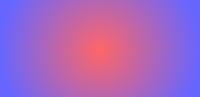
锥型渐变:以圆锥体的方式向顺时针方向扩散,产生渐变效果像辅食原罪体的顶部
background-image: conic-gradient(color-stop)例: background-image: conic-gradient(#f66, #66f);等价于 background-image: conic-gradient(#f66 0, #66f 100%);
实例更改背景色

 1  .gradient-bg {
 2             width: 400px;
 3             display: flex;
 4             justify-content: center;
 5             align-items: center;
 6             height: 200px;
 7             background: linear-gradient(135deg, #f66, #f90, #3c9, #09f, #66f) left center/400%;
 8             font-weight: bold;
 9             font-size: 20px;
10             color: #fff;
11             animation: move 10s infinite;
12         }
13         @keyframes move {
14             0%,
15             100% {
16                 background-position-x: left;
17             }
18             50% {
19                 background-position-x: right;
20             }
21         }
22
23 <div class="gradient-bg">渐变背景</div>
linear-gradient()产生从左上角往右下角渐变的效果,将背景定位在左边,使用animation控制背景定位左右徘徊产生动态的渐变背景
渐变文字:使用镂空文本和江边背景一致,在使用线性渐变,通过filter:hue-rotate()在指定时间内改变背景色相。

 1 .gradient-text {
 2             background-image: linear-gradient(90deg, #f66, #f90);
 3             -webkit-background-clip: text;
 4             font-size: 60px;
 5             color: transparent;
 6             animation: hue 5s linear infinite;
 7         }
 8         @keyframes hue {
 9             from {
10                 filter: hue-rotate(0);
11             }
12             to {
13                 filter: hue-rotate(-1turn);
14             }
15         }
16 <h1 class="gradient-text">Background</h1>
闪烁文本:在渐变文本上声明background-blend-mode为强光模式,可以模拟闪烁效果

 .blink-text {
            width: 100%;
            background-image: linear-gradient(-45deg, #f66 30%, #fff 50%, #f66 70%);
            background-size: 200%;
            -webkit-background-clip: text;
            background-blend-mode: hard-light;
            font-weight: bold;
            font-size: 20px;
            color: transparent;
            animation: shine 2s infinite;
        }
        @keyframes shine {
            from {
                background-position: 100%;
            }
            to {
                background-position: 0;
            }
        }
<h1 class="blink-text">hi,小可爱们,今晚有优惠哦</h1>
方格背景:我就觉得很好用的之一,实现方式:
声明一个左上角的线性渐变,background-image:linear-gradient(45deg,#eee 25%,transparent 25%,transparent 75%,#eee 75%);在复制一份并向上位移20px,通过多重背景属性,声明连个linear-gradient()产生两个图像,再声明position让两个图像错位排列,再声明background-size固定图像大小,在声明repeat平铺(默认为repeat)。
1   .square-bg {
2             width: 500px;
3             height: 300px;
4             background-image: linear-gradient(45deg, #eee 25%, transparent 25%, transparent 75%, #eee 75%),
5             linear-gradient(45deg, #eee 25%, transparent 25%, transparent 75%, #eee 75%);
6             background-position: 0 0, 20px 20px;
7             background-size: 40px 40px;
8         }
9    <h1 class="square-bg"></h1>