数据科学第四章
1.Python绘图基础
- Part 1
import matplotlib.pyplot as plt
from pandas import DataFrame, Series
(1)快速绘图
- Part 2
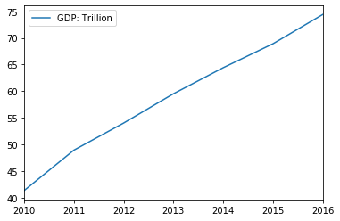
gdp = [41.3, 48.9, 54.0, 59.5, 64.4, 68.9, 74.4]
data = DataFrame({'GDP: Trillion': gdp}, index=['2010', '2011', '2012', '2013', '2014', '2015', '2016'])
data.plot()
plt.show()           # 显示图形
- Part 3
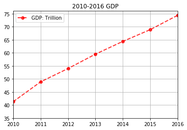
data.plot(title='2010-2016 GDP', LineWidth=2, marker='o', linestyle='dashed', color='r',
          grid=True, alpha=0.8, use_index=True, yticks=[35, 40, 45, 50, 55, 60, 65 ,70, 75])
plt.show()
| 参数名 | 说明 |
|---|---|
| x | x轴数据, 默认值为None |
| y | y轴数据, 默认值为None |
| kind | 绘图类型。'line':折线图, 默认值;'bar':垂直柱状图;'barth':水平柱状图;'hist':直方图;'box':箱式图;'kde'/'density':Kernel核密度估计图;'pie':饼图;'scatter':散点图 |
| title | 图形标题,字符串 |
| color | 画笔颜色。用颜色缩写,如'r', 'b',或者RGB值,如'#CECECE'。主要颜色缩写:'b':blue;'c':cyan;'g':green;'k':black |
| grid | 图形是否有网格,默认为None |
| fontsize | 坐标轴(包括x轴和y轴)刻度的字体大小。整数,默认为None |
| alpha | 透明度0~1 |
| use_index | 默认为True,用索引作为x轴刻度 |
| linewidth | 绘图线宽 |
| linestyle | 绘图线形 |
| marker | 标记风格,即点型 |
| xlim、ylim | x轴,y轴的范围,二元组表示最小值和最大值 |
| ax | axes对象 |
(2)精细画图
- Part 4
plt.figure()       # 创建绘图对象
GDPdata = [41.3, 48.9, 54.0, 59.5, 64.4, 68.9, 74.4]
plt.plot(GDPdata, color='r', linewidth=2, linestyle='dashed', marker='o', label='GDP')    # 绘图

# 精细设置图元
plt.title('2010~2016 GDP: Trillion')
plt.xlim(0, 6)     # x轴绘图范围
plt.ylim(35, 75)   # y轴绘图范围
plt.xticks(range(0, 7), ('2010', '2011', '2012', '2013', '2014', '2015', '2016'))    # 将x轴刻度映射为字符串
plt.legend(loc='upper left')      # 图例说明位置
plt.grid()         # 显示网格线
plt.show()         # 显示并关闭绘图

(3)多子图
- figure.add_subplot(numRows, numCols, plotNum)
- numRows: 绘图区域划分行数
- numCols: 绘图区域划分列数
- plotNum: 绘图区域所在区域
- Part 5
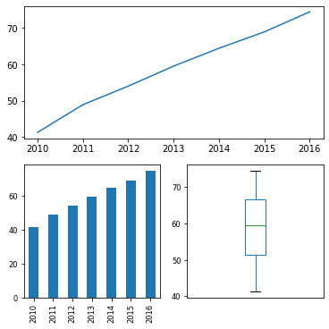
data = Series(GDPdata, index=['2010', '2011', '2012', '2013', '2014', '2015', '2016'])
fig = plt.figure(figsize=(6, 6))      # 定义图形大小

ax1 = fig.add_subplot(2, 1, 1)        # 创建子图1
ax1.plot(data)                        # 用AxesSubplot绘制折线图

ax2 = fig.add_subplot(2, 2, 3)        # 创建子图2
data.plot(kind='bar', use_index=True, fontsize='small', ax=ax2)

ax3 = fig.add_subplot(2, 2, 4)        # 创建子图3
data.plot(kind='box', xticks=[], fontsize='small', ax=ax3)
<matplotlib.axes._subplots.AxesSubplot at 0x27876b1d4c8>
(4)设置图元属性和说明,保存操作
- Part 6
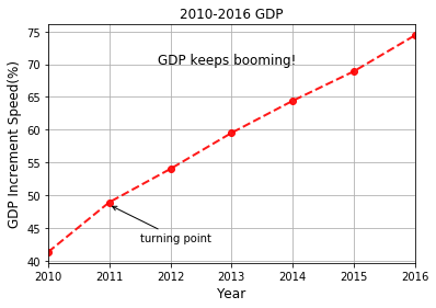
data.plot(title='2010-2016 GDP', LineWidth=2, marker='o', linestyle='dashed', color='r', grid=True, alpha=0.9)

# 超出范围后不显示
plt.annotate('turning point', xy=(1, 48.5), xytext=(1.5, 43), arrowprops=dict(arrowstyle='->'))

plt.text(1.8, 70, 'GDP keeps booming!', fontsize='larger')

plt.xlabel('Year', fontsize=12)
plt.ylabel('GDP Increment Speed(%)', fontsize=12)

# 保存
plt.savefig('3th dataGDP.png', dpi=400, bbox_inches='tight')
2.其他数据可视化表示方法
(1)函数绘图
- Part 7
import numpy as np
import matplotlib.pyplot as plt
from pandas import DataFrame, Series
import pandas as pd

# 设置中文
import matplotlib
plt.rcParams['font.sans-serif'] = ['SimHei']
matplotlib.rcParams['axes.unicode_minus']=False
引入数据
- Part 8
GINI_COV = pd.read_csv('3th dataGINI_COV.csv').iloc[:, 1:]
GINI_COV
| 中国 | 泰国 | 印度尼西亚 | 越南 | 柬埔寨 | 奥地利 | 比利时 | 瑞士 | 捷克 | 德国 | ... | 厄瓜多尔 | 墨西哥 | 巴拿马 | 秘鲁 | 玻利维亚 | 危地马拉 | 洪都拉斯 | 巴拉圭 | 萨尔瓦多 | 南非 | |
|---|---|---|---|---|---|---|---|---|---|---|---|---|---|---|---|---|---|---|---|---|---|
| 0 | 1.472413 | 0.574690 | -1.138000 | 0.961833 | 0.990535 | 0.136190 | 0.030381 | 0.068476 | 0.042095 | -0.323381 | ... | 0.851048 | -0.308119 | 0.322762 | 0.832905 | 0.049214 | 1.650081 | 0.367333 | 0.460762 | 0.765381 | -0.248414 |
| 1 | 0.574690 | 3.887452 | -6.833905 | 0.524238 | 3.745933 | -1.119286 | 0.528905 | 1.387714 | 0.990286 | -0.412095 | ... | 6.916690 | 3.435619 | 3.936405 | 5.758643 | 9.400071 | 2.907842 | 3.463024 | 3.382095 | 6.296405 | -1.531205 |
| 2 | -1.138000 | -6.833905 | 14.122667 | -1.356048 | -6.489586 | 1.886429 | -0.741238 | -2.683857 | -1.907286 | 1.303905 | ... | -13.407095 | -6.943881 | -7.688381 | -10.532714 | -18.070571 | -6.005233 | -4.305619 | -7.516762 | -12.982667 | 4.659531 |
| 3 | 0.961833 | 0.524238 | -1.356048 | 1.286024 | 0.095826 | -0.047500 | 0.106048 | -0.028000 | 0.267429 | -0.462810 | ... | 0.910262 | 0.341690 | 0.487833 | 0.707929 | 0.389357 | 1.017324 | 0.105167 | 0.893524 | 0.997833 | -0.490467 |
| 4 | 0.990535 | 3.745933 | -6.489586 | 0.095826 | 9.228565 | -0.930857 | 1.087014 | 2.284157 | 0.442090 | 0.426067 | ... | 8.361343 | 2.486307 | 3.289538 | 7.452195 | 11.003314 | 4.353009 | 4.024590 | 4.168433 | 5.390538 | 0.507772 |
| ... | ... | ... | ... | ... | ... | ... | ... | ... | ... | ... | ... | ... | ... | ... | ... | ... | ... | ... | ... | ... | ... |
| 62 | 1.650081 | 2.907842 | -6.005233 | 1.017324 | 4.353009 | -0.665786 | -0.105945 | 1.220221 | 0.702843 | -0.544824 | ... | 6.064755 | 2.332612 | 3.492340 | 6.009764 | 7.909443 | 5.156259 | 2.263938 | 4.513252 | 6.001876 | -1.842574 |
| 63 | 0.367333 | 3.463024 | -4.305619 | 0.105167 | 4.024590 | -1.337857 | 0.729190 | 1.060857 | 0.825429 | 0.308048 | ... | 5.653190 | 2.753190 | 3.137762 | 5.501714 | 7.913857 | 2.263938 | 6.586381 | 2.893381 | 4.284190 | 0.413193 |
| 64 | 0.460762 | 3.382095 | -7.516762 | 0.893524 | 4.168433 | -1.205714 | 0.243190 | 1.571286 | 1.186000 | -0.922810 | ... | 7.842762 | 4.199548 | 4.723905 | 7.370429 | 11.137214 | 4.513252 | 2.893381 | 7.250667 | 7.554619 | -2.830776 |
| 65 | 0.765381 | 6.296405 | -12.982667 | 0.997833 | 5.390538 | -1.812143 | 0.501952 | 2.529571 | 1.915143 | -1.159619 | ... | 12.506381 | 6.511738 | 7.451952 | 10.684857 | 17.325214 | 6.001876 | 4.284190 | 7.554619 | 13.171238 | -4.599483 |
| 66 | -0.248414 | -1.531205 | 4.659531 | -0.490467 | 0.507772 | 0.369179 | 0.430743 | -0.412436 | -0.717974 | 1.246205 | ... | -3.732493 | -2.743832 | -2.793590 | -2.007002 | -4.964467 | -1.842574 | 0.413193 | -2.830776 | -4.599483 | 3.824582 |
67 rows × 67 columns
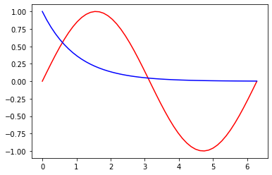
* Part 9x = np.linspace(0, 6.28, 50) # 在0~6.28设置50个采样点
y = np.sin(x) # 计算y=sin(x)数组
plt.plot(x, y, color='r') # 绘制y=sin(x)
plt.plot(x, np.exp(-x), c='b') # 绘制y=exp(-x)
[<matplotlib.lines.Line2D at 0x278769f6f48>]
(2)绘制散点图
- Part 10
data1 = GINI_COV['中国']
data2 = GINI_COV['俄罗斯']
data3 = GINI_COV['泰国']

# 绘制散点图
plt.figure()
plt.scatter(data1, data2, c='r', marker='s', label='China-Russia')
plt.scatter(data1, data3, c='b', marker='^', label='China-Thailand')
plt.title('GINI_COV')
plt.xlabel('China')
plt.ylabel('Other countries')
plt.grid()
plt.legend(loc='upper right')
<matplotlib.legend.Legend at 0x27876a50588>

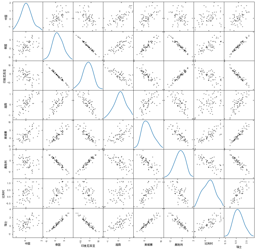
(3)绘制散点图矩阵
- Part 11
# 绘制散点图矩阵
grr = pd.plotting.scatter_matrix(GINI_COV.iloc[:, :8], diagonal='kde', color='k', figsize=(15,15))
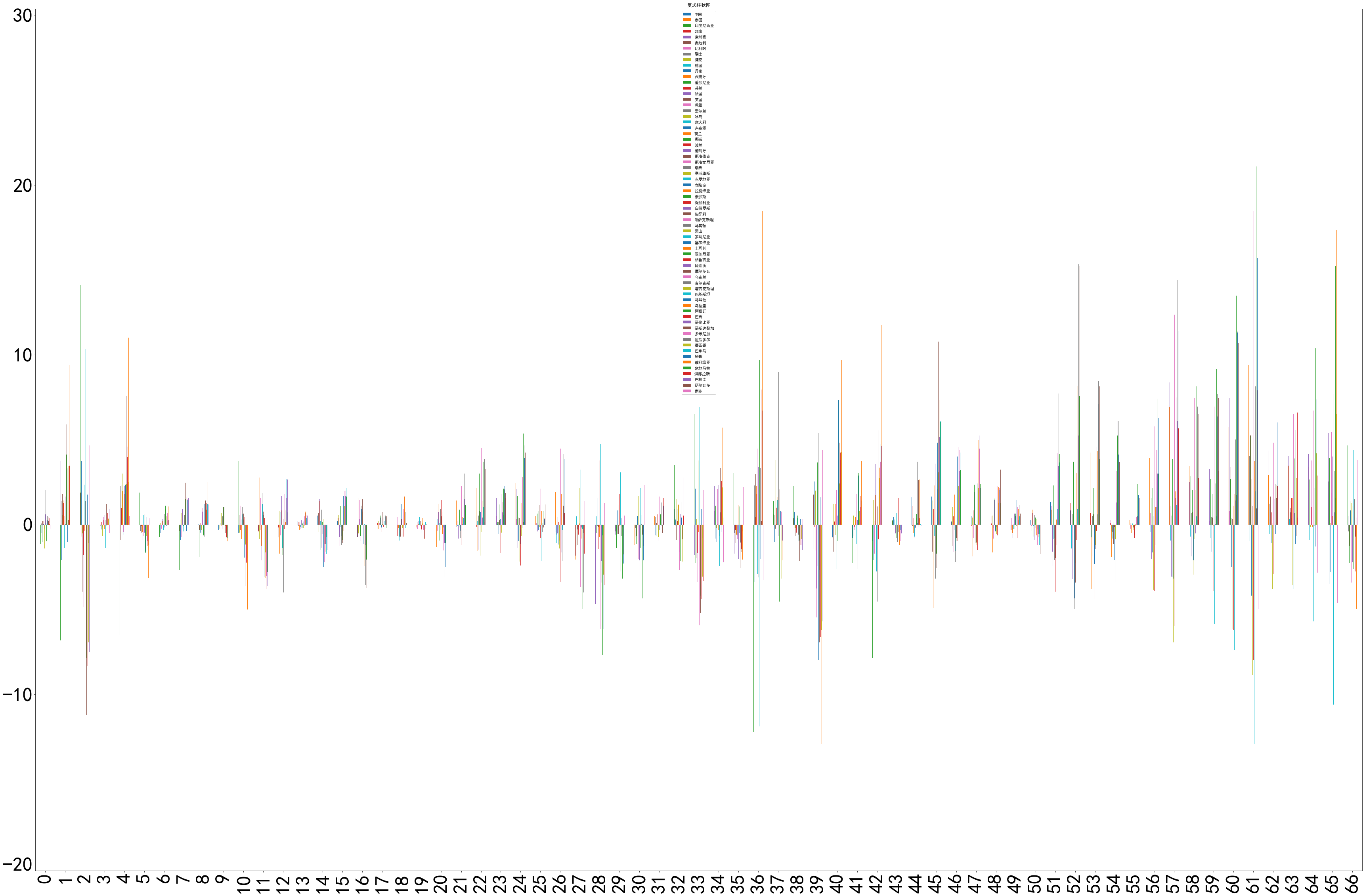
(4)柱状图
- Part 12
# 绘制复式柱状图
GINI_COV.plot(kind='bar', title='复式柱状图', figsize=(60,40), fontsize=50)
<matplotlib.axes._subplots.AxesSubplot at 0x2783b768508>
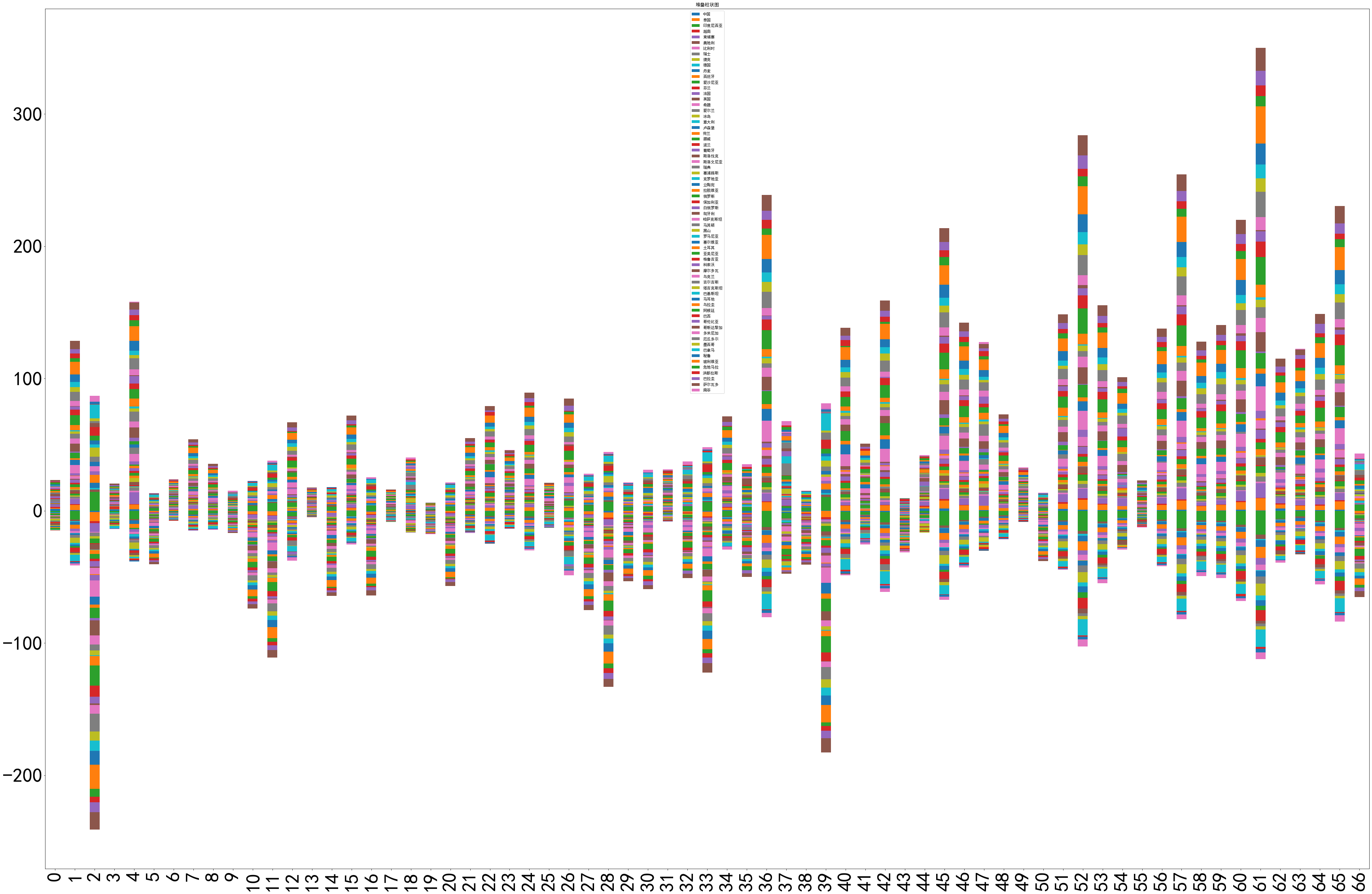
- Part 13
# 绘制堆叠柱状图
GINI_COV.plot(kind='bar', stacked=True, title='堆叠柱状图', figsize=(60,40), fontsize=50)
<matplotlib.axes._subplots.AxesSubplot at 0x2783fa77848>
- Part 14
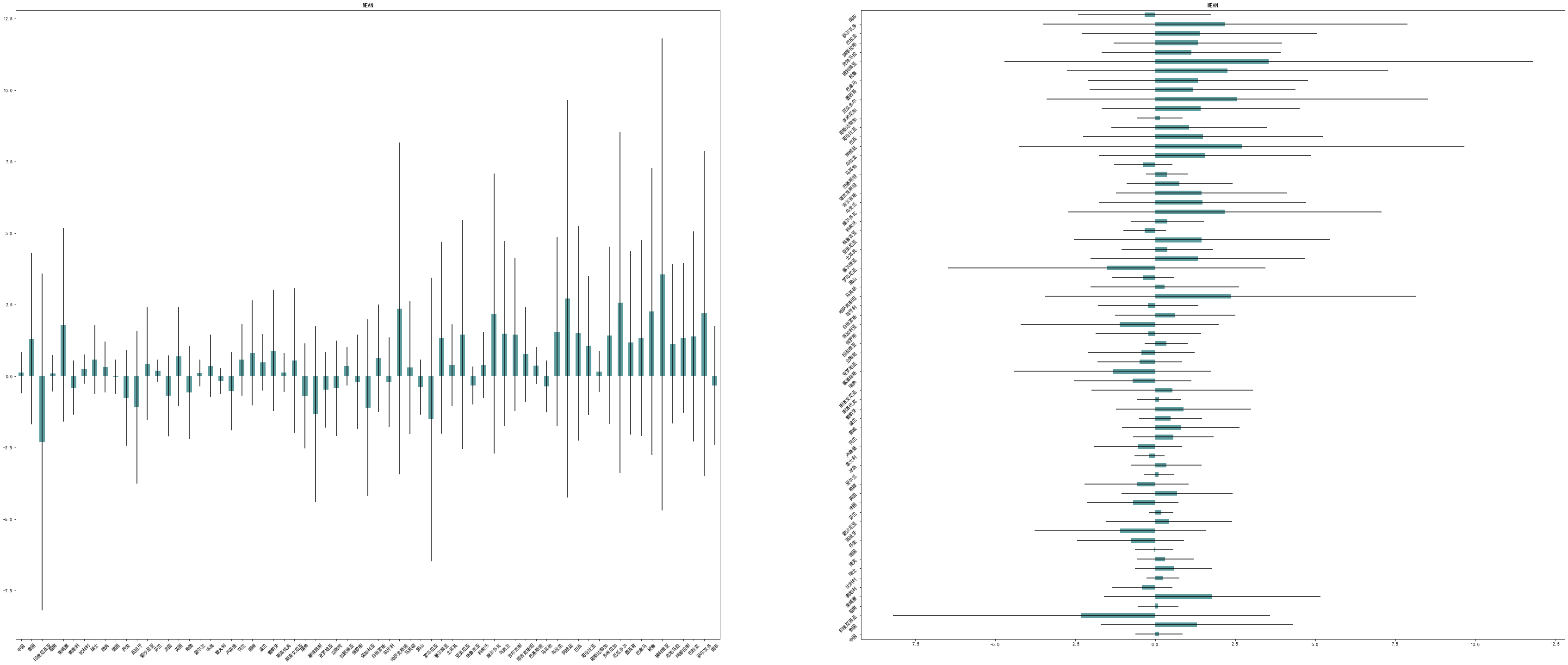
# 绘制均值与标准差图
mean = np.mean(GINI_COV)         # 计算均值
std = np.std(GINI_COV)           # 计算标准差
fig = plt.figure(figsize = (60, 25))
plt.subplots_adjust(wspace=0.2)  # 设置纵向间隔

# 绘制均值的垂直和水平柱状图,标准差使用误差线表示
ax1 = fig.add_subplot(1, 2, 1)
mean.plot(kind='bar', yerr=std, color='cadetblue', title='MEAN', rot=45, ax=ax1)

ax2 = fig.add_subplot(1, 2, 2)
mean.plot(kind='barh', xerr=std, color='cadetblue', title='MEAN', rot=45, ax=ax2)
<matplotlib.axes._subplots.AxesSubplot at 0x21ddd87c488>
(5)折线图
- Part 15
GINI = pd.read_csv('3th dataGINI.csv')
GINI = GINI.iloc[:, 1:].T.interpolate(method='linear').fillna(method='bfill')
GINI
| 0 | 1 | 2 | 3 | 4 | 5 | 6 | 7 | 8 | 9 | ... | 148 | 149 | 150 | 151 | 152 | 153 | 154 | 155 | 156 | 157 | |
|---|---|---|---|---|---|---|---|---|---|---|---|---|---|---|---|---|---|---|---|---|---|
| 2000 | 33.500 | 32.1 | 31.70 | 42.100000 | 38.100000 | 46.1 | 42.80 | 37.700 | 39.1 | 63.2600 | ... | 44.400000 | 48.50 | 40.200 | 46.3 | 39.8000 | 42.20 | 37.300000 | 45.200000 | 42.2000 | 43.2 |
| 2001 | 33.500 | 32.1 | 31.70 | 42.100000 | 38.100000 | 46.1 | 42.35 | 37.700 | 39.1 | 59.0880 | ... | 44.400000 | 49.20 | 40.200 | 46.3 | 39.8000 | 42.20 | 37.728571 | 45.200000 | 42.2000 | 43.2 |
| 2002 | 33.500 | 32.1 | 31.70 | 42.100000 | 38.100000 | 46.1 | 41.90 | 37.675 | 39.1 | 54.9160 | ... | 44.400000 | 49.90 | 40.200 | 46.3 | 39.8000 | 42.20 | 38.157143 | 45.200000 | 42.2000 | 43.2 |
| 2003 | 33.500 | 32.1 | 31.70 | 41.733333 | 38.483333 | 46.1 | 42.20 | 37.650 | 39.1 | 50.7440 | ... | 44.400000 | 50.60 | 40.200 | 46.3 | 39.8000 | 42.20 | 38.585714 | 44.433333 | 42.2000 | 43.2 |
| 2004 | 33.100 | 32.1 | 31.70 | 41.366667 | 38.866667 | 46.1 | 42.50 | 37.625 | 39.1 | 46.5720 | ... | 44.400000 | 51.30 | 39.425 | 46.3 | 40.2375 | 42.20 | 39.014286 | 43.666667 | 42.2000 | 43.2 |
| 2005 | 33.675 | 32.1 | 31.70 | 41.000000 | 39.250000 | 46.1 | 42.15 | 37.600 | 39.1 | 42.4000 | ... | 44.400000 | 52.00 | 38.650 | 46.3 | 40.6750 | 42.20 | 39.442857 | 42.900000 | 42.1875 | 43.2 |
| 2006 | 34.250 | 32.1 | 31.70 | 41.633333 | 39.633333 | 46.1 | 41.80 | 37.575 | 39.1 | 42.1125 | ... | 40.850000 | 51.04 | 37.875 | 46.3 | 41.1125 | 42.20 | 39.871429 | 43.225000 | 42.1750 | 43.2 |
| 2007 | 34.825 | 32.1 | 32.00 | 42.266667 | 40.016667 | 46.1 | 39.80 | 37.550 | 39.1 | 41.8250 | ... | 37.300000 | 50.08 | 37.100 | 46.3 | 41.5500 | 42.96 | 40.300000 | 43.550000 | 42.1625 | 43.2 |
| 2008 | 35.400 | 32.1 | 32.30 | 42.900000 | 40.400000 | 45.5 | 40.30 | 37.525 | 39.1 | 41.5375 | ... | 35.850000 | 49.12 | 36.325 | 46.3 | 41.9875 | 43.72 | 39.675000 | 43.875000 | 42.1500 | 43.2 |
| 2009 | 35.050 | 32.1 | 32.15 | 43.300000 | 39.660000 | 46.3 | 39.60 | 37.500 | 39.1 | 41.2500 | ... | 34.400000 | 48.16 | 35.550 | 46.3 | 42.4250 | 44.48 | 39.050000 | 44.200000 | 42.1375 | 43.2 |
| 2010 | 34.700 | 32.1 | 32.00 | 43.700000 | 38.920000 | 45.1 | 39.40 | 37.500 | 39.1 | 40.9625 | ... | 32.950000 | 47.20 | 34.775 | 46.3 | 42.8625 | 45.24 | 38.425000 | 43.133333 | 42.1250 | 43.2 |
| 2011 | 34.975 | 32.1 | 31.80 | 42.400000 | 38.180000 | 43.9 | 37.50 | 37.500 | 39.1 | 40.6750 | ... | 31.500000 | 46.50 | 34.000 | 46.3 | 43.3000 | 46.00 | 37.800000 | 42.066667 | 42.1125 | 43.2 |
| 2012 | 35.250 | 32.1 | 31.60 | 42.200000 | 37.440000 | 42.6 | 39.30 | 37.500 | 39.1 | 40.3875 | ... | 32.433333 | 45.80 | 34.000 | 46.3 | 43.3000 | 46.00 | 37.800000 | 41.000000 | 42.1000 | 43.2 |
| 2013 | 35.525 | 32.1 | 31.60 | 39.700000 | 36.700000 | 41.3 | 37.80 | 37.500 | 39.1 | 40.1000 | ... | 33.366667 | 45.10 | 34.000 | 46.3 | 43.3000 | 46.00 | 37.800000 | 41.000000 | 42.1000 | 43.2 |
| 2014 | 35.800 | 32.1 | 31.60 | 39.100000 | 36.700000 | 41.3 | 37.00 | 37.500 | 39.1 | 40.1000 | ... | 34.300000 | 45.10 | 34.000 | 46.3 | 43.3000 | 46.00 | 37.800000 | 41.000000 | 42.1000 | 43.2 |
15 rows × 158 columns
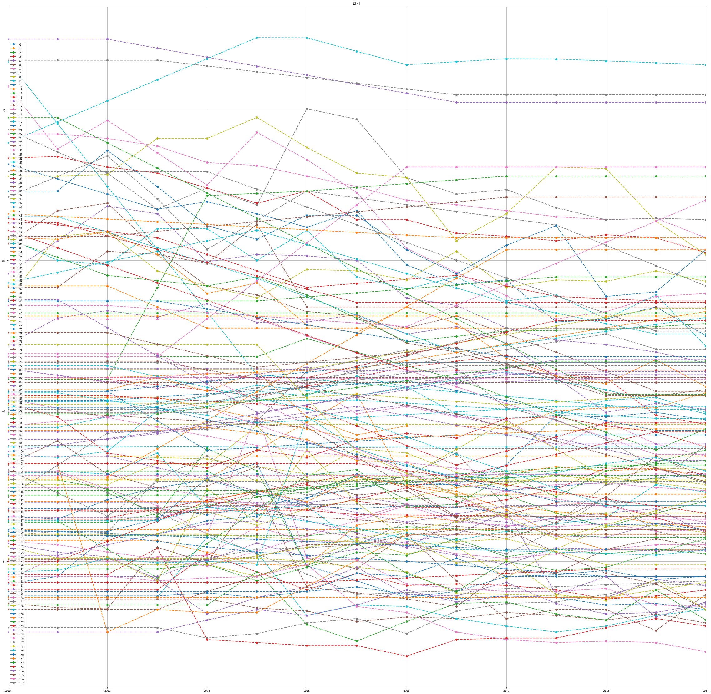
* Part 16GINI.plot(title='GINI', LineWidth=2, marker='o', linestyle='dashed', grid=True, use_index=True, figsize=(40, 40))
<matplotlib.axes._subplots.AxesSubplot at 0x21deb294848>
- Part 17
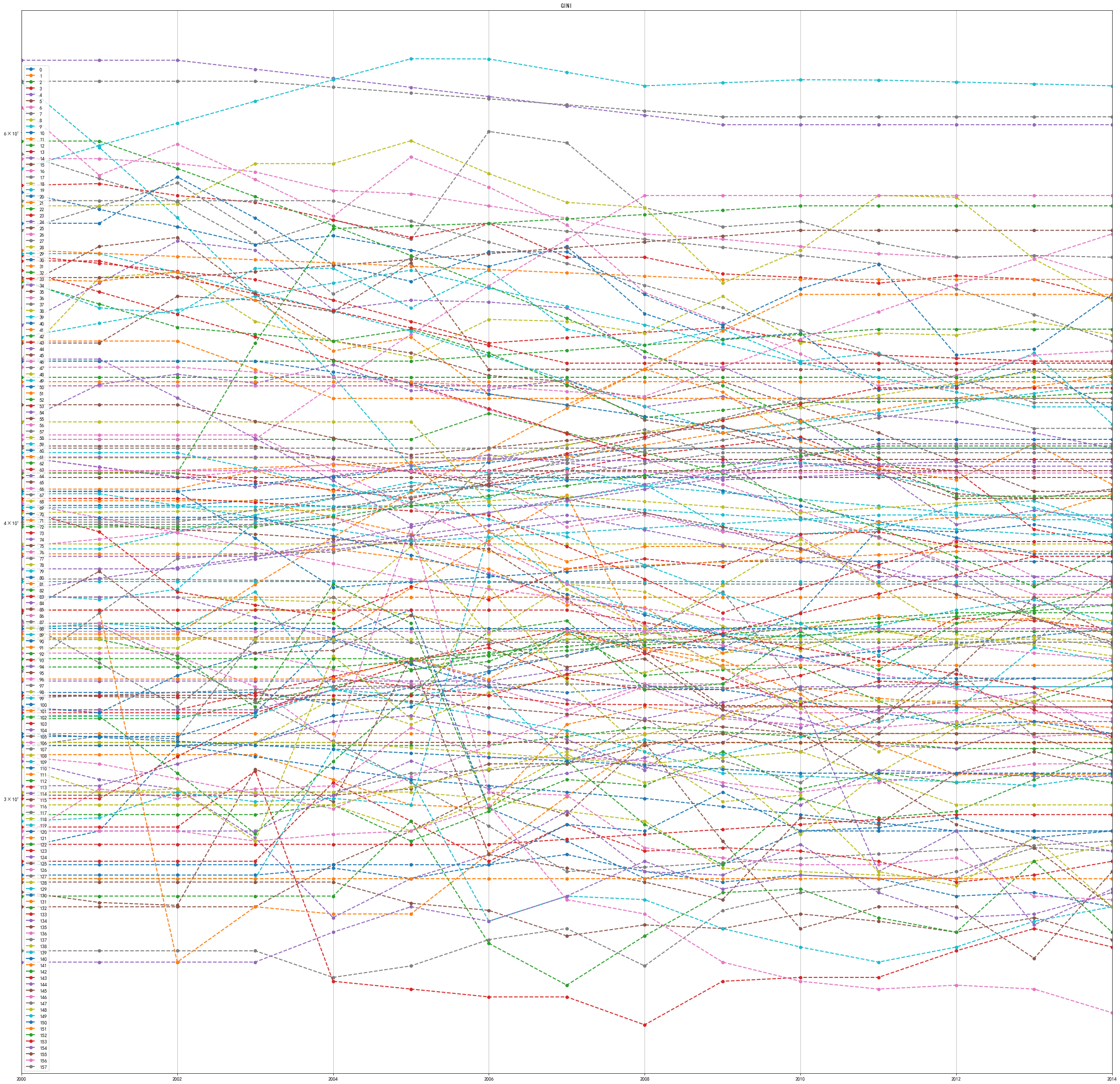
# 半对数折线图
GINI.plot(logy=True, title='GINI', LineWidth=2, marker='o', linestyle='dashed', grid=True, use_index=True, figsize=(40, 40))
<matplotlib.axes._subplots.AxesSubplot at 0x21deb7631c8>
(6)直方图和密度图
- Part 18
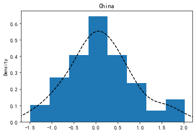
GINI_COV['中国'] .plot(kind='hist', density=True, bins=8, title='China')
GINI_COV['中国'] .plot(kind='kde', title='China', xlim=[-1.7, 2.2], style='k--')
<matplotlib.axes._subplots.AxesSubplot at 0x2461be0ed48>
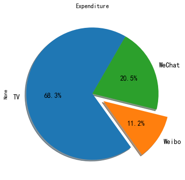
(7)饼图
- Part 19
data = DataFrame([[230.1, 37.8, 69.2]], columns=['TV', 'Weibo', 'WeChat']).sum()
data
TV        230.1
Weibo      37.8
WeChat     69.2
dtype: float64
- Part 20
data.plot(kind='pie', figsize=(6, 6), title='Expenditure', fontsize=14, explode=[0, 0.2, 0], shadow=True, startangle=60, autopct='%1.1f%%')
<matplotlib.axes._subplots.AxesSubplot at 0x2462246ef08>
(8)箱型图
- Part 21
GINI_COV.plot(kind='box', figsize=(20, 10), title='Country', grid=True)
<matplotlib.axes._subplots.AxesSubplot at 0x24621b183c8>
