zoukankan      html  css  js  c++  java
  • CSS3幽灵

    先来看看静态效果图:

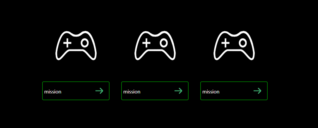
    要做的效果是鼠标移到图片上时,图片旋转360度并放大1.2倍

    鼠标移动到下方框时,四周有四条线分别沿着四条框进入,同时箭头向左移动

    主要使用的CSS3属性是transition,transform

    transition用于定义过渡动画,比如:transition:all 1s; transition:width 1s;意思是所有css属性改变的过渡时间为1s。这个属性定义在需要进行动画发生的那个元素的选择器上面

    transform用于变换,包括缩放scale(倍数,比如1.0、1.2),平移translate(x坐标,y坐标),旋转rotate(XXdeg),语法:transform:ratate() translate() scale();

    参考代码如下:

    <!DOCTYPE html>
    <html>
        <head>
            <meta charset="UTF-8">
            <title>幽灵按钮</title>
            <style type="text/css">
                /*清除默认边距和内填充*/
                *{
                    margin:0;
                    padding:0;
                }
                body{
                    background: black;
                }
                #wrap{
                    width: 900px;
                    height: 300px;
                    margin: 100px auto;/*元素居中*/
                }
                .box{
                    height: 300px;
                    width: 30%;
                    float: left;
                }
                .box span{
                    display: block;
                    width: 100%;
                    height: 200px;
                    text-align: center;/*图片元素会被视为文本内容,水平居中可以使用text-align,但是毕竟不是文本,所以垂直不可以使用line-height*/
                    padding-top: 50px;
                    transition: all 1s; 
                }
                .box span:hover{
                    transform: rotate(360deg) scale(1.2);/*不可以在第二行另写transform:scale(1.2)这样只会覆盖上一句,所以两个效果必须一起写,用空格隔开*/
                }
                .box a{
                    border-radius: 5px;
                    margin: auto;
                    width: 80%;
                    height: 50px;
                    line-height: 55px;/*这里需要算上border的宽度*/
                    padding: 5px;
                    position: relative;/*用于四条动画边的定位*/
                    color: white;
                    text-decoration: none;
                    display: block;
                    border: 2px green solid;
                    background: url(img/allow.png) no-repeat 90%;
                    transition: all 0.5s;
                }
                
                p{
                    background: green;
                    position: absolute;
                    transition: all 0.5s;
                }
                .top{
                    width: 0%;
                    height: 2px;
                    top: -2px;
                    left: -50%;
                }
                .right{
                    width: 2px;
                    height: 0%;
                    top: -100%;
                    right: -2px;
                }
                .bottom{
                    width: 0%;
                    height: 2px;
                    top: calc(100%+2px);
                    left: 150%;
                }
                .left{
                    width: 2px;
                    height: 0%;
                    top: 200%;
                    left: -2px;
                }
                
                .box a:hover{
                    background: url(img/allow.png) no-repeat 95%;
                }
                .box a:hover .top{
                    width: 100%;
                    left: -2px;
                }
                .box a:hover .right{
                    height: 100%;
                    top: -2px;
                }
                .box a:hover .bottom{
                    width: 100%;
                    left:-2px;    
                }
                .box a:hover .left{
                    height: 100%;
                    top: -2px;
                }
            </style>
        </head>
        <body>
            <div id="wrap">
                <div class="box">
                    <span>
                        <img src="img/mission.png" alt="mission" />
                    </span>
                    <a href="#">
                        mission
                        <p class="top"></p>
                        <p class="right"></p>
                        <p class="bottom"></p>
                        <p class="left"></p>
                    </a>
                </div>
            </div>
        </body>
    </html>

    这里说一下四条边制作的思路,拿左边第一条为例。父元素设置为relative,因此,子元素会相对于父元素定位,假如第一条边为top:0,left:0.则只会在父元素的边框下面,而不会与边框重叠,因此top需要设置为负的父元素的边框长度,这样就会使得两边重合。然后通过定义left:-100%,将边设置到左边宽度为父元素宽度的地方,然后把width设置会0%,height为边框高度,然后设置伪类选择器,当鼠标移动到边框范围,就触发动画,在0.5s内将边的width变为100%,并且改变left为:-2px;就可以做到同时边大小改变且向父元素边框靠近重合的效果

    素材如下:

    箭头:

    三张图片(因为白色所以看不见):

  • 相关阅读:
    python3编写网络爬虫18-代理池的维护
    python3编写网络爬虫17-验证码识别
    python3编写网络爬虫16-使用selenium 爬取淘宝商品信息
    python3编写网络爬虫15-Splash的使用
    python3编写网络爬虫14-动态渲染页面爬取
    LeetCode959 由斜杠划分区域(Java并查集)
    编译原理--语法分析之LR分析法的简单实现
    VsCode背景图片设置
    编译原理--基于Lex的词法分析器实验
    HDFS常用的shell命令
  • 原文地址:https://www.cnblogs.com/runhua/p/9622155.html
Copyright © 2011-2022 走看看