W3C提供的CheckBox和radio的原始样式非常的丑,而且在不同的额浏览器表现还不一样,使用常规的方法添加样式没法进行修改样式
一, 单选按钮
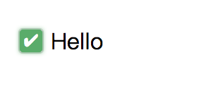
<html>

<head>
    <style type="text/css">
        .switch {
            margin: 20px 20px 0 0;
            display: flex;
            align-items: center;
            width: auto;
        }
        .checkbox-input {
            display: none
        }
        .checkbox {
            -webkit-transition: background-color 0.3s;
            transition: background-color 0.3s;
            background-color: #fff;
            border: 1px solid #d7d7d7;
            border-radius: 3px;
            width: 16px;
            height: 16px;
            vertical-align:middle;
            margin: 0 5px;
        }
        .checkbox-input:checked+.checkbox {
            background-color: #57ad68;
        }
        .checkbox-input:checked+.checkbox:after {
            content: "2714";
            display: inline-block;
            height: 100%;
            width: 100%;
            color: #fff;
            text-align: center;
            line-height: 16px;
            font-size: 12px;
            box-shadow: 0 0 4px #57ad68;
        }
    </style>
</head>

<body>
    <label class="switch">
        <input class="checkbox-input" id="checkbox" type="checkbox" name="demo-checkbox1">
        <label class="checkbox" for="checkbox"></label>
        <span>Hello</span>
    </label>
</body>

</html>
利用的就是label和CSS3的选中状态checked来修改样式, 中间的那个小✔️是一个unicode编码的字符, 如果需要更改参考http://blog.csdn.net/wy_97/article/details/77749405
二, 复选按钮

<html>

<head>
    <style type="text/css">
        .switch {
            display: flex;
            align-items: center;
            width: auto;
            float: left;
        }
        .radio-beauty-container .radio-beauty {
            width: 16px;
            height: 16px;
            box-sizing: border-box;
            display: inline-block;
            border: 1px solid #d7d7d7;
            margin: 0 5px;
            border-radius: 50%;
            transition: 0.2s;
        }
        .radio-beauty-container input[type="radio"]:checked+.radio-beauty {
            border: solid 1px green;
            padding: 3px;
            background-color: green;
            background-clip: content-box;
            box-shadow: inset 0 0 1px rgba(0,128,0, 0.2), 0 0 3px green;
        }
    </style>
</head>

<body>
    <div class="radio-beauty-container">
        <label class="switch">
            <span class="radio-name">radio2</span>
            <input type="radio" name="radioName" id="radioName2" hidden/>
            <label for="radioName2" class="radio-beauty"></label>
        </label>
        <label class="switch">
            <span class="radio-name">radio3</span>
            <input type="radio" name="radioName" id="radioName3" hidden/>
            <label for="radioName3" class="radio-beauty"></label>
        </label>
    </div>
</body>

</html>
和单选按钮的思路一样都是利用选中状态来进行判断
三, 实现滑动按钮
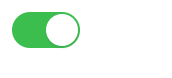
<html>

<head>
    <style type="text/css">
        .switch-slide-label {
            display: block;
            width: 34px;
            height: 18px;
            background: #ccc;
            border-radius: 30px;
            cursor: pointer;
            position: relative;
            -webkit-transition: 0.3s ease;
            transition: 0.3s ease;
        }

        .switch-slide-label:after {
            content: '';
            display: block;
            width: 16px;
            height: 16px;
            border-radius: 100%;
            background: #fff;
            box-shadow: 0 1px 1px rgba(0, 0, 0, .1);
            position: absolute;
            left: 1px;
            top: 1px;
            -webkit-transform: translateZ(0);
            transform: translateZ(0);
            -webkit-transition:0.3s ease;
            transition:0.3s ease;
        }

        .switch-slide input:checked+label {
            background: #34bf49;
            transition: 0.3s ease;
        }
        .switch-slide input:checked+label:after {
            left: 17px;
        }

    </style>
</head>

<body>
    <div class="radio-beauty-container">
        <label class="switch-slide">
            <input type="checkbox" id="menu-right" hidden>
            <label for="menu-right" class="switch-slide-label"></label>
        </label>
    </div>
</body>

</html>