XAML:Extensible Application Markup Language,即可拓展应用程序标记语言
无论是在wp,wpf还是wf中,都可以用XAML来编辑页面的效果,非常简便
使用XAML时,既可以推拽控件到目的位置,也可以手敲代码实现控件的布局。当然,如果熟悉了还是代码方便些···
设计xaml非常的有趣,建议通过视频教程学习,边看边做,加强理解。
下面我把我在看视频教程中使用的几个非常简单的例子介绍一下。
下面的例子使用了grid,rectangle控件,并使用alignment和margin来分配布局
 1 <Page
 2     x:Class="AlignmentAndMargins.MainPage"
 3     xmlns="http://schemas.microsoft.com/winfx/2006/xaml/presentation"
 4     xmlns:x="http://schemas.microsoft.com/winfx/2006/xaml"
 5     xmlns:local="using:AlignmentAndMargins"
 6     xmlns:d="http://schemas.microsoft.com/expression/blend/2008"
 7     xmlns:mc="http://schemas.openxmlformats.org/markup-compatibility/2006"
 8     mc:Ignorable="d"
 9     Background="{ThemeResource ApplicationPageBackgroundThemeBrush}">
10     <!--上面的代码定义了一些默认命名空间,以及设计的参数-->
11     <Grid>
12         <!--方形控件 fill填充色 height高度 width宽度 -->
13         <!--HorizontalAlignment表示水平方向向左对齐-->
14         <!--VerticalAlignment表示竖直方向向上对齐-->
15
16         <!--蓝色方块位于左上角-->
17         <Rectangle Fill="Blue"
18                    Height="100"
19                    Width="100"
20                    HorizontalAlignment="Left"
21                    VerticalAlignment="Top" />
22         <!--红色方块位于右下角-->
23         <Rectangle Fill="Red"
24                    Height="100"
25                    Width="100"
26                    HorizontalAlignment="Right"
27                    VerticalAlignment="Bottom" />
28         <!--绿色方块位于正中间-->
29         <Rectangle Fill="Green"
30                    Height="100"
31                    Width="100"
32                    HorizontalAlignment="Center"
33                    VerticalAlignment="Center" />
34         <!--Margin属性声明了控件四周与其他控件的距离 顺序为:左,上,右,下-->
35
36         <!--黄色方块向左上方对齐,与左侧距离100,与上方距离100-->
37         <Rectangle Fill="Yellow"
38                    Height="100"
39                    Width="100"
40                    HorizontalAlignment="Left"
41                    VerticalAlignment="Top"
42                    Margin="100,100"/>
43         <!--白色方块向左下方对齐,与左侧距离50,与下方距离50-->
44         <Rectangle Fill="White"
45                    Height="100"
46                    Width="100"
47                    HorizontalAlignment="Left"
48                    VerticalAlignment="Bottom"
49                    Margin="50,0,0,50"/>
50
51     </Grid>
52 </Page>

说明一下,Grid控件成为网格布局,类似HTML里面的Table标签,通过定义表格,然后设置表格里面的行和列,进行布局。
第一个例子并没有真正显示Grid的作用,下面通过第二个例子来看看行(row)和列(column)的定义
2.
 1 <Page
 2     x:Class="GridsRowsAndColumns.MainPage"
 3     xmlns="http://schemas.microsoft.com/winfx/2006/xaml/presentation"
 4     xmlns:x="http://schemas.microsoft.com/winfx/2006/xaml"
 5     xmlns:local="using:GridsRowsAndColumns"
 6     xmlns:d="http://schemas.microsoft.com/expression/blend/2008"
 7     xmlns:mc="http://schemas.openxmlformats.org/markup-compatibility/2006"
 8     mc:Ignorable="d"
 9     Background="{ThemeResource ApplicationPageBackgroundThemeBrush}">
10
11     <!--Resources里面定义了一些在整个页面里都可用的一些模式-->
12     <Page.Resources>
13         <Style TargetType="TextBlock">
14             <Setter Property="FontSize" Value="42" />
15         </Style>
16     </Page.Resources>
17
18     <Grid>
19         <!--Grid.RowDefinitions 定义了grid里面的行-->
20         <!--*代表剩余部分,如果前面还有数字,则按照比例进行分配,例如下面各行分别占1/6,2/6,3/6-->
21         <Grid.RowDefinitions>
22             <RowDefinition Height="*" />
23             <RowDefinition Height="2*" />
24             <RowDefinition Height="3*" />
25         </Grid.RowDefinitions>
26         <!--Grid.ColumnDefinitions 定义了grid里面的列-->
27         <Grid.ColumnDefinitions>
28             <ColumnDefinition Width="*" />
29             <ColumnDefinition Width="*" />
30             <ColumnDefinition Width="*" />
31         </Grid.ColumnDefinitions>
32
33         <!--TextBlock文本块控件,用于显示少量文字-->
34         <TextBlock>1</TextBlock>
35         <TextBlock Grid.Column="1">2</TextBlock>
36         <TextBlock Grid.Column="2">3</TextBlock>
37
38         <TextBlock Grid.Row="1">4</TextBlock>
39         <TextBlock Grid.Row="1" Grid.Column="1">5</TextBlock>
40         <TextBlock Grid.Row="1" Grid.Column="2">6</TextBlock>
41
42         <TextBlock Grid.Row="2">7</TextBlock>
43         <TextBlock Grid.Row="2" Grid.Column="1">8</TextBlock>
44         <TextBlock Grid.Row="2" Grid.Column="2">9</TextBlock>
45
46     </Grid>
47 </Page>

grid网格布局,只是xaml提供的众多布局中的一种,其他的还有
StackPanel:堆放布局,将子元素排列成一行或一列
Canvas:绝对布局,通过指定子元素相对父元素的准确位置,来布局子元素。类似于javafx里面的anchorpane
ect.
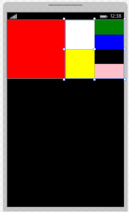
3.StackPanel:
 1 <Page
 2     x:Class="StackPanelExample.MainPage"
 3     xmlns="http://schemas.microsoft.com/winfx/2006/xaml/presentation"
 4     xmlns:x="http://schemas.microsoft.com/winfx/2006/xaml"
 5     xmlns:local="using:StackPanelExample"
 6     xmlns:d="http://schemas.microsoft.com/expression/blend/2008"
 7     xmlns:mc="http://schemas.openxmlformats.org/markup-compatibility/2006"
 8     mc:Ignorable="d"
 9     Background="{ThemeResource ApplicationPageBackgroundThemeBrush}">
10
11     <Grid>
12         <!--Orientation表示stackpanel的方向-->
13         <StackPanel Orientation="Horizontal" VerticalAlignment="Top">
14             <Rectangle Width="200" Height="200" Fill="Red" />
15
16             <StackPanel Orientation="Vertical">
17                 <StackPanel Orientation="Horizontal">
18                     <Rectangle Width="100" Height="100" Fill="White" />
19                     <StackPanel Orientation="Vertical">
20                         <Rectangle Width="100" Height="50" Fill="Green" />
21                         <Rectangle Width="100" Height="50" Fill="Blue" />
22                     </StackPanel>
23                 </StackPanel>
24
25                 <StackPanel Orientation="Horizontal">
26                     <Rectangle Width="100" Height="100" Fill="Yellow" />
27                     <StackPanel Orientation="Vertical">
28                         <Rectangle Width="100" Height="50" Fill="Black" />
29                         <Rectangle Width="100" Height="50" Fill="Pink" />
30                     </StackPanel>
31                 </StackPanel>
32             </StackPanel>
33         </StackPanel>
34     </Grid>
35 </Page>
最后,要提醒一点。如果习惯使用绝对布局,使用margin,或是直接拖拽的朋友要注意,如果在屏幕大小不同的设备上显示你的布局,可能会有问题。
所以,在设计页面布局时,最好使用*这样自动分配大小的属性,或是用ScrollViewer滚动视图控件来实现。