系列文章链接
- WPF进阶技巧和实战01-小技巧
- WPF进阶技巧和实战02-布局
- WPF进阶技巧和实战03-控件(1-控件及内容控件)
- WPF进阶技巧和实战03-控件(2-特殊容器)
- WPF进阶技巧和实战03-控件(5-列表、树、网格01)
- WPF进阶技巧和实战03-控件(5-列表、树、网格02)
- WPF进阶技巧和实战03-控件(5-列表、树、网格03)
- WPF进阶技巧和实战03-控件(5-列表、树、网格04)
- WPF进阶技巧和实战04-资源
- WPF进阶技巧和实战05-样式与行为
- WPF进阶技巧和实战06-控件模板
- WPF进阶技巧和实战07--自定义元素01
- WPF进阶技巧和实战07--自定义元素02
- WPF进阶技巧和实战08-依赖属性与绑定01
- WPF进阶技巧和实战08-依赖属性与绑定02
- WPF进阶技巧和实战08-依赖属性与绑定03
列表控件
ItemsControl为列表项控件定义了基本功能,下图是ItemsControl的继承关系:
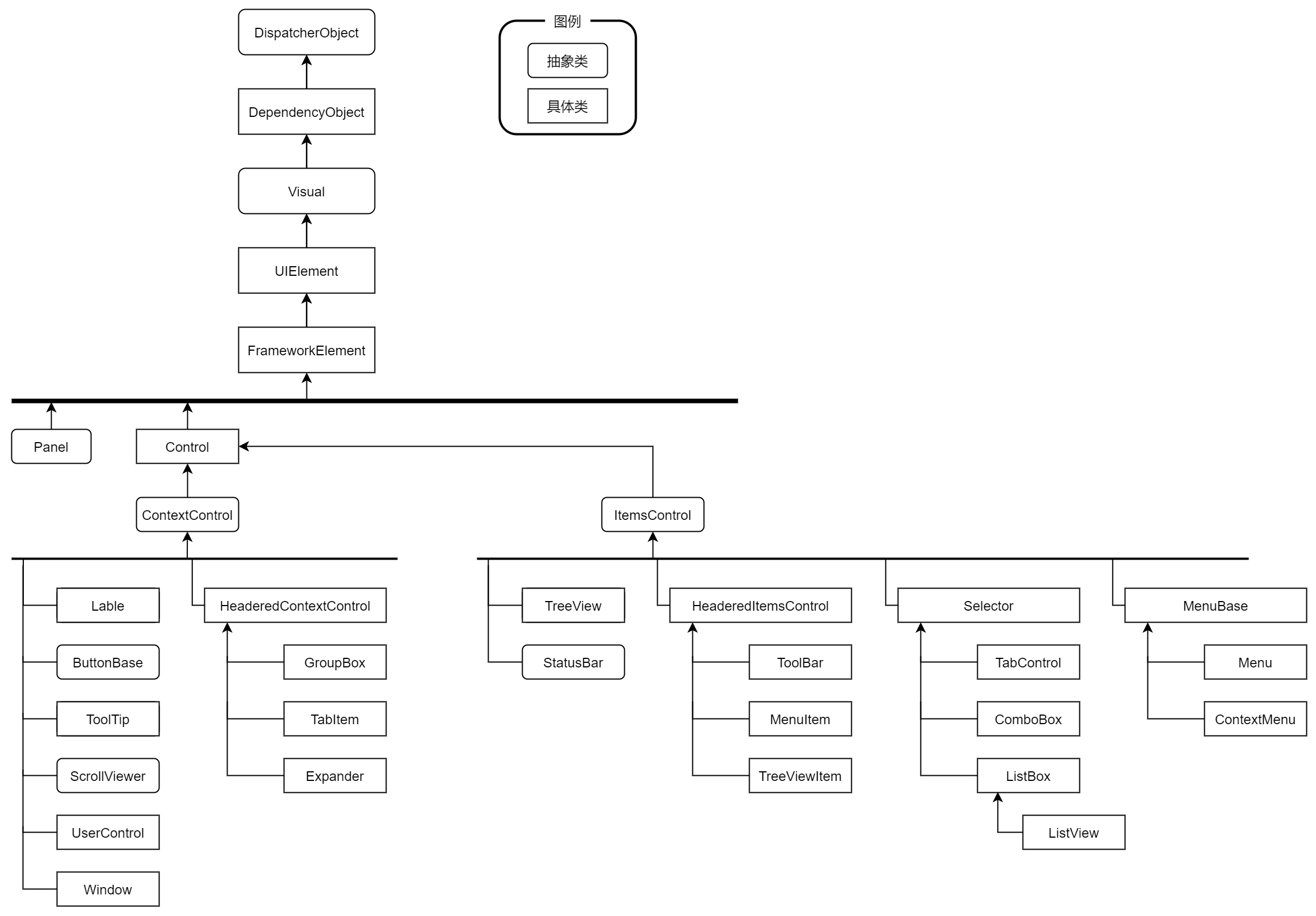
在继承自ItemsControl类的层次结构中,还显示了项封装器(MenuItem、TreeVIewItem),因为这些项(类)可以包含自己的项集合(从而实现数控件和菜单的嵌套关系和层次结构)。在继承表中没有ComboBoxItem和ListBoxItem没有出现,那是因为他们不需要包含项的子集合,所以也就不继承自ItemsControl类。
ItemsControl类中雨格式化相关的属性:
| 名称 | 说明 |
|---|---|
| ItemsSource | 绑定的数据源(希望在列表中显示的集合或者DataView对象) |
| DisplayMemberPath | 希望为每个数据项显示的属性。对于更复杂的表达形式或者为了使用多个属性的组合而言,应改用ItemTemplate(DataTemplate类型,也就是修改数据模板)属性 |
| ItemStringFormat | 格式化字符串,使用这个属性为每个项格式化文本。通常用在数字或者日期只转换成合适的显示形式 |
| ItemContainerStyle | 该属性是个样式。通过该样式可以设置封装每个项的容器的多个属性。容器取决于列表类型(ListBox类是ListBoxItem,ComboBox是ComboBoxItem),当填充列表是,自动创建这些封装器对象。其实就是修改项的样式 |
| ItemContainerStyleSelector | 使用代码为列表中每项的封装器选择样式的StyleSelector对象。可以使用该属性为列表中的不同项提供不同的样式。 |
| AlternationCount | 在数据中设置的交替集合数量。2:将在两个不同的行样式之间交替。3:将在三个不同的行样式之间交替 |
| ItemTemplate | 此类模板从绑定的对象提取合适的数据,并将提取的数据安排到合适的控件组合中(DataTemplate类型,数据模板) |
| ItemTemplateSelector | 使用代码为列表中的每个项选择模板的DataTemplateSelector对象。可以通过这个属性为不同的项应用不同的模板。 |
| ItemsPanel | 定义用于包含列表中项的面板。所有项封装器都添加到这个容器中。通常,使用垂直的VirtualizingStackPanel面板(能够改善性能,大数据量展示的时候。ListBox内部使用了,ItemsControl没有) |
| GroupStyle | 如果使用分组,这个样式定义了应该如何格式化每个分组。当使用分组时,项封装器(ListBoxItem、ComboBoxItem等)被添加到表示每个分组的GroupItem封装器中,然后这些分组被添加到列表中。 |
| GroupStyleSelector | 使用代码为每个分组选择样式的StyleSelector对象,可以通过这个属性为每个不同的分组使用不同的样式 |
ItemsControl类继承层次中的下一层是Selector类,这个类为确定并设置选择项添加了属性,包括SelectedItem(选中的数据对象),SelectedIndex(选中项的位置),SelectedValue(所选数据对象的value属性,通过SelectedValuepath属性指定的)。注意:Selector类不支持多选(ListBox控件通过SelectionMode属性和SelectedItems属性来支持多选)。
并不是所有的ItemsControl都支持选择,对于ToolBar或者Menu控件,选择没有意义,所以只是继承ItemsControl,而不是继承Selector类。
列表样式
应用最多:列表项样式,如何应用交替行样式,如何根据指定的标准应用条件样式
ItemContainerStyle
通过属性ItemContainerStyle可以对列表项中的每个项应用同样的格式。当创建列表项时,列表控件就会将ItemContainerStyle属性向下传递给每个子项。对于ListBox控件,每个子项由ListBoxItem对象表示,对于ComboBox控件,每个子项由ComboBoxItem对象表示。也就是通过ListBox.ItemContainerStyle属性应用的样式都将用于设置每个ListBoxItem对象的属性。
<!--默认ListBoxItem样式-->
<Style x:Key="ListBoxItemBaseStyle" BasedOn="{StaticResource BaseStyle}" TargetType="ListBoxItem">
    <Setter Property="FocusVisualStyle" Value="{StaticResource FocusVisualRadius0Margin0}"/>
    <Setter Property="SnapsToDevicePixels" Value="True"/>
    <Setter Property="Padding" Value="10,0"/>
    <Setter Property="MinHeight" Value="{StaticResource DefaultControlHeight}"/>
    <Setter Property="HorizontalContentAlignment" Value="{Binding HorizontalContentAlignment, RelativeSource={RelativeSource AncestorType=ItemsControl}}"/>
    <Setter Property="VerticalContentAlignment" Value="Center"/>
    <Setter Property="Background" Value="{DynamicResource RegionBrush}"/>
    <Setter Property="BorderBrush" Value="Transparent"/>
    <Setter Property="BorderThickness" Value="0"/>
    <Setter Property="Template">
        <Setter.Value>
            <ControlTemplate TargetType="ListBoxItem">
                <Border x:Name="Bd" CornerRadius="{Binding Path=(hc:BorderElement.CornerRadius),RelativeSource={RelativeSource TemplatedParent}}" BorderBrush="{TemplateBinding BorderBrush}" BorderThickness="{TemplateBinding BorderThickness}" Background="{Templ
                    <ContentPresenter HorizontalAlignment="{TemplateBinding HorizontalContentAlignment}" SnapsToDevicePixels="{TemplateBinding SnapsToDevicePixels}" VerticalAlignment="{TemplateBinding VerticalContentAlignment}"/>
                </Border>
            </ControlTemplate>
        </Setter.Value>
    </Setter>
    <Style.Triggers>
        <Trigger Property="IsMouseOver" Value="true">
            <Setter Property="Background" Value="{DynamicResource SecondaryRegionBrush}"/>
        </Trigger>
        <Trigger Property="IsSelected" Value="true">
            <Setter Property="Background" Value="{DynamicResource PrimaryBrush}"/>
            <Setter Property="Foreground" Value="{DynamicResource TextIconBrush}"/>
        </Trigger>
        <MultiTrigger>
            <MultiTrigger.Conditions>
                <Condition Property="IsSelected" Value="true"/>
                <Condition Property="Selector.IsSelectionActive" Value="false"/>
            </MultiTrigger.Conditions>
            <Setter Property="Background" Value="{DynamicResource DarkDefaultBrush}"/>
            <Setter Property="Foreground" Value="{DynamicResource PrimaryTextBrush}"/>
        </MultiTrigger>
        <Trigger Property="IsEnabled" Value="false">
            <Setter Property="Opacity" Value=".4"/>
        </Trigger>
        <Trigger Property="hc:EdgeElement.ShowEdgeContent" Value="true">
            <Setter Property="Template">
                <Setter.Value>
                    <ControlTemplate TargetType="ListBoxItem">
                        <Border x:Name="Bd" BorderBrush="{TemplateBinding BorderBrush}" BorderThickness="{TemplateBinding BorderThickness}" Background="{TemplateBinding Background}" Padding="{TemplateBinding Padding}" SnapsToDevicePixels="true">
                            <StackPanel Orientation="Horizontal">
                                <ContentControl Width="16" Height="16" Content="{Binding Path=(hc:EdgeElement.LeftContent),RelativeSource={RelativeSource TemplatedParent}}"/>
                                <ContentPresenter Margin="6,0,0,0" HorizontalAlignment="{TemplateBinding HorizontalContentAlignment}" SnapsToDevicePixels="{TemplateBinding SnapsToDevicePixels}" VerticalAlignment="{TemplateBinding VerticalContentAlignment}"/>
                            </StackPanel>
                        </Border>
                    </ControlTemplate>
                </Setter.Value>
            </Setter>
        </Trigger>
    </Style.Triggers>
</Style>
<Style x:Key="ListBoxBaseStyle" TargetType="ListBox">
    <Setter Property="Background" Value="{DynamicResource RegionBrush}"/>
    <Setter Property="FocusVisualStyle" Value="{x:Null}"/>
    <Setter Property="BorderBrush" Value="{DynamicResource BorderBrush}"/>
    <Setter Property="BorderThickness" Value="1"/>
    <Setter Property="hc:ScrollViewer.HorizontalScrollBarVisibility" Value="Disabled"/>
    <Setter Property="hc:ScrollViewer.VerticalScrollBarVisibility" Value="Auto"/>
    <Setter Property="hc:ScrollViewer.CanContentScroll" Value="true"/>
    <Setter Property="hc:ScrollViewer.PanningMode" Value="Both"/>
    <Setter Property="Stylus.IsFlicksEnabled" Value="False"/>
    <Setter Property="VerticalContentAlignment" Value="Center"/>
    <Setter Property="ItemContainerStyle" Value="{StaticResource ListBoxItemBaseStyle}"/>
    <Setter Property="Template">
        <Setter.Value>
            <ControlTemplate TargetType="ListBox">
                <Border x:Name="Bd" BorderBrush="{TemplateBinding BorderBrush}" Background="{TemplateBinding Background}" BorderThickness="{TemplateBinding BorderThickness}" SnapsToDevicePixels="true">
                    <hc:ToggleBlock IsChecked="{Binding HasItems,RelativeSource={RelativeSource TemplatedParent},Mode=OneWay}" VerticalContentAlignment="Stretch" HorizontalContentAlignment="Stretch">
                        <hc:ToggleBlock.CheckedContent>
                            <hc:ScrollViewer Focusable="false">
                                <ItemsPresenter Margin="{TemplateBinding Padding}" SnapsToDevicePixels="{TemplateBinding SnapsToDevicePixels}"/>
                            </hc:ScrollViewer>
                        </hc:ToggleBlock.CheckedContent>
                        <hc:ToggleBlock.UnCheckedContent>
                            <hc:Empty/>
                        </hc:ToggleBlock.UnCheckedContent>
                    </hc:ToggleBlock>
                </Border>
            </ControlTemplate>
        </Setter.Value>
    </Setter>
</Style>
包含复选框或单选按钮的ListBox控件
这种情况,我们分析一下得知:是将ListBox的每一项都改变,所以可以通过上面的ItemContainerStyle来修改每项的展示形式,也就是修改ListBoxItem的样式来实现。原来的内容展示变成了CheckBox或者RadioButton,可以通过修改控件模板的方式来改变每一项的展示形式。我们不需要修改ListBox的控件模板,而是修改ListBoxItem的控件模板(Template属性)。
<Style x:Key="CheckBoxListStyle" TargetType="{x:Type ListBox}">
    <Setter Property="SelectionMode" Value="Multiple" />
    <Setter Property="ItemContainerStyle">
        <Setter.Value>
            <Style TargetType="{x:Type ListBoxItem}">
                <Setter Property="Margin" Value="2" />
                <Setter Property="Template">
                    <Setter.Value>
                        <ControlTemplate TargetType="{x:Type ListBoxItem}">
                            <CheckBox IsChecked="{Binding Path=IsSelected, RelativeSource={RelativeSource TemplatedParent}, Mode=TwoWay}">
                                <ContentPresenter />
                            </CheckBox>
                        </ControlTemplate>
                    </Setter.Value>
                </Setter>
            </Style>
        </Setter.Value>
    </Setter>
</Style>
<Style x:Key="RadioButtonListStyle" TargetType="{x:Type ListBox}">
    <Setter Property="ItemContainerStyle">
        <Setter.Value>
            <Style TargetType="{x:Type ListBoxItem}">
                <Setter Property="Margin" Value="2" />
                <Setter Property="Template">
                    <Setter.Value>
                        <ControlTemplate TargetType="{x:Type ListBoxItem}">
                            <RadioButton Focusable="False" IsChecked="{Binding Path=IsSelected, RelativeSource={RelativeSource TemplatedParent}, Mode=TwoWay}">
                                <ContentPresenter />
                            </RadioButton>
                        </ControlTemplate>
                    </Setter.Value>
                </Setter>
            </Style>
        </Setter.Value>
    </Setter>
</Style>
这里有几点需要说明:
- 上述代码能够正确展示,是因为RadioButton和CheckBox是内容控件,可以包含任何内容
- 使用ContentPresenter元素作为内容控件的内容,能够获取最初在项中显示的内容,这些内容可以是简单的文本,也可以是复杂的数据表达式(如使用了ListBox.ItemTemplate属性)
- RadioButton的IsChecked属性使用了绑定表达式,绑定到父模板的选中IsSelected属性上,能够呈现出RadioButton被选中时,ListBoxItem也就被选中了。
- 同样,使用CheckBox元素时,需要将ListBox的SelectionMode属性设置成Multiple,已达到展示选中的效果
交替条目样式
交替行主要区分每两项的样式,一般通过稍微不同的背景颜色实现,从而清晰地隔离行。
交替行主要的两个属性是:AlternationCount(执行交替的行数,循环的个数,默认是0,不交替)、AlternationIndex(为每个Item提供的交替序列中的编号,使用触发器在ItemContainerStyle中检查这个编号并改变样式)
<ListBox Name="lstProducts" Margin="5" AlternationCount="2" DisplayMemberPath="ModelName">
    <ListBox.ItemContainerStyle>
        <Style TargetType="{x:Type ListBoxItem}">
            <Setter Property="Background" Value="LightSteelBlue" />
            <Setter Property="Margin" Value="5" />
            <Setter Property="Padding" Value="5" />
            <Style.Triggers>
                <Trigger Property="ItemsControl.AlternationIndex" Value="1">
                    <Setter Property="Background" Value="LightBlue" />
                </Trigger>
                <Trigger Property="IsSelected" Value="True">
                    <Setter Property="Background" Value="DarkRed" />
                    <Setter Property="Foreground" Value="White" />
                    <Setter Property="BorderBrush" Value="Black" />
                    <Setter Property="BorderThickness" Value="1" />
                </Trigger>
            </Style.Triggers>
        </Style>
    </ListBox.ItemContainerStyle>
</ListBox>
样式选择器
如果希望能够依赖于数据来决定ListBoxItem的样式,那么可以使用样式选择器,构建专门的集成自StyleSelector的类。该类负责检查每个数据项并选择合适的样式,该工作实在SelectStyle()方法中执行,需要重写这个方法。
public class SingleCriteriaHighlightStyleSelector : StyleSelector
    {
        public Style DefaultStyle
        {
            get;
            set;
        }
        public Style HighlightStyle
        {
            get;
            set;
        }
        public string PropertyToEvaluate
        {
            get;
            set;
        }
        public string PropertyValueToHighlight
        {
            get;
            set;
        }
        public override Style SelectStyle(object item,
          DependencyObject container)
        {
            Product product = (Product)item;
            // Use reflection to get the property to check.
            Type type = product.GetType();
            PropertyInfo property = type.GetProperty(PropertyToEvaluate);
            // Decide if this product should be highlighted
            // based on the property value.
            if (property.GetValue(product, null).ToString() == PropertyValueToHighlight)
            {
                return HighlightStyle;
            }
            else
            {
                return DefaultStyle;
            }
        }
    }
使用场景:
<ListBox Name="lstProducts" Grid.Row="1" Margin="7,3,7,10"
         HorizontalContentAlignment="Stretch" SnapsToDevicePixels="True">
    <ListBox.ItemContainerStyleSelector>
        <local:SingleCriteriaHighlightStyleSelector DefaultStyle="{StaticResource DefaultStyle}"
                                                    HighlightStyle="{StaticResource HighlightStyle}"
                                                    PropertyToEvaluate="CategoryName"
                                                    PropertyValueToHighlight="Travel" />
    </ListBox.ItemContainerStyleSelector>
</ListBox>
注意:样式选择过程只执行一次,当第一次绑定列表是执行。如果正在显示可编辑的数据,并且当进行编辑时可能将数据从一个样式类别移动到另一个样式类别中,这就成问题了。在这种情况下,需要强制WPF重新应用样式,粗鲁的方法就是将ItemContainerStyle属性设置成null,然后再次指定样式选择器。
也可以通过处理事件来响应特定修改,然后自动执行上述的过程。
我会采用一般的做法是刷新ItemsControl的数据来实现。