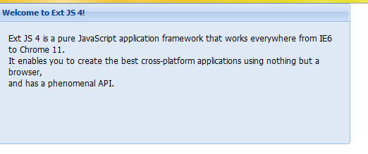
一个简单的Panel效果:
效果图:

 View Code
 View Code
<link href="../extjs-4.1.0/resources/css/ext-all.css" rel="stylesheet" type="text/css" />
    <script src="../extjs-4.1.0/bootstrap.js" type="text/javascript"></script>
    <script type="text/javascript">
        Ext.onReady(function () {
            Ext.widget('panel', {
                title: 'Welcome to Ext JS 4!',
                height: 200,
                500,
                html: 'Ext JS 4 is a pure JavaScript application framework that works everywhere from IE6 to Chrome 11.<br />' +
                'It enables you to create the best cross-platform applications using nothing but a browser,<br />' +
                'and has a phenomenal API.',
                bodyPadding: 10,
                //frame: true,
                renderTo: Ext.getBody()
            });
        });
    </script>
属性:frame: true, 设置为true后,panel就是圆角的效果。
Panel With Rounded Corners
Collapsible Panel 可折叠的面板
设置 collapsible:true,
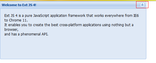
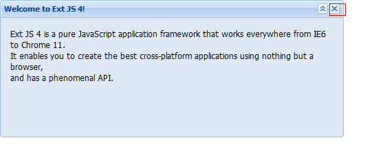
Closable Panel 可关闭的面板
closable:true,
View Code
 <link href="../extjs-4.1.0/resources/css/ext-all.css" rel="stylesheet" type="text/css" />
    <script src="../extjs-4.1.0/bootstrap.js" type="text/javascript"></script>
    <script type="text/javascript">
        Ext.onReady(function () {
            Ext.widget('panel', {
                title: 'Welcome to Ext JS 4!',
                height: 200,
                500,
                html: 'Ext JS 4 is a pure JavaScript application framework that works everywhere from IE6 to Chrome 11.<br />' +
                'It enables you to create the best cross-platform applications using nothing but a browser,<br />' +
                'and has a phenomenal API.',
                bodyPadding: 10,
                frame: true,
                collapsible: true,
                closable:true,
                renderTo: Ext.getBody()
            });
        });
    </script>
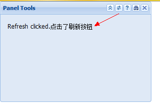
Panel With Header Tools 标题工具栏
View Code
<link href="../extjs-4.1.0/resources/css/ext-all.css" rel="stylesheet" type="text/css" />
    <script src="../extjs-4.1.0/bootstrap.js" type="text/javascript"></script>
    <script type="text/javascript">
        Ext.onReady(function () {
            Ext.widget('panel', {
                title: 'Panel Tools',
                height: 200,
                 300,
                html: 'Click on Tool',
                bodyPadding: 10,
                frame: true,
                collapsible: true,
                closable: true,
                tools: [
                    {
                        type: 'refresh',
                        tooltip: 'Refresh',
                        handler: function (event, target, owner, tool) {
                            this.up("panel").update('Refresh clicked.点击了刷新按钮');
                        }
                    },
                    {
                        type: 'help',
                        tooltip: 'help',
                        handler: function (event, target, owner, tool) {
                            this.up("panel").update("Help clicked.点击了帮助按钮");
                        }
                    },
                    {
                        type: 'search',
                        tooltip: 'Search',
                        handler: function (event, target, owner, tool) {
                            this.up("panel").update("Search clicked.点击了搜索按钮");
                        }
                    }
                ],
                renderTo: Ext.getBody()
            });
        });
    </script>
Panel Toolbars
A Panel may also contain bottom and top toolbars. 同时有 顶部 和 底部的 toolbar

View Code
Ext.onReady(function () {
    Ext.widget('panel', {
        title: 'Panel Toolbars',
        html: 'Click on button',
         300,
        bodyPadding: 10,
        tbar: [
            {
                text: 'tbar button',
                handler: function () {
                    this.up('panel').update('Top Bar button clicked');
                }
            }
        ],
        bbar: [
            {
                text: 'fbar button',
                handler: function () {
                    this.up('panel').update('Bottom Bar button clicked');
                }
            }
        ],
        renderTo: 'output'
    });
});
Panel With Buttons
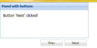
View Code
Ext.onReady(function () {
    Ext.widget('panel', {
        title: 'Panel with buttons',
        html: 'Click on button',
         300,
        height: 150,
        bodyPadding: 10,
        buttons: [
            {
                text: 'Prev',
                handler: function () {
                    this.up('panel').update('Button "Prev" clicked');
                }
            },
            {
                text: 'Next',
                handler: function () {
                    this.up('panel').update('Button "Next" clicked');
                }
            }
        ],
        renderTo: 'output'
    });
});
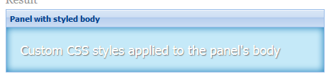
Panel Body Style
配置选项“bodyStyle”的 - 被应用到自定义的CSS样式面板的body元素,它可以作为一个有效的CSS样式的字符串,提供一个对象,包含样式属性的名称/值对或一个函数,返回一个字符串或对象。
View Code
Ext.onReady(function () {
    Ext.widget('panel', {
        title: 'Panel with styled body',
        html: "Custom CSS styles applied to the panel's body",
         450,
        bodyStyle: {
            'color': '#fff',
            'background': '#C5E9F8',
            'font-size': '18px',
            'padding': '20px',
            'text-shadow': '1px 1px 1px #777',
            'box-shadow': 'inset 0 0 10px #157AB6'
        },
        renderTo: 'output'
    });
});
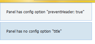
Panel Hide Header
panel的Title显示,可以通过设置title:'我是标题' 来显示,如果不设置的话,将不会显示了。同时也可以通过preventHeader: true, 这样标题也不显示了。但是两者的背景颜色还有区别的
View Code
Ext.onReady(function () {
            Ext.widget('panel', {
                title: 'Panel has header but will not render it',
                preventHeader: true,
                 300,
                html: 'Panel has config option "preventHeader: true"',
                bodyStyle: {
                    'padding': '20px',
                    'background-color': 'rgb(242,245,246)'
                },
                renderTo: Ext.getBody()
            });
            Ext.widget('panel', {
                 300,
                html: 'Panel has no config option "title"',
                bodyStyle: {
                    'padding': '20px',
                    'background-color': 'rgb(212,228,239)'
                },
                renderTo: Ext.getBody(),
                margin: '5 0 0 0'
            });
        });
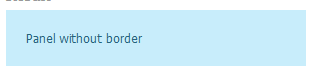
Panel With No Borders
通过设置属性 border: false, 即可
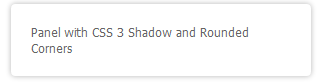
Panel With CSS 3 Shadow And Rounded Corners
IE8及以下就甭看了 肯定木有这效果撒。哎。
View Code
Ext.onReady(function () {
    Ext.widget('panel', {
        border: false,
         300,
        html: 'Panel with CSS 3 Shadow and Rounded Corners',
        style: {
            'padding': '20px',
            'border-radius': '4px 4px 4px 4px',
            'box-shadow': '0 0 5px rgba(0, 0, 0, 0.3)'
        },
        bodyStyle: {
            'color': '#646464'
        },
        renderTo: Ext.getBody()
    });
});
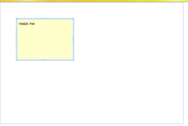
Resizable Panel 可改变大小的面板
Panel config option "resizable" – specify as true to apply a Resizer to this Component after rendering. May also be specified as a config object to be passed to the constructor of Resizer to override any defaults.
View Code
 Ext.onReady(function () {
            Ext.widget('panel', {
                 600,
                height: 400,
                bodyPadding: 50,
                items: [
            {
                 150,
                height: 150,
                minWidth: 100,
                minHeight: 100,
                maxWidth: 500,
                maxHeight: 300,
                bodyStyle: 'background:#ffc;',
                resizable: true,
                bodyPadding: 10,
                html: 'resize me'
            }
        ],
                renderTo:Ext.getBody()
            });
        });
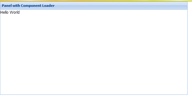
Panel With Component Loader
This class is used to load content via Ajax into a Ext.Component. In general this class will not be instanced directly, rather a loader configuration will be passed to the constructor of the Ext.Component.
View Code
Ext.onReady(function () {
            Ext.widget('panel', {
                 600,
                height: 300,
                title: 'Panel with Component Loader',
                loader: {
                    url: 'a.ashx',
                    render: function (loader, response, active) {
                        var text = response.responseText;
                        loader.getTarget().update(text, true);
                        return true;
                    },
                    scripts: true,
                    autoLoad:true
                },
                renderTo:Ext.getBody()
            });
        });
Render Panel To Tab
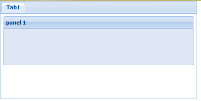
 Ext.onReady(function () {
            Ext.widget('tabpanel',{
                bodyPadding:5,
                400,
                height:200,
                renderTo:Ext.getBody(),
                items:[
                    {
                        id:'tab-1',
                        title:'Tab1'
                    }
                ]
            });
            Ext.widget('panel',{
                title:'panel 1',
                frame:true,
                height:100,
                renderTo:'tab-1-body'
            });
        });
How To Change Style Of Just One Panel
当只有一个Panel时候 如何去更改不同的样式,效果图下图:
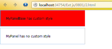
<script type="text/javascript">
        Ext.onReady(function () {
            //base class 基础类
            Ext.define('MyPanelBase', {
                extend: 'Ext.panel.Panel',
                 300,
                bodyPadding: 20,
                initComponent: function () {
                    if (this.$className == 'MyPanelBase') {
                        this.bodyStyle = "background-color:red";
                    }
                    this.callParent(arguments);
                }
            });
            //derived class 派生类
            Ext.define('MyPanel', {
                extend: 'MyPanelBase',
                initComponent: function () {
                    this.callParent(arguments);
                }
            });
            //instance of MyPanelBase 实例
            Ext.create('MyPanelBase', {
                html: 'MyPanelBase has custom style',
                renderTo: Ext.getBody()
            });
            //instance of MyPanel 实例
            Ext.create('MyPanel', {
                html: 'MyPanel has no custom style',
                margin: '5 0 0 0',
                renderTo: Ext.getBody()
            });
        });
    </script>