引言
今天来看一组表单标签动画效果,希望可以对大家有所帮助,灵感来自于Inspiration for Text Input和Text Input Love,一并致谢。
效果照例放在Codepen,虽少效果较慢,但值得期待。在线编辑,下载收藏。
搭建根基
我们同样使用了haml来简化html书写。
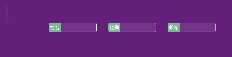
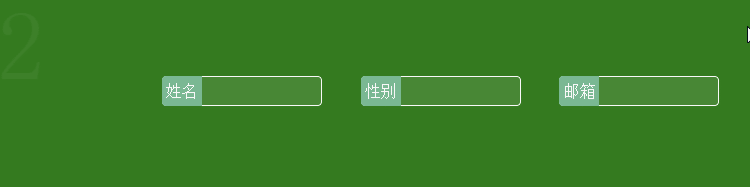
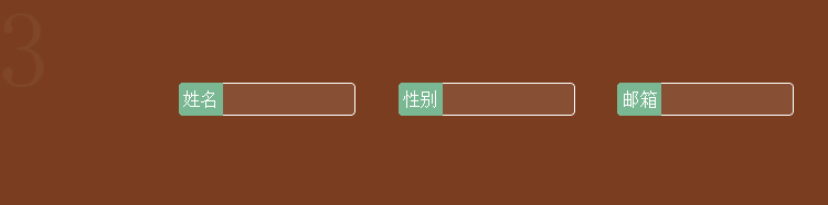
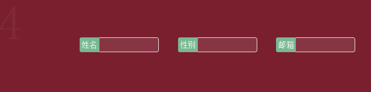
#container
  -(1..15).each do
    %div.row
      %label
        %input{:type=>"text"}
        %span姓名
      %label
        %input{:type=>"text"}
        %span性别
      %label
        %input{:type=>"text"}
        %span邮箱
css部分我们使用了scss,首先我们来搭建页面布局和基础设置。
/* 重置*/
*, *:before, *:after { box-sizing: border-box; }
/*容器设置*/
#container{
  counter-reset: counterA;
}
/*布局实现*/
div.row{
  position: relative;
   100%;
  height:20vw;
  padding-left:15vw;
  counter-increment: counterA;
  &:before{
    content:counter(counterA);
    color:rgba(255,255,255,.05);
    font-size:10vw;
    position: absolute;
    left:0px;
  }
  label{
    position: relative;
    display: block;
    float: left;
    margin:8vw 2vw;
    input{
      160px;
      height:30px;
      line-height:30px;
      background: rgba(255,255,255,.1);
      border:none;
      outline:none;
      border:1px solid #fff;
      color: #377D6A;
      padding:4px 10px;
      border-radius:4px;
      text-indent: 38px;
      transition: all .3s ease-in-out;

      ::-webkit-input-placeholder {
        color: transparent;
      }
      +span{
        position: absolute;
        left:0;
        top:0;
        color:#fff;
        background: #7AB893;
        display: inline-block;
        padding: 7px 4px;
        transform-origin:left center;
        transform: perspective(300px);
        transition: all .3s ease-in-out;
        border-radius:4px 0 0 4px;
      }
    }
    input:focus,
    input:active {
      text-indent: 0;
      background: rgba(255,255,255,.2);

      ::-webkit-input-placeholder {
        color: #f00;
      }
      +span{
        background: darken(#7AB893,20%);
      }
    }
  }
  /*设置背景色,随机颜色*/
  @for $i from 1 through 15{
    &:nth-child(#{$i}){
      background:hsl(random(360),60%,30%);
    }
  }
 //设置每一行的动画效果
 //&:nth-child(1){}
}
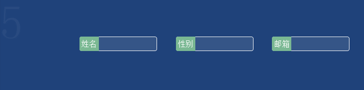
效果一
 //设置每一行的动画效果
 //&:nth-child(1){}
 //效果一,标签左移
 &:nth-child(1){
    input:focus,
    input:active{
      border-radius:0 4px 4px 0;
      +span{
        border-radius:4px 0 0 4px;
        transform: translateX(-100%);
      }
    }
 }
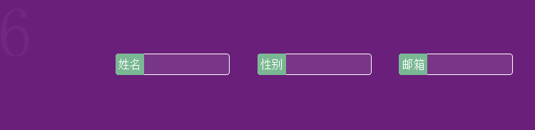
效果二
 //效果二,标签右移
 &:nth-child(2){
    input:focus,
    input:active{
      +span{
        border-radius:0 4px 4px 0;
        transform: translateX(300%);
      }
    }
 }
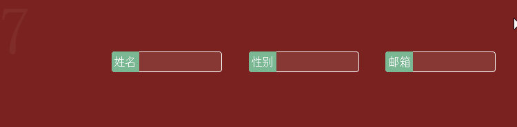
效果三
 //效果三,标签上移
  &:nth-child(3){
    input:focus,
    input:active{
      text-indent: 0px;
      +span{
        background-color: transparent;
        transform: translateY(-100%);
      }
    }
  }
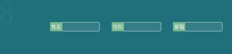
效果四
 //效果四,标签下移
 &:nth-child(4){
    input:focus,
    input:active{
      text-indent: 0px;
      +span{
        background-color: transparent;
        transform: translateY(100%);
      }
    }
  }
效果五
 //效果五,标签上旋
 &:nth-child(5){
   input+span{
       transform-origin:left bottom;
   }
  input:focus,
  input:active{
    border-radius:0 4px 4px 0;
    text-indent: 20px;
    +span{
      transform: rotate(-60deg);
      border-radius:0 4px 4px 0;
    }
  }
 }
效果六
 //效果六,标签下旋
  &:nth-child(6){
   input+span{
     transform-origin:left bottom;
   }
  input:focus,
  input:active{
    border-radius:0 4px 4px 0;
    +span{
      animation:swing 1s;
      animation-fill-mode: forwards;
      border-radius:0 4px 4px 0;
    }
  }
 }
  //第6个动画
  @keyframes swing{
    0% {
      transform: rotate(0);
    }
    20% {
      transform: rotate(116deg);
    }
    40% {
      transform: rotate(60deg);
    }
    60% {
      transform: rotate(98deg);
    }
    80% {
      transform: rotate(76deg);
    }
    100% {
      transform: rotate(82deg);
    }
  }
效果七
 //效果七,标签左折
  &:nth-child(7){
  input+span{
     transform-origin:right center;
   }
  input:focus,
  input:active{
     border-radius:0 4px 4px 0;
    +span{
      transform:perspective(300px) translateX(-100%) rotateY(60deg);
    }
  }
 }
效果八
 //效果八,标签左翻
  &:nth-child(8){
  input:focus,
  input:active{
    border-radius:0 4px 4px 0;
    +span{
      transform: rotateY(180deg);
      border-radius:0 4px 4px 0;
    }
  }
 }
效果九
 //效果九,标签上移变提示框
 &:nth-child(9){
  input{
    +span{
      background: transparent;
      &:before{
        content:"";
        0;
        height:0;
        position: absolute;
        left:20px;
        bottom:-10px;
        border:5px solid #000;
        border-color:darken(#7AB893,20%) transparent transparent transparent;
        transition:all .3s;
        opacity: 0;
      }
    }
  }
  input:focus,
  input:active{
    +span{
      padding:3px 10px;
      border-radius:6px;
      transform:translateY(-150%);
      &:before{
        opacity: 1;
      }
    }
  }
 }
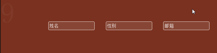
效果十
 //效果十,标签上移,框变色
 &:nth-child(10){
  input{
    border-1px 0;
    border-radius:0;
    +span{
      background: transparent;
    }
  }
  input:focus,
  input:active{
    border-2px 0;
    border-color:#000;
    +span{
      background:transparent;
      transform:translateY(-120%);
    }
  }
 }
效果十一
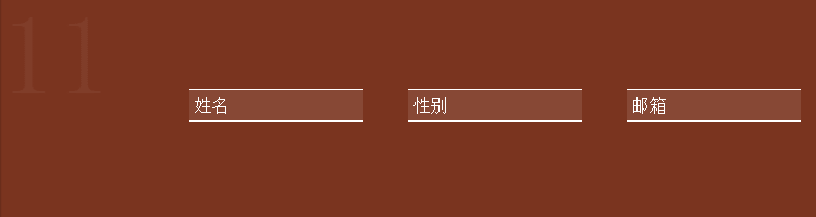
 //效果十一,标签左弹性
&:nth-child(11){
  input{
    border-radius:0;
    border-1px 0;
    +span{
      background: transparent;
    }
  }
  input:focus,
  input:active{
    +span{
      background:transparent;
      border:1px solid #fff;
      border-radius:0;
      border-0 0 0 1px;
      animation:halfLeft .6s ease-in;
      animation-fill-mode: forwards;
    }
  }
  @keyframes halfLeft{
    20%{
      transform:translateX(-60%);
    }
     40%{
      transform:translateX(-42%);
    }
     60%{
      transform:translateX(-56%);
    }
     80%{
      transform:translateX(-46%);
    }
    100%{
      transform:translateX(-50%);
    }
  }
 }
效果十二

 //效果十二,横线上移
 &:nth-child(12){
  input{
    border-radius:0;
    border-0;
    background:transparent;
    +span{
      background: transparent;
      &:before{
        content:"";
        160px;
        height:1px;
        background-color: #fff;
        position: absolute;
        left:0;
        bottom:0;
      }
    }
  }
  input:focus,
  input:active{
    +span{
      background:transparent;
      transform:translateY(-100%);
    }
  }
 }
效果十三
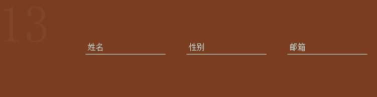
 //效果十三,边框动画
 &:nth-child(13){
  input{
    border-radius:0;
    border:1px solid #fff;
    border-top-color:rgba(255,255,255,0);
    border-right-color:rgba(255,255,255,0);
    border-bottom-color:rgba(255,255,255,1);
    border-left-color:rgba(255,255,255,0);
    background:transparent;
    +span{
      background: transparent;
    }
  }
  input:focus,
  input:active{
    transition:none;
    animation:borderAnim 3s;
    animation-fill-mode:forward;
    border:1px solid #fff;
    +span{
      background:transparent;
      transform:translateY(-100%);
    }
  }
 }
 @keyframes borderAnim{
   25%{
      border-top-color:rgba(255,255,255,0);
      border-right-color:rgba(255,255,255,1);
      border-bottom-color:rgba(255,255,255,1);
      border-left-color:rgba(255,255,255,0);
   }
   50%{
      border-top-color:rgba(255,255,255,1);
      border-right-color:rgba(255,255,255,1);
      border-bottom-color:rgba(255,255,255,1);
      border-left-color:rgba(255,255,255,0);
   }
   75%{
      border-top-color:rgba(255,255,255,1);
      border-right-color:rgba(255,255,255,1);
      border-bottom-color:rgba(255,255,255,1);
      border-left-color:rgba(255,255,255,1);
   }
 }
效果十四
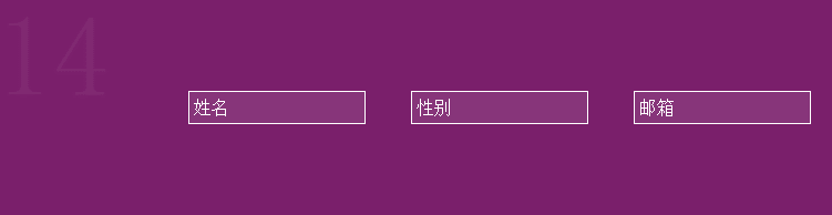
 //效果十四,前后立体变化
 &:nth-child(14){
  input{
    border-radius:0;
    border:1px solid #fff;
    transform-origin:left center;
    color:#fff;
    +span{
      background: transparent;
    }
  }
  input:focus,
  input:active{
    transform:scale(1.2);
    box-shadow:0px 0px 2px #000;
    color:#fff;
    border:2px solid #fff;
    +span{
      background:transparent;
      transform:translateY(-100%) scale(0.8);
    }
  }
 }
效果十五
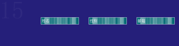
 //效果十五,背景条纹动画
 &:nth-child(15){
  input{
    border-radius:0;
    border:1px solid #fff;
    background-color: #026873;
    background-image: linear-gradient(90deg, rgba(255,255,255,.07) 50%, transparent 50%),
    linear-gradient(90deg, rgba(255,255,255,.13) 50%, transparent 50%),
    linear-gradient(90deg, transparent 50%, rgba(255,255,255,.17) 50%),
    linear-gradient(90deg, transparent 50%, rgba(255,255,255,.19) 50%);
    background-size: 13px, 29px, 37px, 53px;
    animation: shadowGo 10s linear infinite;
    animation-play-state:running;
    +span{
      background: transparent;
    }
  }
  input:focus,
  input:active{
    background-color: #137884;
    background-size: 13px, 29px, 37px, 53px;
    animation-play-state:paused;
    +span{
      transform:translateY(-100%) scale(0.8);
      background:transparent;
      color:#137884;
    }
  }
 }
  @keyframes shadowGo{
      0% {background-position: 0 0}
      100% {background-position: -600% 0%}
  };
十五种动画效果,希望可以对您有所帮助。如果你耐着性子读到这里,是我的莫大荣幸,感谢感谢。
欢迎评论,欢迎拍砖。