我的用法
用Rectangle作背景(好处是可以设置渐变色),然后用Grid分段,在其中一个格子里填充Button,然后在Button里添加一个背景透明的png图片
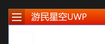
出现问题
虽然按钮图片的背景色是透明的,但是按钮区域仍然会有一个半透明的阴影,尝试使用纯文字也一样。如下图:
官方用例的解决方案
官方Windows-universal-samples-master的用例里,汉堡菜单使用的是ToggleButton,然后使用了自定义样式ToggleButton Style="{StaticResource SymbolButton}"
Style代码
        <Style x:Key="SymbolButton" TargetType="ToggleButton">
            <Setter Property="Background" Value="{ThemeResource ToggleButtonBackgroundThemeBrush}"/>
            <Setter Property="Foreground" Value="{ThemeResource ToggleButtonForegroundThemeBrush}"/>
            <Setter Property="BorderBrush" Value="{ThemeResource ToggleButtonBorderThemeBrush}"/>
            <Setter Property="BorderThickness" Value="{ThemeResource ToggleButtonBorderThemeThickness}"/>
            <Setter Property="Padding" Value="12,4,12,5"/>
            <Setter Property="HorizontalAlignment" Value="Left"/>
            <Setter Property="VerticalAlignment" Value="Center"/>
            <Setter Property="FontFamily" Value="{ThemeResource ContentControlThemeFontFamily}"/>
            <Setter Property="FontWeight" Value="SemiBold"/>
            <Setter Property="FontSize" Value="{ThemeResource ControlContentThemeFontSize}"/>
            <Setter Property="Template">
                <Setter.Value>
                    <ControlTemplate TargetType="ToggleButton">
                        <Grid>
                            <VisualStateManager.VisualStateGroups>
                                <VisualStateGroup x:Name="CommonStates">
                                    <VisualState x:Name="Normal"/>
                                    <VisualState x:Name="PointerOver">
                                        <Storyboard>
                                        </Storyboard>
                                    </VisualState>
                                    <VisualState x:Name="Pressed">
                                        <Storyboard>
                                            <ObjectAnimationUsingKeyFrames Storyboard.TargetProperty="Foreground" Storyboard.TargetName="ContentPresenter">
                                                <DiscreteObjectKeyFrame KeyTime="0" Value="{ThemeResource ToggleButtonCheckedPressedBackgroundThemeBrush}"/>
                                            </ObjectAnimationUsingKeyFrames>
                                        </Storyboard>
                                    </VisualState>
                                    <VisualState x:Name="Disabled">
                                        <Storyboard>
                                            <ObjectAnimationUsingKeyFrames Storyboard.TargetProperty="Foreground" Storyboard.TargetName="ContentPresenter">
                                                <DiscreteObjectKeyFrame KeyTime="0" Value="{ThemeResource ToggleButtonDisabledForegroundThemeBrush}"/>
                                            </ObjectAnimationUsingKeyFrames>
                                        </Storyboard>
                                    </VisualState>
                                    <VisualState x:Name="Checked">
                                        <Storyboard>
                                            <ObjectAnimationUsingKeyFrames Storyboard.TargetProperty="Foreground" Storyboard.TargetName="ContentPresenter">
                                                <DiscreteObjectKeyFrame KeyTime="0" Value="{ThemeResource ToggleButtonCheckedBackgroundThemeBrush}"/>
                                            </ObjectAnimationUsingKeyFrames>
                                        </Storyboard>
                                    </VisualState>
                                    <VisualState x:Name="CheckedPointerOver">
                                        <Storyboard>
                                            <ObjectAnimationUsingKeyFrames Storyboard.TargetProperty="Foreground" Storyboard.TargetName="ContentPresenter">
                                                <DiscreteObjectKeyFrame KeyTime="0" Value="{ThemeResource ToggleButtonCheckedPointerOverBackgroundThemeBrush}"/>
                                            </ObjectAnimationUsingKeyFrames>
                                        </Storyboard>
                                    </VisualState>
                                    <VisualState x:Name="CheckedPressed">
                                        <Storyboard>
                                            <ObjectAnimationUsingKeyFrames Storyboard.TargetProperty="Foreground" Storyboard.TargetName="ContentPresenter">
                                                <DiscreteObjectKeyFrame KeyTime="0" Value="{ThemeResource ToggleButtonCheckedPressedBackgroundThemeBrush}"/>
                                            </ObjectAnimationUsingKeyFrames>
                                        </Storyboard>
                                    </VisualState>
                                    <VisualState x:Name="CheckedDisabled">
                                        <Storyboard>
                                            <ObjectAnimationUsingKeyFrames Storyboard.TargetProperty="Foreground" Storyboard.TargetName="ContentPresenter">
                                                <DiscreteObjectKeyFrame KeyTime="0" Value="{ThemeResource ToggleButtonCheckedDisabledForegroundThemeBrush}"/>
                                            </ObjectAnimationUsingKeyFrames>
                                        </Storyboard>
                                    </VisualState>
                                    <VisualState x:Name="Indeterminate"/>
                                    <VisualState x:Name="IndeterminatePointerOver">
                                    </VisualState>
                                    <VisualState x:Name="IndeterminatePressed">
                                        <Storyboard>
                                            <ObjectAnimationUsingKeyFrames Storyboard.TargetProperty="Foreground" Storyboard.TargetName="ContentPresenter">
                                                <DiscreteObjectKeyFrame KeyTime="0" Value="{ThemeResource ToggleButtonPressedForegroundThemeBrush}"/>
                                            </ObjectAnimationUsingKeyFrames>
                                        </Storyboard>
                                    </VisualState>
                                    <VisualState x:Name="IndeterminateDisabled">
                                        <Storyboard>
                                            <ObjectAnimationUsingKeyFrames Storyboard.TargetProperty="Foreground" Storyboard.TargetName="ContentPresenter">
                                                <DiscreteObjectKeyFrame KeyTime="0" Value="{ThemeResource ToggleButtonDisabledForegroundThemeBrush}"/>
                                            </ObjectAnimationUsingKeyFrames>
                                        </Storyboard>
                                    </VisualState>
                                </VisualStateGroup>
                                <VisualStateGroup x:Name="FocusStates">
                                    <VisualState x:Name="Focused">
                                        <Storyboard>
                                            <DoubleAnimation Duration="0" To="1" Storyboard.TargetProperty="Opacity" Storyboard.TargetName="FocusVisualWhite"/>
                                            <DoubleAnimation Duration="0" To="1" Storyboard.TargetProperty="Opacity" Storyboard.TargetName="FocusVisualBlack"/>
                                        </Storyboard>
                                    </VisualState>
                                    <VisualState x:Name="Unfocused"/>
                                    <VisualState x:Name="PointerFocused"/>
                                </VisualStateGroup>
                            </VisualStateManager.VisualStateGroups>
                            <ContentPresenter x:Name="ContentPresenter" AutomationProperties.AccessibilityView="Raw" ContentTemplate="{TemplateBinding ContentTemplate}" ContentTransitions="{TemplateBinding ContentTransitions}" Content="{TemplateBinding Content}" HorizontalAlignment="{TemplateBinding HorizontalContentAlignment}" Margin="{TemplateBinding Padding}" VerticalAlignment="{TemplateBinding VerticalContentAlignment}"/>
                            <Rectangle x:Name="FocusVisualWhite" IsHitTestVisible="False" Opacity="0" StrokeDashOffset="1.5" StrokeEndLineCap="Square" Stroke="{ThemeResource FocusVisualWhiteStrokeThemeBrush}" StrokeDashArray="1,1"/>
                            <Rectangle x:Name="FocusVisualBlack" IsHitTestVisible="False" Opacity="0" StrokeDashOffset="0.5" StrokeEndLineCap="Square" Stroke="{ThemeResource FocusVisualBlackStrokeThemeBrush}" StrokeDashArray="1,1"/>
                        </Grid>
                    </ControlTemplate>
                </Setter.Value>
            </Setter>
        </Style>
后续研究
这和之前我用的模式差不多,但是之前是样式大变样,所以必须要自定义样式。
但是这样有一个蔽端,按钮的状态减少了很多。需要对Button样式进行完整的自定义,主要应该是<VisualStateManager.VisualStateGroups>里的内容。