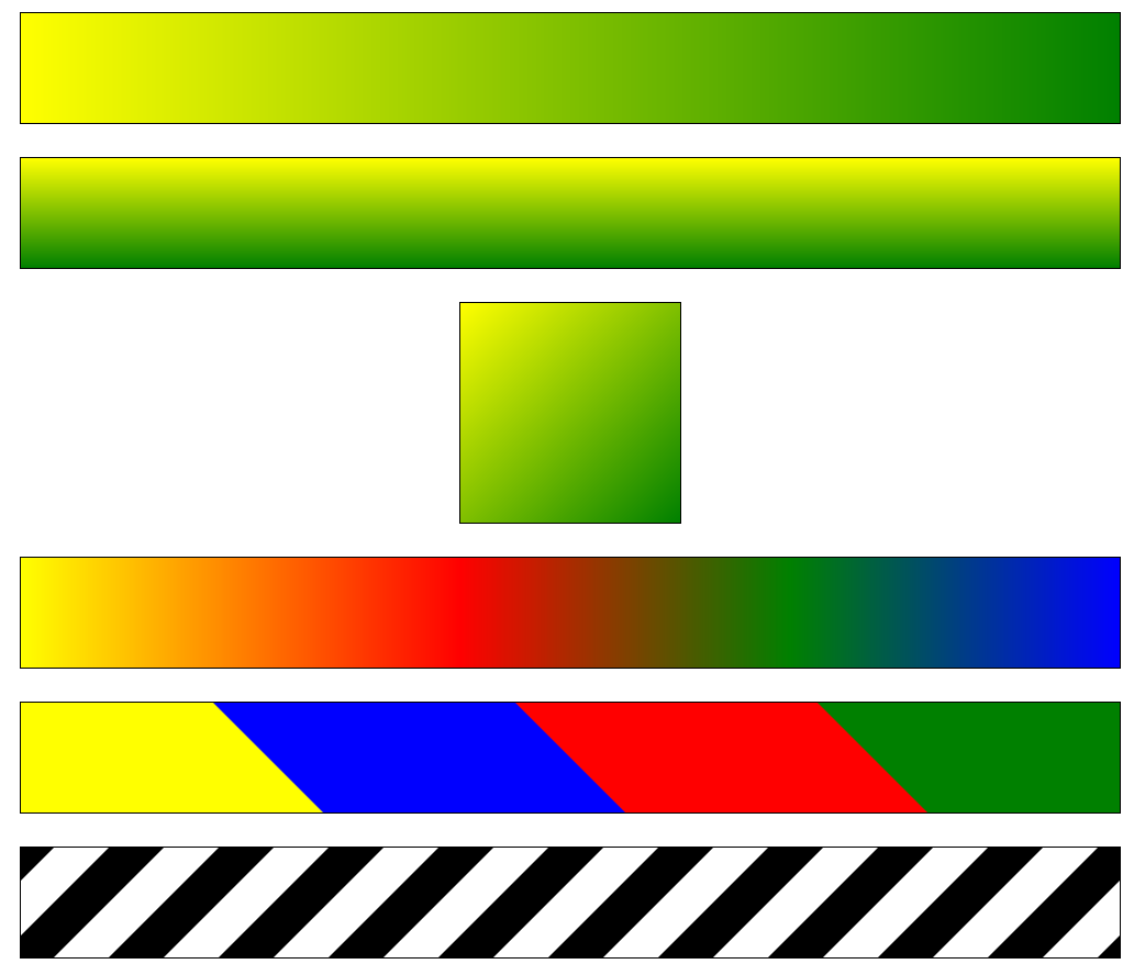
1、背景的线性渐变
2、径向渐变---从中间到外围渐变
3、background
4、提升移动端响应区域的大小
5、边框图片
6、过渡
7、2d转换----2d移动
8、2d转换----缩放
9、2d转换---旋转
10、2d转换---斜切
11、旋转中心设置transform-origin
12、案例:扑克牌旋转
13、同时添加多个tranform属性
14、子盒子居中
15、3d移动、3d缩放、3d旋转
1、背景的线性渐变 <--返回目录
* background:linear-gradient(方向,开始颜色1 位置,颜色2 位置,颜色3 位置···);
- backgournd:linear-gradient(to right,red,blue);
- backgournd:linear-gradient(to right,red 0%,red 50%,blue 50%,blue 100%);
- 方向可以是
30deg
to top === 0deg
to rigth === 90deg
to bottom === 180deg 默认
to left === 270deg
<!DOCTYPE html>
<html>
<head lang="en">
    <meta charset="UTF-8">
    <title></title>
    <style>
        div{
            width: 1000px;
            height: 100px;
            margin:30px auto;
            border: 1px solid #000;
        }
        /* 语法:
            linear-gradient(方向,起始颜色,终止颜色);
            方向:to left   to right  to top   to bottom  角度 30deg
        */
        div:nth-child(1){
            background-image: linear-gradient(to right,yellow ,green);
        }

        div:nth-child(2){
            background-image: linear-gradient(yellow ,green);
        }

        div:nth-child(3){
            width: 200px;
            height: 200px;
            background-image: linear-gradient(135deg,yellow,green);
        }


        div:nth-child(4){
            background-image: linear-gradient(to right,
                yellow 0% ,
                red 40% ,
                green 70% ,
                blue 100%);
        }

        div:nth-child(5) {
            background-image: linear-gradient(45deg,
                yellow 0%,
                yellow 25%,
                blue 25%,
                blue 50%,
                red 50%,
                red 75%,
                green 75%,
                green 100%
            );
        }

        div:nth-child(6){
            background-image: linear-gradient(135deg,
                #000 0%,
                #000 25%,
                #fff 25%,
                #fff 50%,
                #000 50%,
                #000 75%,
                #fff 75%,
                #fff 100%
            );

            /*background-repeat: no-repeat;*/
            background-size:100px 100%;

            animation: gun 1s infinite linear;
        }

        @keyframes gun {
            0%{

            }

            100%{
                background-position: 100px 0px;
            }
        }
    </style>
</head>
<body>
    <div></div>
    <div></div>
    <div></div>
    <div></div>
    <div></div>
    <div></div>
</body>
</html>
2、径向渐变---从中间到外围渐变 <--返回目录
* background:radial-gradient(red,blue) 默认从中心向外围渐变
* 用法:background:radial-gradient(形状,大小,坐标,颜色);
- 形状可以是:circle圆形 ellipse(默认值)适配当前的形状,如果容器是长方形,形状是椭圆
- 大小取值:closest-side最近边 farthest-side 最远边 closest-corner最近角 closest-corner最远角,默认是最远角
- 坐标:默认正中心,可以赋值坐标,也可以赋值关键字,left、center、right、top、bottom
at 50px 20px 或 at left top
* 例子;
- background:radial-gradient(at left top, red, blue);
- background:radial-gradient(circle farthest-side at 20px 30px, red, blue);
<!DOCTYPE html>
<html>
<head lang="en">
    <meta charset="UTF-8">
    <title></title>
    <style>
        div{
            width: 250px;
            height: 250px;
            border: 1px solid #000;
            margin: 20px auto;
        }
        /*
            径向渐变:
            radial-gradient(辐射半径, 中心的位置,起始颜色,终止颜色);
            中心点位置:at  left  right  center bottom  top
        */
        div:nth-child(1){
            background-image: radial-gradient(at left top,yellow,green);
        }

        div:nth-child(2){
            background-image: radial-gradient(at 50px 50px,yellow,green);
        }

        div:nth-child(3){
            background-image: radial-gradient(100px at center,yellow ,green);
        }

        div:nth-child(4){
            background-image: radial-gradient(100px at center,
            yellow 0% ,
            green 30%,
            blue 60%,
            red 100%);
        }

        div:nth-child(5){
            background-image: radial-gradient(100px 50px  at center,yellow ,green);
        }


    </style>
</head>
<body>
    <div class="box"></div>
    <div class="box"></div>
    <div class="box"></div>
    <div class="box"></div>
    <div class="box"></div>
</body>
</html>
3、background <--返回目录
* background-color:背景色
* background-image:url("") 背景图片
- 如果图片大于容器,默认从容器左上角开始放置
- 如果图片小于容器,图片默认平铺
* background-repeat:round/space
- round:将图片缩放后平铺,以紧凑平铺
- space:图片平铺,但是图片不会缩放,中间可能出现间隔
* background-attachment:scroll|fixed|local;背景是否滚动
- fixed图片的定位是基于浏览器
- scroll图片的定位是基于div,默认是scroll。当滚动容器的滚动条时,背景不动,当滚动浏览器的滚动条时,背景跟着动。
- local:当盒子里面内容超出盒子高度,盒子出现滚动条;当滚动容器的滚动条时,背景也跟着动。
* background-size:length/auto/contain/cover/pencentage
- background-size:300px 500px; 宽 高
- background-size:300px;宽,高度保存等比例缩放
- background-size:50% 50%; 参照容器*50%
- background-size:contain; 按比例调整图片,使图片完全包含于盒子,可能造成空白区。
- background-size:cover; 按比例调整图片,使图片自适应整个盒子,盒子没有空白区。
- 建议:使用这个属性时,确定图片的宽高比是否与容器宽高比一致;图片等比例缩小,不要放大,否则图片失真。
* background-position:
left top
left center
left bottom
right top
right center
right bottom
center top
center center
center bottom
4、提升移动端响应区域的大小 <--返回目录
* background-origin: border-box/padding-box/content-box
- content-box:从内容的位置开始填充背景
* background-clip: border-box/padding-box/content-box
- content-box:背景只显示内容以内的区域,border和padding区域不显示。
5、边框图片 <--返回目录
* border-image-source:可以指定边框图片的路径,默认填充容器的四个角点。
* border-image-slice:10 [fill];
- 让图片裁剪为九宫格
- 数值:裁剪的宽度,fill:内容内部填充
* border-image-10px; 边框图片的宽度 这个值一般等于border的宽度。
* border-image-outset:0px; 扩展边框
* border-image-repeat:round/repeat
- repeat:直接平铺,不缩放
- round:缩放平铺
- stretch:拉伸(默认值)
* 连写 border-image:source slice /width /outset repeat
- border-image:url() 27 /27px /0px round;
6、过渡 <--返回目录
* 过渡效果,完毕后默认回到初始状态.
* IE10及以上才支持过渡效果
* 过渡效果只能应用于某个具体的值到另一个具体的值的过渡,不能应用于display:none到display:block。
* transition-property:属性值;
* transition-duration:2s; 过渡效果时间
* transition-function:linear; 过渡的效果,时间函数,控制运动的速度。默认是先加速后减速。
* transition-delay:2s; 延迟
* 连写: transition:属性值 过渡时间 时间函数 延迟;
* 为多个样式同时添加过渡效果
- transition: left 2s linear, background-color 5s linear; 时间可以设置不同
- transition: all 2s linear;效率不高,不建议这样使用
- transition: all 2s steps(4);跳跃式动画,总共4步完成该动画。
demo
<!DOCTYPE html>
<html>
<head>
    <title>标题</title>
    <meta charset="utf-8">
    <style type="text/css">
        div {
            position: absolute;
            width: 200px;
            height: 200px;
            left: 0px;
            top:0px;
            background-color: #eee;

            transition-property:left;
            transition-duration:2s;
        }
        div:active {
            left: 500px;
            background-color: red;
        }
    </style>
</head>
<body>
    <div></div>
</body>
</html>
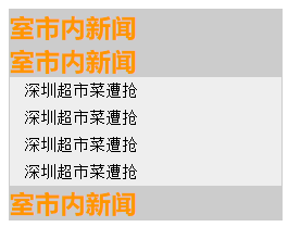
案例:手风琴菜单
<!DOCTYPE html>
<html>
<head>
    <title>标题</title>
    <meta charset="utf-8">
    <style type="text/css">
        div, h3, ul, li {
            padding: 0;
            margin: 0;
        }
        ul {
            list-style: none;
        }
        .menu {
            border: 1px solid #ccc;
            width: 200px;
        }
        .item h3 {
            color: rgb(255,150,0);
            background-color: #ccc;
        }
        .item ul li {
            display: inline-block;
            width: 100%;
            font: 400 12px/20px "SimSun";
            float: left;  /*浮动是为了清除li之间的间隔*/
            padding-left: 10px;
            background-color: #eee;
        }
        .itemBox {
            height: 0px;
            overflow: hidden;
            transition-property: height;
            transition-duration:1s;
        }
        .item:hover .itemBox {
            height: 80px;
        }
    </style>
</head>
<body>
    <div class="menu">
        <div class="item">
            <h3>室市内新闻</h3>
            <div class="itemBox">
                <ul>
                    <li>深圳超市菜遭抢</li>
                    <li>深圳超市菜遭抢</li>
                    <li>深圳超市菜遭抢</li>
                    <li>深圳超市菜遭抢</li>
                </ul>
            </div>
        </div>
    </div>
</body>
</html>
7、2d转换----2d移动 <--返回目录
* 通过CSS3 transform转换,我们能够对元素进行移动、缩放、旋转、斜切等操作。
* 2d移动
- 使用translate()函数,你可以吧元素从原来的位置移动。移动参照左上角原点。
- transform: translate(500px,200px); 只有一个值,表示水平移动,两个值则表示水平和垂直
- transform: translateX(500px);
- transform: translateY(500px);
<!DOCTYPE html>
<html>
<head>
    <title>标题</title>
    <meta charset="utf-8">
    <style type="text/css">
        div {
            width: 100px;
            height: 100px;
            background-color: #ccc;
            transition-property: transform;
            transition-duration:2s;
        }
        div:active {
            transform: translateY(200px);
        }
    </style>
</head>
<body>
    <div></div>
</body>
</html>
8、2d转换----缩放 <--返回目录
* 大于1放大,小于1缩小
* 缩放参照元素中心点
* scale(2) 写一个参数,表示x和y都缩放2倍
* scale(2,3) 表示x方向我原来2倍,y方向为原来3倍
* scaleX() scaleY()
<!DOCTYPE html>
<html>
<head>
    <title>标题</title>
    <meta charset="utf-8">
    <style type="text/css">
        * {  padding: 0;margin: 0;}
        div {
            width: 100px;
            height: 100px;
            margin: 100px auto;
            background-color: #ccc;
            transition-property: transform;
            transition-duration:2s;
        }
        div:active {
            transform: scale(2,3);
        }
    </style>
</head>
<body>
    <div></div>
</body>
</html>
9、2d转换---旋转 <--返回目录
* transform:rotate(90deg); 正值,相对元素中心点顺时针旋转
10、2d转换---斜切 <--返回目录
* transform:skew(30deg) 往左边斜30度
* transform:skew(-30deg) 往右边斜30度
* transform:skew(30deg,-30deg) 往左边斜30度,往下边斜30度
* transform:skewX(30deg)
* transform:skewY(30deg)
11、旋转中心设置transform-origin <--返回目录
* transform-origin:left top;
12、案例:扑克牌旋转 <--返回目录
<!DOCTYPE html>
<html>
<head>
<title>标题</title>
<meta charset="utf-8">
<style type="text/css">
    .box {
        width: 100px;
        height: 200px;
        position: relative;
        margin: 200px auto;
    }
    .box > img {
        position: absolute;
        width: 100px;
        height: 200px;
        transition: transform 2s;
        transform-origin:left top;
    }
    .box:hover img:nth-of-type(1) {
        transform: rotate(60deg);
        transform-origin:left top;
    }
    .box:hover img:nth-of-type(2) {
        transform: rotate(120deg);
    }
    .box:hover img:nth-of-type(3) {
        transform: rotate(180deg);
    }
    .box:hover img:nth-of-type(4) {
        transform: rotate(240deg);
    }
    .box:hover img:nth-of-type(5) {
        transform: rotate(300deg);
    }
    .box:hover img:nth-of-type(6) {
        transform: rotate(360deg);
    }
</style>
</head>
<body>
<div class="box">
    <img src="pk1.png">
    <img src="pk1.png">
    <img src="pk1.png">
    <img src="pk1.png">
    <img src="pk1.png">
    <img src="pk1.png">
</div>
</body>
</html>

13、同时添加多个tranform属性 <--返回目录
* 注意:旋转元素的同时也会旋转坐标系,所以先添加移动,后添加旋转
<!DOCTYPE html>
<html>
<head>
    <title>标题</title>
    <meta charset="utf-8">
    <style type="text/css">
        div.box {
            width: 100px;
            height: 100px;
            margin: 400px auto 0;
            border: 1px solid #000;
        }
        div.sub {
            width: 100%;
            height:100%;
            background-color: red;
            transition: transform 2s;

        }
        div.box:hover div.sub{
            /*transform: translateX(300px) rotate(-90deg);*/
            transform: rotate(-90deg) translateX(300px);
        }

    </style>
</head>
<body>
    <div class="box">
        <div class="sub"></div>
    </div>
</body>
</html>
14、子盒子居中 <--返回目录
代码1:以前的方法
<!DOCTYPE html>
<html>
<head>
    <meta charset="utf-8">
    <style type="text/css">
        div.box {
            width: 200px;
            height: 200px;
            background-color: blue;
            position: relative;
        }
        div.sub {
            background-color: red;
            width: 50%;
            height: 50%;

            position: absolute;
            top: 50%;
            margin-top: -25%;
            left: 50%;
            margin-left: -25%;
        }
    </style>
</head>
<body>
<div class="box">
    <div class="sub"></div>
</div>
</body>
</html>
代码2:使用transform移动
<!DOCTYPE html>
<html>
<head>
    <meta charset="utf-8">
    <style type="text/css">
        div.box {
            width: 200px;
            height: 200px;
            background-color: blue;
            position: relative;
        }
        div.sub {
            background-color: red;
            width: 50%;   /*百分百相对父盒子*/
            height: 50%;

            position: absolute;
            top: 50%;
            left: 50%;
            transform: translate(-50%,-50%);  /*百分百相对自己*/
        }
    </style>
</head>
<body>
<div class="box">
    <div class="sub"></div>
</div>
</body>
</html>
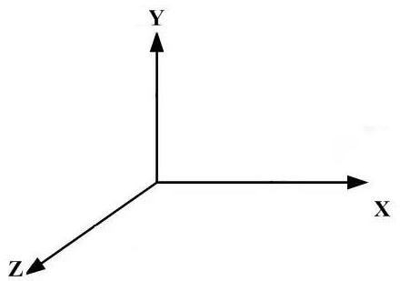
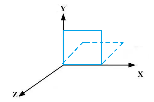
15、3d移动、3d缩放、3d旋转 <--返回目录
* 3d移动 transform:translate3d(x,y,z);
- 也可以分开来写 transform:translateX(x);
- transform:translateY(y);
- transform:translateZ(z);
- 注意:3个值都要给,比如transform:translate3d(400px,0,0)
* 3d缩放 scale3d(num1,num2,num3)
- 也可以分开来写 transform:scaleX(x);
- transform:scaleY(y);
- transform:scaleZ(z);
* 3d旋转
* transform: rotate3d(x,y,z,angle); 指定需要进行选择的坐标轴
- transform: rotate3d(1,0,0,angle); 元素按照x轴旋转
- x,y,z为向量坐标
* transform: rotateX(angle); 元素按照x轴旋转
* transform: rotateY(angle); 元素按照y轴旋转
* transform: rotateZ(angle); 元素按照z轴旋转
- 默认3维坐标系原点定位在元素的中心点
<!DOCTYPE html>
<html>
<head>
<title>标题</title>
<meta charset="utf-8">
<style type="text/css">
    div {
        position: absolute;
        width: 200px;
        height: 200px;
        left: 0px;
        top:0px;
    }
    .one {
        background-color: blue;
        transform: rotate3d(0,0,1,20deg);

        transform-origin: left bottom;
    }
    .two {
        background-color: #eee;
    }
</style>
</head>
<body>
    <div class="one"></div>
    <!-- <div class="two"></div> -->
</body>
</html>
transform-origin: left bottom; // 将坐标系原点定位在div左下角
transform: rotate3d(0,0,1,20deg); // 旋转轴:Z轴,顺时针旋转20°

<!DOCTYPE html>
<html>
<head>
<title>标题</title>
<meta charset="utf-8">
<style type="text/css">
    div {
        position: absolute;
        width: 200px;
        height: 200px;
        left: 0px;
        top:0px;
    }
    .one {
        background-color: blue;
        transform: rotate3d(1,0,0,60deg);

        transform-origin: left bottom;
    }
    .two {
        background-color: #eee;
    }
</style>
</head>
<body>
    <div class="one"></div>
    <!-- <div class="two"></div> -->
</body>
</html>
transform-origin: left bottom; // 将坐标系原点定位在div左下角
transform: rotate3d(1,0,0,60deg); // 旋转轴:x轴,顺时针旋转60°
---