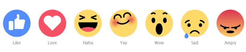
css3非常强大,我们可以利用css3相关特性绘制很多平面图形,并且可以制作很多简单的动画。今天要分享的是一款用纯css3实现的可爱表情动画,一共有7组表情动画。
这些表情图实在太可爱了,哈哈CSS真的是太强大了
效果如下:
pixabayhttps://www.wode007.com/sites/73237.html wallhavenhttps://www.wode007.com/sites/73236.html
代码如下:
<!DOCTYPE html>
<html>
<head>
    <title></title>
    <style type="text/css">
        body {
  text-align: center;
  margin: 80px auto 0;
  font-family: "Lucida Sans Unicode", "Lucida Grande", sans-serif;
}

.emoji {
   120px;
  height: 120px;
  margin: 15px;
  background: #FFDA6A;
  display: inline-block;
  border-radius: 50%;
  position: relative;
}
.emoji:after {
  position: absolute;
  bottom: -40px;
  font-size: 18px;
   60px;
  left: calc(50% - 30px);
  color: #8A8A8A;
}

.emoji__face, .emoji__eyebrows, .emoji__eyes, .emoji__mouth, .emoji__tongue, .emoji__heart, .emoji__hand, .emoji__thumb {
  position: absolute;
}
.emoji__face:before, .emoji__face:after, .emoji__eyebrows:before, .emoji__eyebrows:after, .emoji__eyes:before, .emoji__eyes:after, .emoji__mouth:before, .emoji__mouth:after, .emoji__tongue:before, .emoji__tongue:after, .emoji__heart:before, .emoji__heart:after, .emoji__hand:before, .emoji__hand:after, .emoji__thumb:before, .emoji__thumb:after {
  position: absolute;
  content: '';
}

.emoji__face {
   inherit;
  height: inherit;
}

.emoji--like {
  background: #548DFF;
}
.emoji--like:after {
  content: 'Like';
}
.emoji--like .emoji__hand {
  left: 25px;
  bottom: 30px;
   20px;
  height: 40px;
  background: #FFFFFF;
  border-radius: 5px;
  z-index: 0;
  animation: hands-up 2s linear infinite;
}
.emoji--like .emoji__hand:before {
  left: 25px;
  bottom: 5px;
   40px;
  background: inherit;
  height: 10px;
  border-radius: 2px 10px 10px 2px;
  box-shadow: 1px -9px 0 1px #FFFFFF, 2px -19px 0 2px #FFFFFF, 3px -29px 0 3px #FFFFFF;
}
.emoji--like .emoji__thumb {
  border-bottom: 20px solid #FFFFFF;
  border-left: 20px solid transparent;
  top: -25px;
  right: -25px;
  z-index: 2;
  transform: rotate(5deg);
  transform-origin: 0% 100%;
  animation: thumbs-up 2s linear infinite;
}
.emoji--like .emoji__thumb:before {
  border-radius: 50% 50% 0 0;
  background: #FFFFFF;
   10px;
  height: 12px;
  left: -10px;
  top: -8px;
  transform: rotate(-15deg);
  transform-origin: 100% 100%;
  box-shadow: -1px 4px 0 -1px #FFFFFF;
}

.emoji--love {
  background: #F55064;
}
.emoji--love:after {
  content: 'Love';
}
.emoji--love .emoji__heart {
  left: calc(50% - 40px);
  top: calc(50% - 40px);
   80px;
  height: 80px;
  animation: heart-beat 1s linear infinite alternate;
}
.emoji--love .emoji__heart:before, .emoji--love .emoji__heart:after {
  left: calc(50% - 20px);
  top: calc(50% - 32px);
   40px;
  height: 64px;
  background: #FFFFFF;
  border-radius: 20px 20px 0 0;
}
.emoji--love .emoji__heart:before {
  transform: translate(20px) rotate(-45deg);
  transform-origin: 0 100%;
}
.emoji--love .emoji__heart:after {
  transform: translate(-20px) rotate(45deg);
  transform-origin: 100% 100%;
}

.emoji--haha:after {
  content: 'Haha';
}
.emoji--haha .emoji__face {
  animation: haha-face 2s linear infinite;
}
.emoji--haha .emoji__eyes {
   26px;
  height: 6px;
  border-radius: 2px;
  left: calc(50% - 13px);
  top: 35px;
  transform: rotate(20deg);
  background: transparent;
  box-shadow: -25px 5px 0 0 #000000, 25px -5px 0 0 #000000;
}
.emoji--haha .emoji__eyes:after {
  left: 0;
  top: 0;
   26px;
  height: 6px;
  border-radius: 2px;
  transform: rotate(-40deg);
  background: transparent;
  box-shadow: -25px -5px 0 0 #000000, 25px 5px 0 0 #000000;
}
.emoji--haha .emoji__mouth {
   80px;
  height: 40px;
  left: calc(50% - 40px);
  top: 50%;
  background: #000000;
  border-radius: 0 0 40px 40px;
  overflow: hidden;
  z-index: 1;
  animation: haha-mouth 2s linear infinite;
}
.emoji--haha .emoji__tongue {
   70px;
  height: 30px;
  background: #F55064;
  left: calc(50% - 35px);
  bottom: -10px;
  border-radius: 50%;
}

.emoji--yay:after {
  content: 'Yay';
  animation: yay-reverse 1s linear infinite;
}
.emoji--yay .emoji__face {
  animation: yay 1s linear infinite alternate;
}
.emoji--yay .emoji__eyebrows {
  left: calc(50% - 3px);
  top: 30px;
  height: 6px;
   6px;
  border-radius: 50%;
  background: transparent;
  box-shadow: -6px 0 0 0 #000000, -36px 0 0 0px #000000, 6px 0 0 0 #000000, 36px 0 0 0px #000000;
}
.emoji--yay .emoji__eyebrows:before, .emoji--yay .emoji__eyebrows:after {
   36px;
  height: 18px;
  border-radius: 60px 60px 0 0;
  background: transparent;
  border: 6px solid black;
  box-sizing: border-box;
  border-bottom: 0;
  bottom: 3px;
  left: calc(50% - 18px);
}
.emoji--yay .emoji__eyebrows:before {
  margin-left: -21px;
}
.emoji--yay .emoji__eyebrows:after {
  margin-left: 21px;
}
.emoji--yay .emoji__mouth {
  top: 60px;
  background: transparent;
  left: 50%;
}
.emoji--yay .emoji__mouth:after {
   80px;
  height: 80px;
  left: calc(50% - 40px);
  top: -75px;
  border-radius: 50%;
  background: transparent;
  border: 6px solid #000000;
  box-sizing: border-box;
  border-top-color: transparent;
  border-left-color: transparent;
  border-right-color: transparent;
  z-index: 1;
}
.emoji--yay .emoji__mouth:before {
   6px;
  height: 6px;
  background: transparent;
  border-radius: 50%;
  bottom: 5px;
  left: calc(50% - 3px);
  box-shadow: -25px 0 0 0 #000000, 25px 0 0 0 #000000, -35px -2px 30px 10px #D5234C, 35px -2px 30px 10px #D5234C;
}

.emoji--wow:after {
  content: 'Wow';
}
.emoji--wow .emoji__face {
  animation: wow-face 3s linear infinite;
}
.emoji--wow .emoji__eyebrows {
  left: calc(50% - 3px);
  height: 6px;
   6px;
  border-radius: 50%;
  background: transparent;
  box-shadow: -18px 0 0 0 #000000, -33px 0 0 0 #000000, 18px 0 0 0 #000000, 33px 0 0 0 #000000;
  animation: wow-brow 3s linear infinite;
}
.emoji--wow .emoji__eyebrows:before, .emoji--wow .emoji__eyebrows:after {
   24px;
  height: 20px;
  border: 6px solid #000000;
  box-sizing: border-box;
  border-radius: 50%;
  border-bottom-color: transparent;
  border-left-color: transparent;
  border-right-color: transparent;
  top: -3px;
  left: calc(50% - 12px);
}
.emoji--wow .emoji__eyebrows:before {
  margin-left: -25px;
}
.emoji--wow .emoji__eyebrows:after {
  margin-left: 25px;
}
.emoji--wow .emoji__eyes {
   16px;
  height: 24px;
  left: calc(50% - 8px);
  top: 35px;
  border-radius: 50%;
  background: transparent;
  box-shadow: 25px 0 0 0 #000000, -25px 0 0 0 #000000;
}
.emoji--wow .emoji__mouth {
   30px;
  height: 45px;
  left: calc(50% - 15px);
  top: 50%;
  border-radius: 50%;
  background: #000000;
  animation: wow-mouth 3s linear infinite;
}

.emoji--sad:after {
  content: 'Sad';
}
.emoji--sad .emoji__face {
  animation: sad-face 2s ease-in infinite;
}
.emoji--sad .emoji__eyebrows {
  left: calc(50% - 3px);
  top: 35px;
  height: 6px;
   6px;
  border-radius: 50%;
  background: transparent;
  box-shadow: -40px 9px 0 0 #000000, -25px 0 0 0 #000000, 25px 0 0 0 #000000, 40px 9px 0 0 #000000;
}
.emoji--sad .emoji__eyebrows:before, .emoji--sad .emoji__eyebrows:after {
   30px;
  height: 20px;
  border: 6px solid #000000;
  box-sizing: border-box;
  border-radius: 50%;
  border-bottom-color: transparent;
  border-left-color: transparent;
  border-right-color: transparent;
  top: 2px;
  left: calc(50% - 15px);
}
.emoji--sad .emoji__eyebrows:before {
  margin-left: -30px;
  transform: rotate(-30deg);
}
.emoji--sad .emoji__eyebrows:after {
  margin-left: 30px;
  transform: rotate(30deg);
}
.emoji--sad .emoji__eyes {
   14px;
  height: 16px;
  left: calc(50% - 7px);
  top: 50px;
  border-radius: 50%;
  background: transparent;
  box-shadow: 25px 0 0 0 #000000, -25px 0 0 0 #000000;
}
.emoji--sad .emoji__eyes:after {
  background: #548DFF;
   12px;
  height: 12px;
  margin-left: 6px;
  border-radius: 0 100% 40% 50% / 0 50% 40% 100%;
  transform-origin: 0% 0%;
  animation: tear-drop 2s ease-in infinite;
}
.emoji--sad .emoji__mouth {
   60px;
  height: 80px;
  left: calc(50% - 30px);
  top: 80px;
  box-sizing: border-box;
  border: 6px solid #000000;
  border-radius: 50%;
  border-bottom-color: transparent;
  border-left-color: transparent;
  border-right-color: transparent;
  background: transparent;
  animation: sad-mouth 2s ease-in infinite;
}
.emoji--sad .emoji__mouth:after {
   6px;
  height: 6px;
  background: transparent;
  border-radius: 50%;
  top: 4px;
  left: calc(50% - 3px);
  box-shadow: -18px 0 0 0 #000000, 18px 0 0 0 #000000;
}

.emoji--angry {
  background: linear-gradient(#D5234C -10%, #FFDA6A);
  background-size: 100%;
  animation: angry-color 2s ease-in infinite;
}
.emoji--angry:after {
  content: 'Angry';
}
.emoji--angry .emoji__face {
  animation: angry-face 2s ease-in infinite;
}
.emoji--angry .emoji__eyebrows {
  left: calc(50% - 3px);
  top: 55px;
  height: 6px;
   6px;
  border-radius: 50%;
  background: transparent;
  box-shadow: -44px 5px 0 0 #000000, -7px 16px 0 0 #000000, 7px 16px 0 0 #000000, 44px 5px 0 0 #000000;
}
.emoji--angry .emoji__eyebrows:before, .emoji--angry .emoji__eyebrows:after {
   50px;
  height: 20px;
  border: 6px solid #000000;
  box-sizing: border-box;
  border-radius: 50%;
  border-top-color: transparent;
  border-left-color: transparent;
  border-right-color: transparent;
  top: 0;
  left: calc(50% - 25px);
}
.emoji--angry .emoji__eyebrows:before {
  margin-left: -25px;
  transform: rotate(15deg);
}
.emoji--angry .emoji__eyebrows:after {
  margin-left: 25px;
  transform: rotate(-15deg);
}
.emoji--angry .emoji__eyes {
   12px;
  height: 12px;
  left: calc(50% - 6px);
  top: 70px;
  border-radius: 50%;
  background: transparent;
  box-shadow: 25px 0 0 0 #000000, -25px 0 0 0 #000000;
}
.emoji--angry .emoji__mouth {
   36px;
  height: 18px;
  left: calc(50% - 18px);
  bottom: 15px;
  background: #000000;
  border-radius: 50%;
  animation: angry-mouth 2s ease-in infinite;
}

@keyframes heart-beat {
  25% {
    transform: scale(1.1);
  }
  75% {
    transform: scale(0.6);
  }
}
@keyframes haha-face {
  10% {
    transform: translateY(25px);
  }
  20% {
    transform: translateY(15px);
  }
  30% {
    transform: translateY(25px);
  }
  40% {
    transform: translateY(15px);
  }
  50% {
    transform: translateY(25px);
  }
  60% {
    transform: translateY(0);
  }
  70% {
    transform: translateY(-10px);
  }
  80% {
    transform: translateY(0);
  }
  90% {
    transform: translateY(-10px);
  }
}
@keyframes haha-mouth {
  10% {
    transform: scale(0.6);
    top: 45%;
  }
  20% {
    transform: scale(0.8);
    top: 45%;
  }
  30% {
    transform: scale(0.6);
    top: 45%;
  }
  40% {
    transform: scale(0.8);
    top: 45%;
  }
  50% {
    transform: scale(0.6);
    top: 45%;
  }
  60% {
    transform: scale(1);
    top: 50%;
  }
  70% {
    transform: scale(1.2);
    top: 50%;
  }
  80% {
    transform: scale(1);
    top: 50%;
  }
  90% {
    transform: scale(1.1);
    top: 50%;
  }
}
@keyframes yay {
  25% {
    transform: rotate(-15deg);
  }
  75% {
    transform: rotate(15deg);
  }
}
@keyframes wow-face {
  15%, 25% {
    transform: rotate(20deg) translateX(-25px);
  }
  45%, 65% {
    transform: rotate(-20deg) translateX(25px);
  }
  75%, 100% {
    transform: rotate(0deg) translateX(0);
  }
}
@keyframes wow-brow {
  15%, 65% {
    top: 25px;
  }
  75%, 100%, 0% {
    top: 15px;
  }
}
@keyframes wow-mouth {
  10%, 30% {
     20px;
    height: 20px;
    left: calc(50% - 10px);
  }
  50%, 70% {
     30px;
    height: 40px;
    left: calc(50% - 15px);
  }
  75%, 100% {
    height: 50px;
  }
}
@keyframes sad-face {
  25%, 35% {
    top: -15px;
  }
  55%, 95% {
    top: 10px;
  }
  100%, 0% {
    top: 0;
  }
}
@keyframes sad-mouth {
  25%, 35% {
    transform: scale(0.85);
    top: 70px;
  }
  55%, 100%, 0% {
    transform: scale(1);
    top: 80px;
  }
}
@keyframes tear-drop {
  0%, 100% {
    display: block;
    left: 35px;
    top: 15px;
    transform: rotate(45deg) scale(0);
  }
  25% {
    display: block;
    left: 35px;
    transform: rotate(45deg) scale(2);
  }
  49.9% {
    display: block;
    left: 35px;
    top: 65px;
    transform: rotate(45deg) scale(0);
  }
  50% {
    display: block;
    left: -35px;
    top: 15px;
    transform: rotate(45deg) scale(0);
  }
  75% {
    display: block;
    left: -35px;
    transform: rotate(45deg) scale(2);
  }
  99.9% {
    display: block;
    left: -35px;
    top: 65px;
    transform: rotate(45deg) scale(0);
  }
}
@keyframes hands-up {
  25% {
    transform: rotate(15deg);
  }
  50% {
    transform: rotate(-15deg) translateY(-10px);
  }
  75%, 100% {
    transform: rotate(0deg);
  }
}
@keyframes thumbs-up {
  25% {
    transform: rotate(20deg);
  }
  50%, 100% {
    transform: rotate(5deg);
  }
}
@keyframes angry-color {
  45%, 60% {
    background-size: 250%;
  }
  85%, 100%, 0% {
    background-size: 100%;
  }
}
@keyframes angry-face {
  35%, 60% {
    transform: translateX(0) translateY(10px) scale(0.9);
  }
  40% {
    transform: translateX(-5px) translateY(10px) scale(0.9);
  }
  45% {
    transform: translateX(5px) translateY(10px) scale(0.9);
  }
  50% {
    transform: translateX(-5px) translateY(10px) scale(0.9);
  }
  55% {
    transform: translateX(5px) translateY(10px) scale(0.9);
  }
}
@keyframes angry-mouth {
  25%, 50% {
    height: 6px;
    bottom: 25px;
  }
}

    </style>
</head>
<body>
    <divclass="emoji  emoji--like">
  <divclass="emoji__hand">
    <divclass="emoji__thumb"></div>
  </div>
</div>
<divclass="emoji  emoji--love">
  <divclass="emoji__heart"></div>
</div>
<div class="emoji  emoji--haha">
  <div class="emoji__face">
    <div class="emoji__eyes"></div>
    <div class="emoji__mouth">
      <div class="emoji__tongue"></div>
    </div>
  </div>
</div>
<div class="emoji  emoji--yay">
  <div class="emoji__face">
    <div class="emoji__eyebrows"></div>
    <div class="emoji__mouth"></div>
  </div>
</div>
<div class="emoji  emoji--wow">
  <div class="emoji__face">
    <div class="emoji__eyebrows"></div>
    <div class="emoji__eyes"></div>
    <div class="emoji__mouth"></div>
  </div>
</div>
<div class="emoji  emoji--sad">
  <div class="emoji__face">
    <div class="emoji__eyebrows"></div>
    <div class="emoji__eyes"></div>
    <div class="emoji__mouth"></div>
  </div>
</div>
<div class="emoji  emoji--angry">
  <div class="emoji__face">
    <div class="emoji__eyebrows"></div>
    <div class="emoji__eyes"></div>
    <div class="emoji__mouth"></div>
  </div>
</div>
</body>
</html>