1:常用之动画(View Animation,Drawable Animation,Property Animation)
http://blog.csdn.net/huxueyan521/article/details/8179036
http://www.360doc.com/content/13/0102/22/6541311_257754535.shtml
http://blog.csdn.net/yanbober/article/details/46481171
http://blog.csdn.net/lmj623565791/article/details/38067475 (Property Animation)
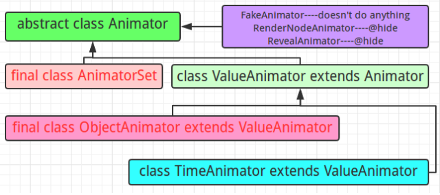
Property Animation概述:
ValueAnimator<animator> 放置在res/animator/目录下 在一个特定的时间里执行一个动画
TimeAnimator 时序监听回调工具
ObjectAnimator<objectAnimator> 放置在res/animator/目录下 一个对象的一个属性动画
AnimatorSet<set> 放置在res/animator/目录下 动画集合
2:shape 自定义
自定义各种详细属性的描述


<?xml version="1.0" encoding="utf-8"?>
<!--
    shape drawable xml文件中定义的一个几何图形,定义在res/drawable/目录下,文件名filename称为访问的资源ID
    在代码中通过R.drawable.filename进行访问,在xml文件中通过@[package:]drawable/filename进行访问。
 -->
 <!--
     android:shape=["rectangle" | "oval" | "line" | "ring"]
     shape的形状,默认为矩形,可以设置为矩形(rectangle)、椭圆形(oval)、线性形状(line)、环形(ring)
      下面的属性只有在android:shape="ring时可用:
      android:innerRadius         尺寸,内环的半径。
      android:innerRadiusRatio    浮点型,以环的宽度比率来表示内环的半径,
      例如,如果android:innerRadiusRatio,表示内环半径等于环的宽度除以5,这个值是可以被覆盖的,默认为9.
      android:thickness            尺寸,环的厚度
      android:thicknessRatio        浮点型,以环的宽度比率来表示环的厚度,例如,如果android:thicknessRatio="2",
      那么环的厚度就等于环的宽度除以2。这个值是可以被android:thickness覆盖的,默认值是3.
      android:useLevel            boolean值,如果当做是LevelListDrawable使用时值为true,否则为false.
  -->
<shape
    xmlns:android="http://schemas.android.com/apk/res/android"
    android:shape="rectangle">

    <!--
         圆角
         android:radius              整型 半径
        android:topLeftRadius          整型 左上角半径
        android:topRightRadius      整型 右上角半径
        android:bottomLeftRadius     整型 左下角半径
        android:bottomRightRadius     整型 右下角半径
     -->
     <corners
        android:radius="8dp"
        android:topLeftRadius="5dp"
        android:topRightRadius="15dp"
        android:bottomLeftRadius="20dp"
        android:bottomRightRadius="25dp"
        />

     <!--
         渐变色
         android:startColor  颜色值                             起始颜色
        android:endColor    颜色值                             结束颜色
        android:centerColor 整型                               渐变中间颜色,即开始颜色与结束颜色之间的颜色
        android:angle       整型                               渐变角度(PS:当angle=0时,渐变色是从左向右。 然后逆时针方向转,当angle=90时为从下往上。angle必须为45的整数倍)
        android:type        ["linear" | "radial" | "sweep"] 渐变类型(取值:linear、radial、sweep)
                            linear 线性渐变,这是默认设置
                            radial 放射性渐变,以开始色为中心。
                            sweep 扫描线式的渐变。
       android:useLevel       ["true" | "false"]                 如果要使用LevelListDrawable对象,就要设置为true。设置为true无渐变。false有渐变色
       android:gradientRadius 整型                             渐变色半径.当 android:type="radial" 时才使用。单独使用 android:type="radial"会报错。
       android:centerX        整型                               渐变中心X点坐标的相对位置
       android:centerY       整型                               渐变中心Y点坐标的相对位置
    -->
    <gradient
        android:startColor="#FFFF0000"
        android:endColor="#80FF00FF"
        android:angle="45"
        />

    <!--
         内边距,即内容与边的距离
         android:left      整型 左内边距
        android:top       整型 上内边距
        android:right      整型 右内边距
        android:bottom     整型 下内边距
      -->
     <padding
         android:left="10dp"
         android:top="10dp"
         android:right="10dp"
         android:bottom="10dp"
         />

    <!--
        size 大小
        android:width     整型 宽度
        android:height     整型 高度
    -->
    <size
        android:width="600dp"
        />

    <!--
        内部填充
        android:color     颜色值 填充颜色
    -->
    <solid
        android:color="#ffff9d77"
        />

     <!--
         描边
         android:width         整型     描边的宽度
        android:color         颜色值     描边的颜色
        android:dashWidth     整型     表示描边的样式是虚线的宽度, 值为0时,表示为实线。值大于0则为虚线。
        android:dashGap      整型     表示描边为虚线时,虚线之间的间隔 即“ - - - - ”
     -->
     <stroke
        android:width="2dp"
        android:color="#dcdcdc"
        />
</shape>
3:selector
android:state_pressed=["true" | "false"]//是否触摸
android:state_focused=["true" | "false"]//是否获取到焦点
android:state_hovered=["true" | "false"]//光标是否经过
android:state_selected=["true" | "false"]//是否选中
android:state_checkable=["true" | "false"]//是否可勾选
android:state_checked=["true" | "false"]//是否勾选
android:state_enabled=["true" | "false"]//是否可用
android:state_activated=["true" | "false"]//是否激活
android:state_window_focused=["true" | "false"] />//所在窗口是否获取焦点(对话框显示时对应false状态)
<?xml version="1.0" encoding="utf-8" ?>
<selector xmlns:android="http://schemas.android.com/apk/res/android">
    <!-- 默认时的背景图片-->
    <item android:drawable="@drawable/pic1" />
    <!-- 没有焦点时的背景图片-->
    <item android:state_window_focused="false" android:drawable="@drawable/pic1" />
    <!-- 非触摸模式下获得焦点并单击时的背景图片-->
    <item android:state_focused="true" android:state_pressed="true"
        android:drawable="@drawable/pic2" />
    <!-- 触摸模式下单击时的背景图片-->
    <item android:state_focused="false" android:state_pressed="true"
        android:drawable="@drawable/pic3" />
    <!--选中时的图片背景-->
    <item android:state_selected="true" android:drawable="@drawable/pic4" />
    <!--获得焦点时的图片背景-->
    <item android:state_focused="true" android:drawable="@drawable/pic5" />
</selector>