弹性盒布局(Flex Box)
一、概念
弹性盒子是 CSS3 的一种新的布局模式。
CSS3 弹性盒( Flexible Box 或 flexbox),是一种当页面需要适应不同的屏幕大小以及设备类型时确保元素拥有恰当的行为的布局方式。
引入弹性盒布局模型的目的是提供一种更加有效的方式来对一个容器中的子元素进行排列、对齐和分配空白空间。
采用Flex布局的元素,称为Flex容器(flex container),简称”容器”。它的所有子元素自动成为容器成员,称为Flex项目(flex item),简称”项目”。

容器默认存在两根轴:水平的主轴(main axis)和垂直的交叉轴(cross axis)。
主轴的开始位置(与边框的交叉点)叫做main start,
结束位置叫做main end;
交叉轴的开始位置叫做cross start,
结束位置叫做cross end。
项目默认沿主轴排列。单个项目占据的主轴空间叫做main size,占据的交叉轴空间叫做cross size。
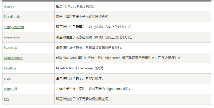
容器的属性
以下6个属性设置在容器上。
- flex-direction
- flex-wrap
- flex-flow
- justify-content
- align-items
- align-content
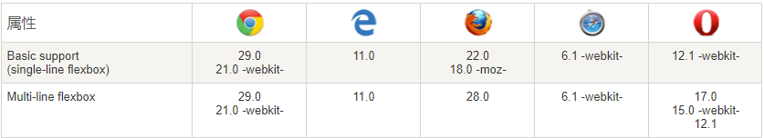
二、兼容性
表格中的数字表示支持该属性的第一个浏览器的版本号。
紧跟在数字后面的 -webkit- 或 -moz- 为指定浏览器的前缀。
三、弹性盒子内容
弹性盒子由弹性容器(Flex container)和弹性子元素(Flex item)组成。
弹性容器通过设置 display 属性的值为 flex 或 inline-flex将其定义为弹性容器。
弹性容器内包含了一个或多个弹性子元素。
.box{
display: flex;
}
行内元素也可以使用Flex布局。
.box{
display: inline-flex;
}
Webkit内核的浏览器,必须加上-webkit前缀。
.box{
display: -webkit-flex; /* Safari */
display: flex;
}
注意,设为Flex布局以后,子元素的float、clear和vertical-align属性将失效。
3.1、flex-direction
flex-direction 属性指定了弹性子元素在父容器中的排列方式。
flex-direction的值有:
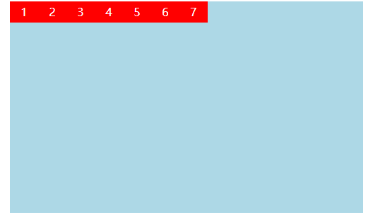
- row:横向从左到右排列(左对齐),默认的排列方式。
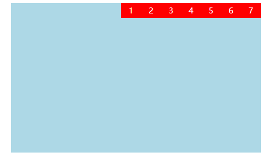
- row-reverse:反转横向排列(右对齐,从后往前排,最后一项排在最前面。
- column:纵向排列。
- column-reverse:反转纵向排列,从后往前排,最后一项排在最上面。
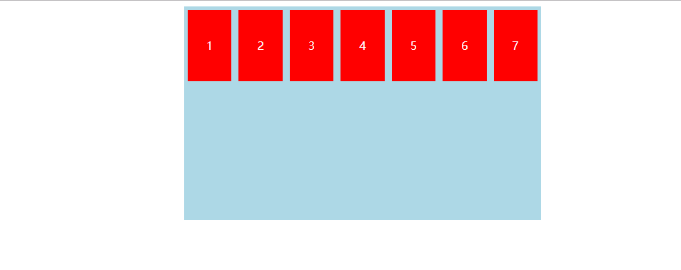
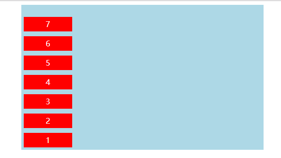
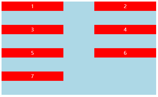
3.1.1、row
示例:

<!DOCTYPE html>
<html>
    <head>
        <meta charset="UTF-8">
        <title></title>
        <style type="text/css">
            #big{
                 500PX;
                height: 300PX;
                background: lightblue;
                margin: auto;
                display: flex;    /*定义为弹性盒子*/
                flex-direction:row;/*设置排列方式*/
            }
            #big div{
                margin-left:5PX ;
                margin-right: 5PX;
                 100PX;
                height: 100PX;
                margin-top: 5PX;
                margin-bottom: 5PX;
                background: red;
                text-align: center;
                line-height: 100PX;
                color: white;
            }
        </style>
    </head>
    <body>
        <div id="big">
            <div class="div1">1</div>
            <div class="div1">2</div>
            <div class="div1">3</div>
            <div class="div1">4</div>
            <div class="div1">5</div>
            <div class="div1">6</div>
            <div class="div1" title="最后">7</div>
        </div>
    </body>
</html>
运行结果:
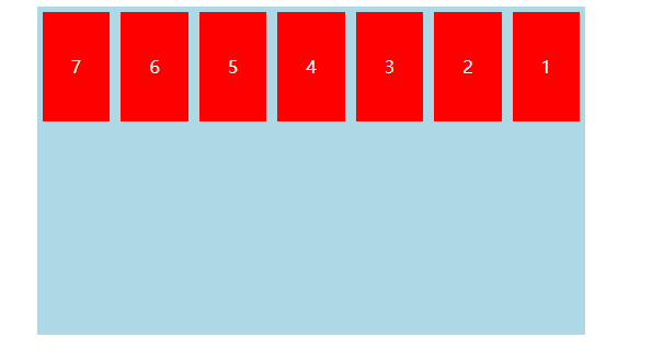
3.1.2、row-reverse
示例:
<!DOCTYPE html>
<html>
    <head>
        <meta charset="UTF-8">
        <title></title>
        <style type="text/css">
            #big{
                 500PX;
                height: 300PX;
                background: lightblue;
                margin: auto;
                display: flex;                    /*定义为弹性盒子*/
                flex-direction:row-reverse;        /*设置排列方式*/
            }
            #big div{
                margin-left:5PX ;
                margin-right: 5PX;
                 100PX;
                height: 100PX;
                margin-top: 5PX;
                margin-bottom: 5PX;
                background: red;
                text-align: center;
                line-height: 100PX;
                color: white;
            }
        </style>
    </head>
    <body>
        <div id="big">
            <div class="div1">1</div>
            <div class="div1">2</div>
            <div class="div1">3</div>
            <div class="div1">4</div>
            <div class="div1">5</div>
            <div class="div1">6</div>
            <div class="div1" title="最后">7</div>
        </div>
    </body>
</html>
运行结果:
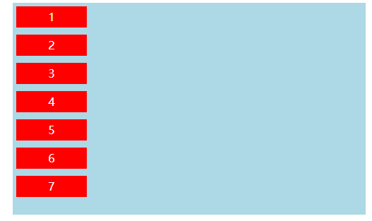
3.1.3、column
示例:
<!DOCTYPE html>
<html>
    <head>
        <meta charset="UTF-8">
        <title></title>
        <style type="text/css">
            #big{
                 500PX;
                height: 300PX;
                background: lightblue;
                margin: auto;
                display: flex;                    /*定义为弹性盒子*/
                flex-direction:column;        /*设置排列方式*/
            }
            #big div{
                margin-left:5PX ;
                margin-right: 5PX;
                 100PX;
                height: 30PX;
                margin-top: 5PX;
                margin-bottom: 5PX;
                background: red;
                text-align: center;
                line-height: 30PX;
                color: white;
            }
        </style>
    </head>
    <body>
        <div id="big">
            <div class="div1">1</div>
            <div class="div1">2</div>
            <div class="div1">3</div>
            <div class="div1">4</div>
            <div class="div1">5</div>
            <div class="div1">6</div>
            <div class="div1" title="最后">7</div>
        </div>
    </body>
</html>
运行结果:
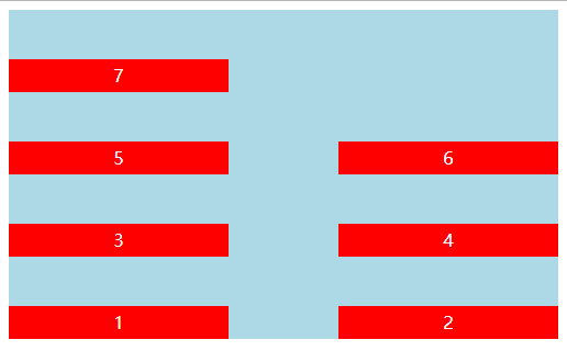
3.1.4、column-reverse
示例:
<!DOCTYPE html>
<html>
    <head>
        <meta charset="UTF-8">
        <title></title>
        <style type="text/css">
            #big{
                 500PX;
                height: 300PX;
                background: lightblue;
                margin: auto;
                display: flex;                    /*定义为弹性盒子*/
                flex-direction:column-reverse;        /*设置排列方式*/
            }
            #big div{
                margin-left:5PX ;
                margin-right: 5PX;
                 100PX;
                height: 30PX;
                margin-top: 5PX;
                margin-bottom: 5PX;
                background: red;
                text-align: center;
                line-height: 30PX;
                color: white;
            }
        </style>
    </head>
    <body>
        <div id="big">
            <div class="div1">1</div>
            <div class="div1">2</div>
            <div class="div1">3</div>
            <div class="div1">4</div>
            <div class="div1">5</div>
            <div class="div1">6</div>
            <div class="div1" title="最后">7</div>
        </div>
    </body>
</html>
运行结果:
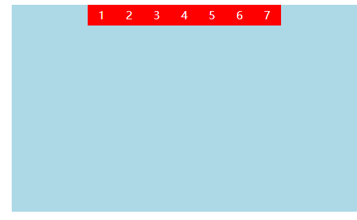
3.2、justify-content
内容对齐的方式。
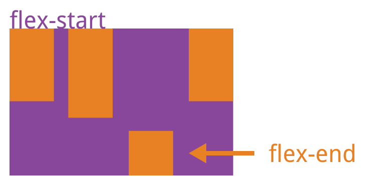
- flex-start:默认值 向左对齐、不会自动填充边距,可以自己设定边距,当设置宽度超出容器时,填充容器。
- flex-end:向右对齐、不会自动填充边距,可以自己设定边距,当设置宽度超出容器时,填充容器。
- center:弹性盒子内的元素居中紧挨着填充(元素之间没有边距),当设置宽度超出容器时,填充容器。
- space-between:弹性盒子内的元素平均分布在该行上,元素与盒子没有边距,元素与元素的边距自动适应,当设置宽度超出容器时,填充容器。
- space-around:弹性盒子内的元素平均分布在该行上,元素与盒子边距自动适应,元素与元素的边距也自动适应,当设置宽度超出容器时,填充容器。
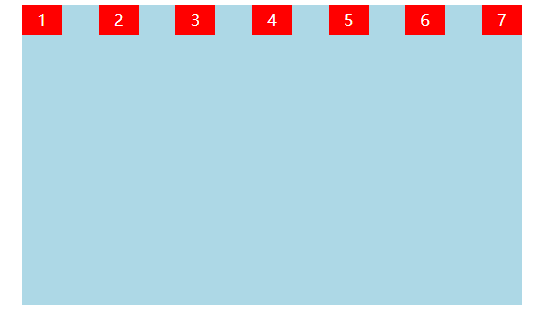
3.2.1、flex-start( 向左对齐、不会自动填充边距,可以自己设定边距,当设置宽度超出容器时,填充容器)
示例:
<!DOCTYPE html>
<html>
    <head>
        <meta charset="UTF-8">
        <title></title>
        <style type="text/css">
            #big{
                 500PX;
                height: 300PX;
                background: lightblue;
                margin: auto;
                display: flex;                    /*定义为弹性盒子*/
                flex-direction:row;                /*设置排列方式*/
                justify-content:flex-start ;    /*设置对齐方式*/
            }
            #big div{
                40PX;
                height: 30PX;
                background: red;
                text-align: center;
                line-height: 30PX;
                color: white;
            }
        </style>
    </head>
    <body>
        <div id="big">
            <div class="div1">1</div>
            <div class="div1">2</div>
            <div class="div1">3</div>
            <div class="div1">4</div>
            <div class="div1">5</div>
            <div class="div1">6</div>
            <div class="div1" title="最后">7</div>
        </div>
    </body>
</html>
运行结果:
3.2.2、flex-end(向右对齐、不会自动填充边距,可以自己设定边距,当设置宽度超出容器时,填充容器)
示例:
<!DOCTYPE html>
<html>
    <head>
        <meta charset="UTF-8">
        <title></title>
        <style type="text/css">
            #big{
                 500PX;
                height: 300PX;
                background: lightblue;
                margin: auto;
                display: flex;                    /*定义为弹性盒子*/
                flex-direction:row;                /*设置排列方式*/
                justify-content:flex-end ;    /*设置对齐方式*/
            }
            #big div{
                40PX;
                height: 30PX;
                background: red;
                text-align: center;
                line-height: 30PX;
                color: white;
            }
        </style>
    </head>
    <body>
        <div id="big">
            <div class="div1">1</div>
            <div class="div1">2</div>
            <div class="div1">3</div>
            <div class="div1">4</div>
            <div class="div1">5</div>
            <div class="div1">6</div>
            <div class="div1" title="最后">7</div>
        </div>
    </body>
</html>
运行结果:
3.2.3、center(弹性盒子内的元素居中紧挨着填充(元素之间没有边距),当设置宽度超出容器时,填充容器)
示例:
<!DOCTYPE html>
<html>
    <head>
        <meta charset="UTF-8">
        <title></title>
        <style type="text/css">
            #big{
                 500PX;
                height: 300PX;
                background: lightblue;
                margin: auto;
                display: flex;                    /*定义为弹性盒子*/
                flex-direction:row;                /*设置排列方式*/
                justify-content:center ;    /*设置对齐方式*/
            }
            #big div{
                40PX;
                height: 30PX;
                background: red;
                text-align: center;
                line-height: 30PX;
                color: white;
            }
        </style>
    </head>
    <body>
        <div id="big">
            <div class="div1">1</div>
            <div class="div1">2</div>
            <div class="div1">3</div>
            <div class="div1">4</div>
            <div class="div1">5</div>
            <div class="div1">6</div>
            <div class="div1" title="最后">7</div>
        </div>
    </body>
</html>
运行结果:
3.2.4、space-between(弹性盒子内的元素平均分布在该行上,元素与盒子没有边距,元素与元素的边距自动适应,当设置宽度超出容器时,填充容器)
示例:
<!DOCTYPE html>
<html>
    <head>
        <meta charset="UTF-8">
        <title></title>
        <style type="text/css">
            #big{
                 500PX;
                height: 300PX;
                background: lightblue;
                margin: auto;
                display: flex;                    /*定义为弹性盒子*/
                flex-direction:row;                /*设置排列方式*/
                justify-content:space-between ;    /*设置对齐方式*/
            }
            #big div{
                40PX;
                height: 30PX;
                background: red;
                text-align: center;
                line-height: 30PX;
                color: white;
            }
        </style>
    </head>
    <body>
        <div id="big">
            <div class="div1">1</div>
            <div class="div1">2</div>
            <div class="div1">3</div>
            <div class="div1">4</div>
            <div class="div1">5</div>
            <div class="div1">6</div>
            <div class="div1" title="最后">7</div>
        </div>
    </body>
</html>
运行结果:
3.2.5、space-around(弹性盒子内的元素平均分布在该行上,元素与盒子边距自动适应,元素与元素的边距也自动适应,当设置宽度超出容器时,填充容器)
示例:
<!DOCTYPE html>
<html>
    <head>
        <meta charset="UTF-8">
        <title></title>
        <style type="text/css">
            #big{
                 500PX;
                height: 300PX;
                background: lightblue;
                margin: auto;
                display: flex;                    /*定义为弹性盒子*/
                flex-direction:row;                /*设置排列方式*/
                justify-content:space-around ;    /*设置对齐方式*/
            }
            #big div{
                40PX;
                height: 30PX;
                background: red;
                text-align: center;
                line-height: 30PX;
                color: white;
            }
        </style>
    </head>
    <body>
        <div id="big">
            <div class="div1">1</div>
            <div class="div1">2</div>
            <div class="div1">3</div>
            <div class="div1">4</div>
            <div class="div1">5</div>
            <div class="div1">6</div>
            <div class="div1" title="最后">7</div>
        </div>
    </body>
</html>
运行结果:

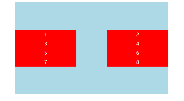
3.3、align-items
align-items 设置改行在垂直方向的对齐方式
- flex-start:改行在弹性盒子的最顶部。
- flex-end:改行在弹性盒子的最低部。
- center:改行在弹性盒子的最中间。
- baseline:如弹性盒子元素的行内轴与侧轴为同一条,则该值与'flex-start'等效。其它情况下,该值将参与基线对齐。
- stretch:如果指定侧轴大小的属性值为'auto',则其值会使项目的边距盒的尺寸尽可能接近所在行的尺寸,但同时会遵照'min/max-width/height'属性的限制。
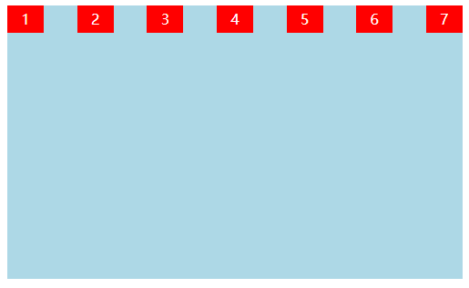
3.3.1、flex-start(改行在弹性盒子的最顶部)
示例:
<!DOCTYPE html>
<html>
    <head>
        <meta charset="UTF-8">
        <title></title>
        <style type="text/css">
            #big{
                 500PX;
                height: 300PX;
                background: lightblue;
                margin: auto;
                display: flex;                    /*定义为弹性盒子*/
                flex-direction:row;                /*设置排列方式*/
                justify-content:space-between ;    /*设置水平对齐方式*/
                align-items:flex-start;                /*设置改行垂直对齐方式*/
            }
            #big div{
                40PX;
                height: 30PX;
                background: red;
                text-align: center;
                line-height: 30PX;
                color: white;
            }
        </style>
    </head>
    <body>
        <div id="big">
            <div class="div1">1</div>
            <div class="div1">2</div>
            <div class="div1">3</div>
            <div class="div1">4</div>
            <div class="div1">5</div>
            <div class="div1">6</div>
            <div class="div1" title="最后">7</div>
        </div>
    </body>
</html>
运行结果:
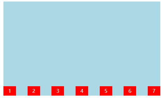
3.3.2、flex-end(改行在弹性盒子的最低部)
示例:
<!DOCTYPE html>
<html>
    <head>
        <meta charset="UTF-8">
        <title></title>
        <style type="text/css">
            #big{
                 500PX;
                height: 300PX;
                background: lightblue;
                margin: auto;
                display: flex;                    /*定义为弹性盒子*/
                flex-direction:row;                /*设置排列方式*/
                justify-content:space-between ;    /*设置水平对齐方式*/
                align-items:flex-end;                /*设置改行垂直对齐方式*/
            }
            #big div{
                40PX;
                height: 30PX;
                background: red;
                text-align: center;
                line-height: 30PX;
                color: white;
            }
        </style>
    </head>
    <body>
        <div id="big">
            <div class="div1">1</div>
            <div class="div1">2</div>
            <div class="div1">3</div>
            <div class="div1">4</div>
            <div class="div1">5</div>
            <div class="div1">6</div>
            <div class="div1" title="最后">7</div>
        </div>
    </body>
</html>
运行结果:
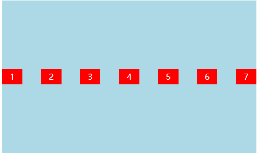
3.3.3、center(改行在弹性盒子的最中间)
示例:
<!DOCTYPE html>
<html>
    <head>
        <meta charset="UTF-8">
        <title></title>
        <style type="text/css">
            #big{
                 500PX;
                height: 300PX;
                background: lightblue;
                margin: auto;
                display: flex;                    /*定义为弹性盒子*/
                flex-direction:row;                /*设置排列方式*/
                justify-content:space-between ;    /*设置水平对齐方式*/
                align-items:center;                /*设置改行垂直对齐方式*/
            }
            #big div{
                40PX;
                height: 30PX;
                background: red;
                text-align: center;
                line-height: 30PX;
                color: white;
            }
        </style>
    </head>
    <body>
        <div id="big">
            <div class="div1">1</div>
            <div class="div1">2</div>
            <div class="div1">3</div>
            <div class="div1">4</div>
            <div class="div1">5</div>
            <div class="div1">6</div>
            <div class="div1" title="最后">7</div>
        </div>
    </body>
</html>
运行结果:
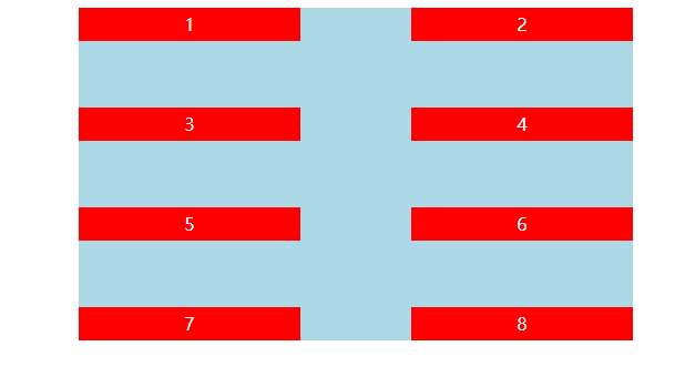
3.5、flex-wrap
flex-wrap 属性用于弹性盒子内的元素溢出时换行排列
- nowrap - 默认, 弹性容器为单行。
- wrap - 弹性盒子内的元素溢出时换行,从盒子顶部开始排列
- wrap-reverse - 弹性盒子内的元素溢出时换行,从盒子低部开始排列。
3.5.1、wrap (弹性盒子内的元素溢出时换行,从盒子顶部开始排列)
示例:
<!DOCTYPE html>
<html>
    <head>
        <meta charset="UTF-8">
        <title></title>
        <style type="text/css">
            #big{
                 500PX;
                height: 300PX;
                background: lightblue;
                margin: auto;
                display: flex;                    /*定义为弹性盒子*/
                flex-direction:row;                /*设置排列方式*/
                justify-content:space-between ;    /*设置水平对齐方式*/
                align-items:flex-start;                /*设置改行垂直对齐方式*/
                flex-wrap:wrap;            /*设置溢出是否换行*/
            }
            #big div{
                200PX;
                height: 30PX;
                background: red;
                text-align: center;
                line-height: 30PX;
                color: white;
            }
        </style>
    </head>
    <body>
        <div id="big">
            <div class="div1">1</div>
            <div class="div1">2</div>
            <div class="div1">3</div>
            <div class="div1">4</div>
            <div class="div1">5</div>
            <div class="div1">6</div>
            <div class="div1" title="最后">7</div>
        </div>
    </body>
</html>
运行结果:
3.5.2、wrap-reverse ( 弹性盒子内的元素溢出时换行,从盒子低部开始排列)
示例:
<!DOCTYPE html>
<html>
    <head>
        <meta charset="UTF-8">
        <title></title>
        <style type="text/css">
            #big{
                 500PX;
                height: 300PX;
                background: lightblue;
                margin: auto;
                display: flex;                    /*定义为弹性盒子*/
                flex-direction:row;                /*设置排列方式*/
                justify-content:space-between ;    /*设置水平对齐方式*/
                align-items:flex-start;                /*设置改行垂直对齐方式*/
                flex-wrap:wrap-reverse;            /*设置溢出是否换行*/
            }
            #big div{
                200PX;
                height: 30PX;
                background: red;
                text-align: center;
                line-height: 30PX;
                color: white;
            }
        </style>
    </head>
    <body>
        <div id="big">
            <div class="div1">1</div>
            <div class="div1">2</div>
            <div class="div1">3</div>
            <div class="div1">4</div>
            <div class="div1">5</div>
            <div class="div1">6</div>
            <div class="div1" title="最后">7</div>
        </div>
    </body>
</html>
运行结果:
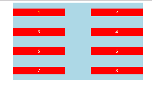
3.6、align-content
align-content 属性用于修改 flex-wrap 属性的行为。类似于 align-items, 但它不是设置弹性子元素的对齐,而是设置各个行的对齐。
stretch- 默认。各行将会伸展以占用剩余的空间。flex-start- 各行向弹性盒容器的起始位置堆叠。flex-end- 各行向弹性盒容器的结束位置堆叠。center-各行向弹性盒容器的中间位置堆叠。space-between-各行在弹性盒容器中平均分布。space-around- 各行在弹性盒容器中平均分布,两端保留子元素与子元素之间间距大小的一半。
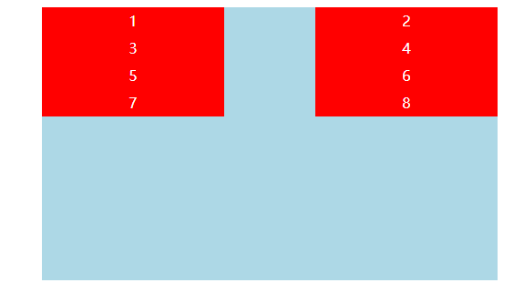
3.6.1、flex-start (各行向弹性盒容器的起始位置堆叠)
示例:
<!DOCTYPE html>
<html>
    <head>
        <meta charset="UTF-8">
        <title></title>
        <style type="text/css">
            #big{
                 500PX;
                height: 300PX;
                background: lightblue;
                margin: auto;
                display: flex;                    /*定义为弹性盒子*/
                flex-direction:row;                /*设置排列方式*/
                justify-content:space-between ;    /*设置水平对齐方式*/
                /*align-items:flex-start;                /*设置改行垂直对齐方式*/
                flex-wrap:wrap;            /*设置溢出是否换行*/
                align-content:flex-start ;
            }
            #big div{
                200PX;
                height: 30PX;
                background: red;
                text-align: center;
                line-height: 30PX;
                color: white;
            }
        </style>
    </head>
    <body>
        <div id="big">
            <div class="div1">1</div>
            <div class="div1">2</div>
            <div class="div1">3</div>
            <div class="div1">4</div>
            <div class="div1">5</div>
            <div class="div1">6</div>
            <div class="div1">7</div>
            <div class="div1" title="最后">8</div>
        </div>
    </body>
</html>
运行结果:
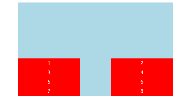
3.6.2、flex-end (各行向弹性盒容器的结束位置堆叠)
示例:
示例与3.6.1一样 只是align-content 属性变化了
运行结果:
3.6.3、center(各行向弹性盒容器的中间位置堆叠)
示例:
示例与3.6.1一样 只是align-content 属性变化了
运行结果:
3.6.4、space-between(各行在弹性盒容器中平均分布)
示例:
示例与3.6.1一样 只是align-content 属性变化了
运行结果:
3.6.5、space-around(各行在弹性盒容器中平均分布,两端保留子元素与子元素之间间距大小的一半)
示例:
示例与3.6.1一样 只是align-content 属性变化了
运行结果:
flex-flow
flex-flow属性是flex-direction属性和flex-wrap属性的简写形式,默认值为row nowrap。
.box {
flex-flow: <flex-direction> <flex-wrap>;
}
四、弹性盒子常用属性归纳
项目的属性
以下6个属性设置在项目上。
- order
- flex-grow
- flex-shrink
- flex-basis
- flex
- align-self
4.1 order属性
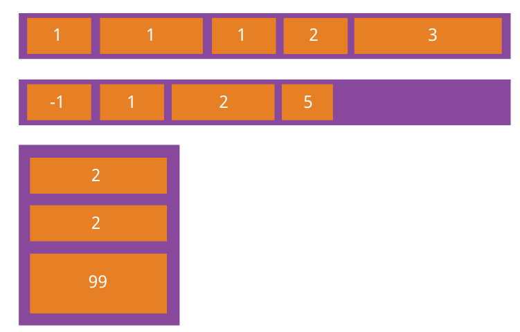
order属性定义项目的排列顺序。数值越小,排列越靠前,默认为0。
.item {
  order: <integer>;
}
4.2 flex-grow属性
flex-grow属性定义项目的放大比例,默认为0,即如果存在剩余空间,也不放大。
.item {
  flex-grow: <number>; /* default 0 */
}

如果所有项目的flex-grow属性都为1,则它们将等分剩余空间(如果有的话)。如果一个项目的flex-grow属性为2,其他项目都为1,则前者占据的剩余空间将比其他项多一倍。
4.3 flex-shrink属性
flex-shrink属性定义了项目的缩小比例,默认为1,即如果空间不足,该项目将缩小。
.item {
  flex-shrink: <number>; /* default 1 */
}

如果所有项目的flex-shrink属性都为1,当空间不足时,都将等比例缩小。如果一个项目的flex-shrink属性为0,其他项目都为1,则空间不足时,前者不缩小。
负值对该属性无效。
4.4 flex-basis属性
flex-basis属性定义了在分配多余空间之前,项目占据的主轴空间(main size)。浏览器根据这个属性,计算主轴是否有多余空间。它的默认值为auto,即项目的本来大小。
.item {
  flex-basis: <length> | auto; /* default auto */
}
它可以设为跟width或height属性一样的值(比如350px),则项目将占据固定空间。
4.5 flex属性
flex属性是flex-grow, flex-shrink 和 flex-basis的简写,默认值为0 1 auto。后两个属性可选。
.item {
  flex: none | [ <'flex-grow'> <'flex-shrink'>? || <'flex-basis'> ]
}
该属性有两个快捷值:auto (1 1 auto) 和 none (0 0 auto)。
建议优先使用这个属性,而不是单独写三个分离的属性,因为浏览器会推算相关值。
4.6 align-self属性
align-self属性允许单个项目有与其他项目不一样的对齐方式,可覆盖align-items属性。默认值为auto,表示继承父元素的align-items属性,如果没有父元素,则等同于stretch。
.item {
  align-self: auto | flex-start | flex-end | center | baseline | stretch;
}
该属性可能取6个值,除了auto,其他都与align-items属性完全一致。