直接贴代码,效果图在后面:
index.html
<!DOCTYPE html>
<html lang="en">
<head>
	<meta charset="UTF-8">
	<title>响应式布局</title>
	<link rel="stylesheet" href="response.css">
</head>
<body>
	<div id="container">
		<div id="header"> <p>header</p> </div>
		<div id="left"> <p>left</p> </div>
		<div id="main"> <p>main</p> </div>
		<div id="right"> <p>right</p> </div>
		<div id="footer"> <p>footer</p> </div>
	</div>
</body>
</html>
response.css
/*基础样式*/
*{margin:0; padding:0; }
#container{margin:0 auto; 1300px; background:#ddd; font-size:3em;}
#header{margin-bottom:5px;background:orange;height:200px;100%; float:left;}
#left{margin-bottom:5px;background:orange;height:400px; 350px;float:left;}
#main{margin-bottom:5px;background:orange;height:400px;580px;margin-left:10px;margin-right:10px;float:left;}
#right{margin-bottom:5px;background:orange;height:400px;350px;float:left;}
#footer{background:orange;height:100px;100%;float:left; }

/*最大宽度小于1000px,最小宽度大于700px时,使用下面的样式*/
@media screen and (max-1000px) and (min-700px) {
	#container{margin:0 auto;100%; background:#ddd; font-size:2em;}
	#left{margin-bottom:5px;background:orange;height:200px; 35%;float:left;}
	#main{margin-bottom:5px;background:orange;height:200px;64%;margin-left:0;margin-right:0;float:right;}
	#right{margin-bottom:5px;background:orange;height:200px;100%;float:left;}
}

/*最大宽度小于699px时,使用下面这种样式*/
@media screen and (max-699px){
	#container{margin:0 auto;100%; background:#ddd; font-size:1.5em;}
	#header{margin-bottom:5px;background:orange;height:100px;100%; float:left;}
	#left{margin:0;margin-bottom:5px;background:orange;height:150px; 100%;float:left;}
	#main{margin-bottom:5px;background:orange;height:150px;100%;margin-left:0;margin-right:0;float:left;}
	#right{margin-bottom:5px;background:orange;height:100px;100%;float:left;}
}
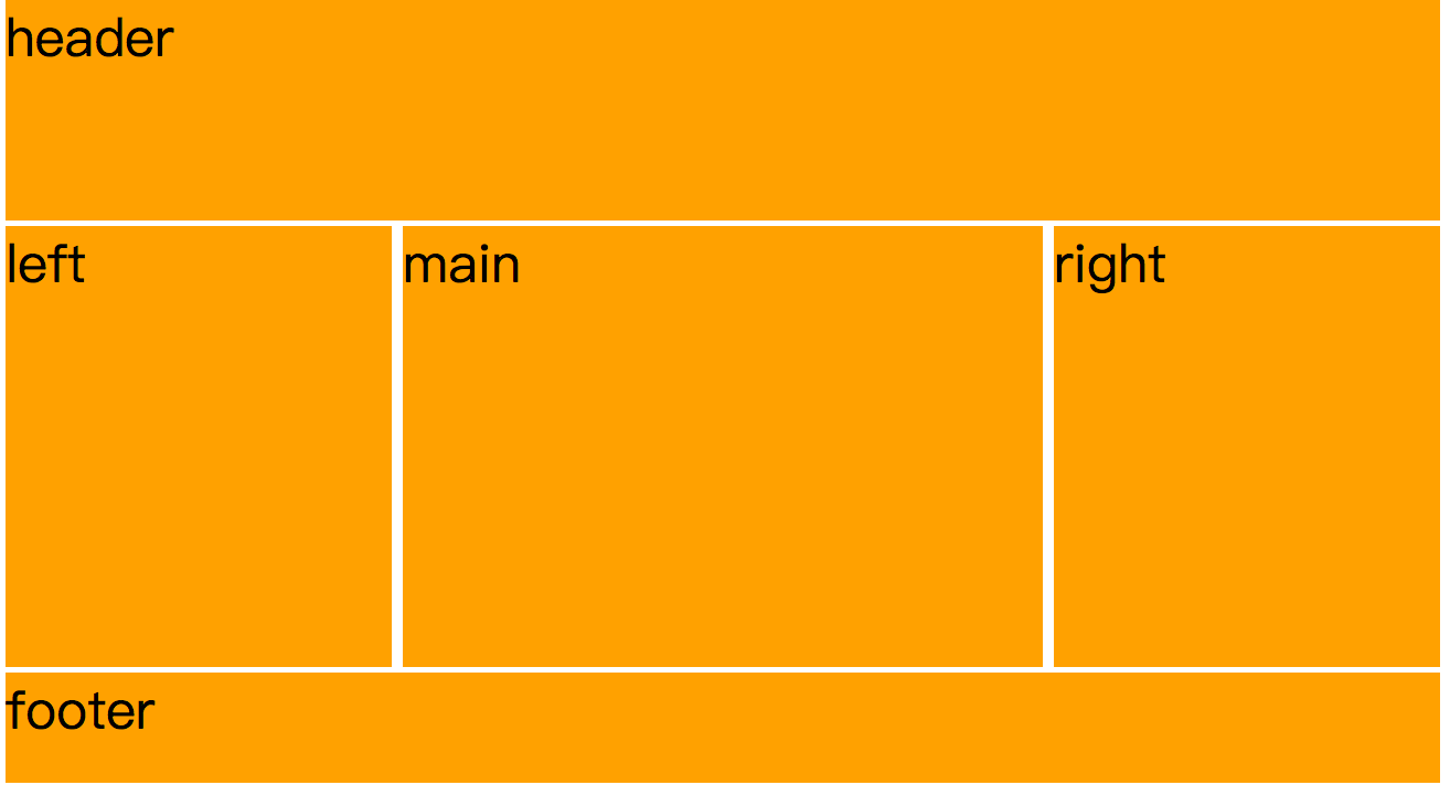
效果图:
宽度大于1000px时
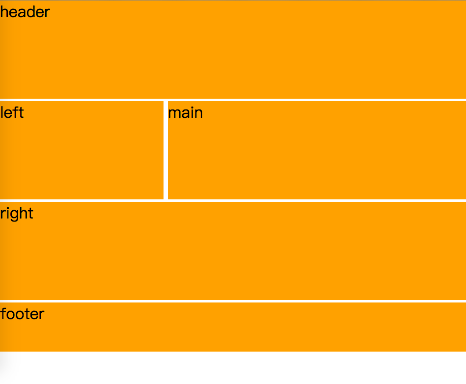
700px < 宽度 < 1000px时
当最大宽度小于699px时,

需要注意的有以下几点:
1、上面的代码在移动端并不会如此显示,因为移动端的显示器和电脑的显示器像素比例是有区别的。
2、从1000以上的宽度变为1000以下,700以上,那么@media中写的会覆盖从祖先继承来的样式。此时1000px以上的样式为父,1000到700px的样式为子。
然后宽度变为600px,小于了700px,那么就会加载第三个样式,此时第三个样式的父亲为第二个样式。继承的是第一个样式、第二个样式。以此类推。