盒子阴影(box-shadow)
复写属性 :一共六个属性值
box-shadow:1. 水平偏移(必写)2. 垂直偏移(必写) 3. 阴影模糊程度 4. 阴影扩散宽度 5. 阴影颜色 6. inset (阴影向内)
圆角(border-radius)
tips
- 一般绘制纯圆盒子宽高设置一样为正方形 border-radius:50%
- 绘制盒子两边为与圆角 border-radius: 盒子高度的一半+px
布局技巧
-
如何解决添加有个类名叫banner的div 此时div中需要一张宽度特别宽的图片作为背景,为了解决图片在浏览器缩小窗口的同时对banner区域的图片造成挤压的情况,此时需要如何处理?
设置banner 里的background-size:cover 同时 设置background-position :center center 就可以既解决图片可以完整显示,也可以不被缩放挤压变形
-
background-size 中的属性值:
cover 回想办法解决图片将整个设置背景的区域填充覆盖完
contain 图片会想办法进行等比例的缩放 太填充设置背景图的区域 如果实在还是填充不完 也会相应留白background-attachment :scroll fixed 使用场景:fixed这里不会因为背景图片的内容过多而显示滚动条
-
background的复写 background: red url(img/1.png) no repeat fixed 0 0/ 100% 100%
1.background-color
2.background - image
3.background - repeat
4.background - attachment
5 background - position (可以跟left top bottom right center center 像素值 百分比)
6 background - size
开发经验总结:
设置网页的logo 需求需要在网络环境不好的情况下 能够正常的点击logo的地方 进行对应的操作?
<!DOCTYPE html>
<html lang="en">
<head>
    <meta charset="UTF-8">
    <meta name="viewport" content="width=device-width, initial-scale=1.0">
    <title>Document</title>
    <style>
        *{
            margin: 0;
            padding: 0;
        }
        .box{
             213px;
            height: 0;
            padding-top: 57px ;
            background: url(./淘宝.png) no-repeat 0 0/100% 100%;
            /* border: 5px solid #000000; */
            overflow: hidden;
        }
    </style>
</head>
<body>
    <div class="box">
        <h1><a href="https://uland.taobao.com/">淘宝一下</a></h1>
    </div>
</body>
</html>

tips :
在这里我们一般在设置logo的时候并不能单纯的只设置一张背景图在哪里当,因为在网络不好的情况下其实我们也需要用户能够点击相应的位置进行页面的跳转,所以里面需要在提供一个链接,为了只需要在网路不好的情况下没有加载出对应的logo的情况下显示,所以我们需要将其隐藏,这里的隐藏采用了比较好的方式overflow:hidden ,同时开始也能看见logo
table的用法技巧
单独的设置table的边框的不同点:
属性选择器的方式:
table {
	border:1px solid #000000
}
行内样式设置table的边框
<table border="1"></table>
注意:第一种形式通过属性的方式添加的边框只是设置的table外部的边框,里面的单元格不会加上边框
caption 设置表格的标题 caption-side 用来设置标题的位置 top 显示在表格的上方,bottom 显示在表格的下方
border-collapse 设置表格的边框是否被合并为单一的边框
- collapse 显示的单一边框样式,
- separation 默认值 显示的边框有间隙
table-layout 一般用来处理当某一个单元格的内容过多的时候,会挤压其他的单元格的宽度
-
fixed 设置过后每个单元格的宽度不会被挤压
-
automatic 自动适应调整 默认值
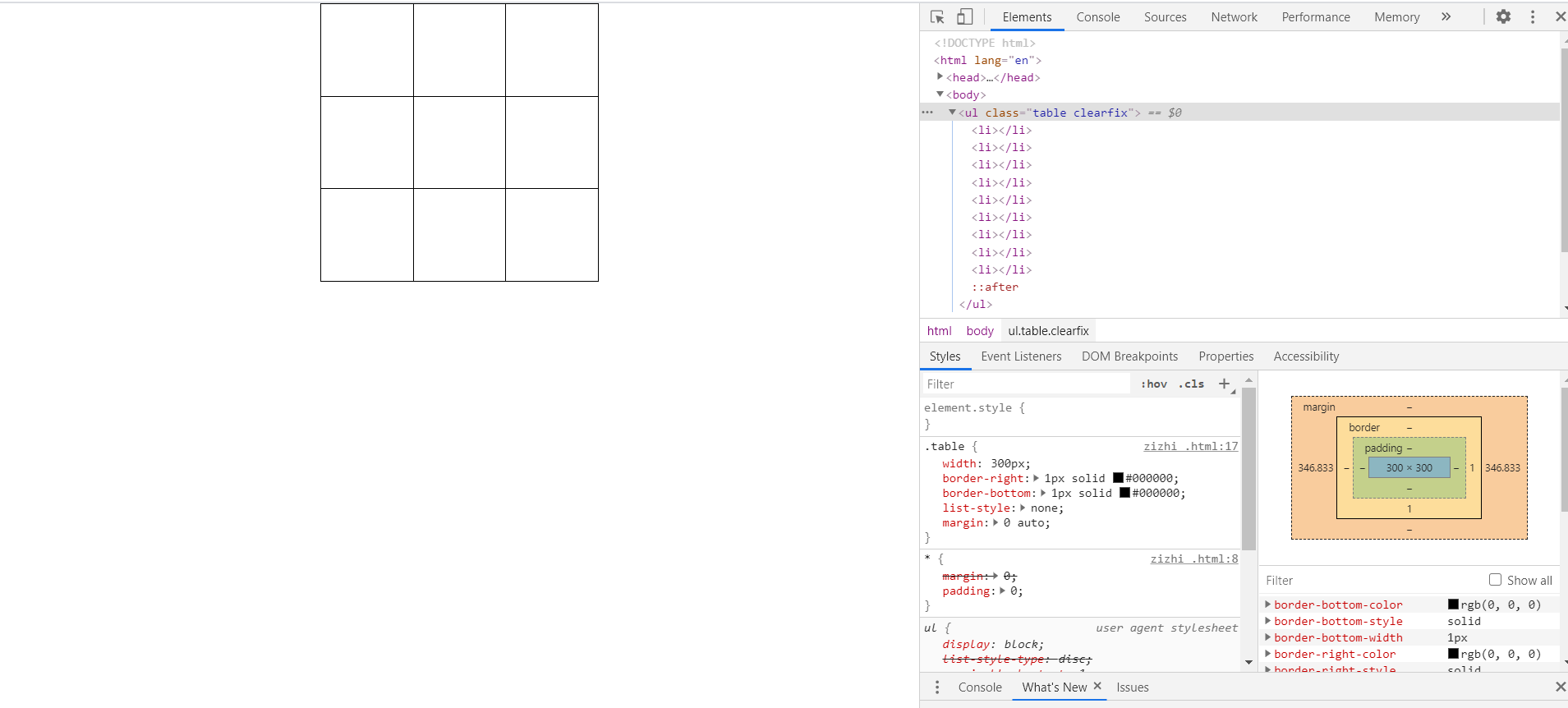
利用ul 和li绘制表格技巧
<!DOCTYPE html>
<html lang="en">
<head>
    <meta charset="UTF-8">
    <meta name="viewport" content="width=device-width, initial-scale=1.0">
    <title>Document</title>
    <style>
        *{
            margin: 0;
            padding: 0;
        }
        .clearfix::after{
            content:'';
            display: block;
            clear: both;
        }
        .table{
             300px;
            border-right: 1px solid #000000;
            border-bottom: 1px solid #000000;
            list-style: none;
            margin:0 auto;
        }
        .table li{
            float: left;
             100px;
            height: 100px;
            border-top: 1px solid #000000;
            border-left: 1px solid #000;
            box-sizing: border-box;
        }
    </style>
</head>
<body>
    <ul class="table clearfix">
        <li></li>
        <li></li>
        <li></li>
        <li></li>
        <li></li>
        <li></li>
        <li></li>
        <li></li>
        <li></li>
    </ul>
</body>
</html>
这里自制表格的技巧:
-
先设置li标签的border-left 和 border-top box-sizing : border-box
-
再设置外层的ul的border-right 和border-bottom 的值
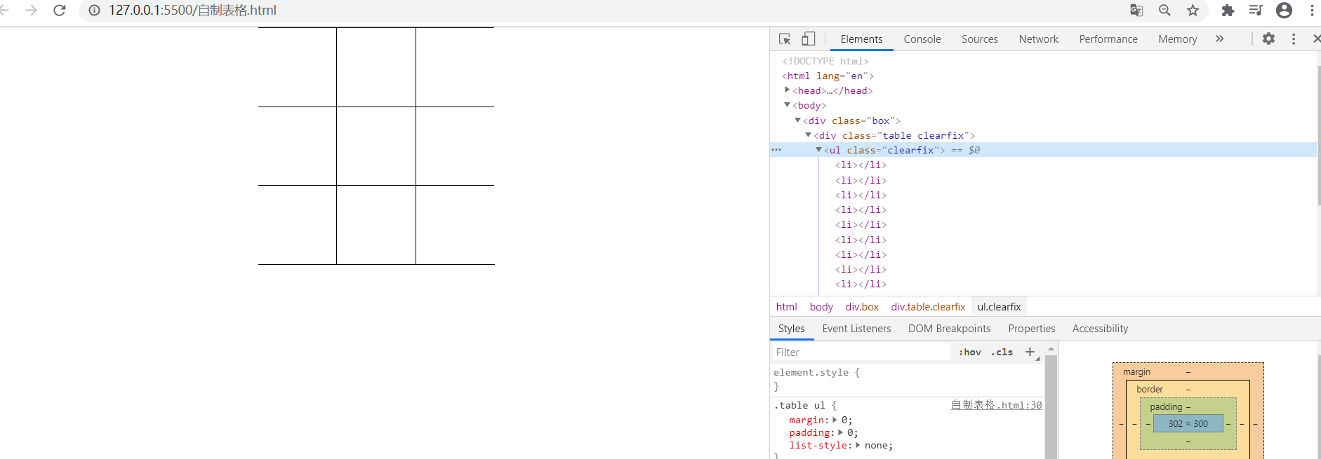
绘制一个左右没有边框的表格的布局
<!DOCTYPE html>
<html lang="en">
<head>
    <meta charset="UTF-8">
    <meta name="viewport" content="width=device-width, initial-scale=1.0">
    <title>Document</title>
    <style>
        *{
            margin: 0;
            padding: 0;
        }
        .box{
             300px;
            overflow-x: hidden;
            margin: 0 auto;
        }

        .table{
             302px;
            border-right: 1px solid #000000;
            border-bottom: 1px solid #000000;
            margin-left: -1px;
        }

        .clearfix::after{
            display: block;
            content: '';
            clear: both;
        }
        .table ul{
            margin: 0;
            padding: 0;
            list-style: none;
        }
        .table ul li{
            float: left;
             100px;
            height: 100px;
            border-top: 1px solid #000;
            border-left: 1px solid #000000;
            box-sizing: border-box;
        }
    </style>
</head>
<body>
    <div class="box">
        <div class="table clearfix">
            <ul class="clearfix">
                <li></li>
                <li></li>
                <li></li>
                <li></li>
                <li></li>
                <li></li>
                <li></li>
                <li></li>
                <li></li>
            </ul>
        </div>
    </div>
</body>
</html>
tips:
- 首先将外层的盒子的宽度设置的宽度比里面的表格的宽度小,然后overflow-x:hidden
- 里面的.table元素正常布局,最后将margin-left 的值设置为-1px
BFC(块级格式化上下文)
具有以下属性值的元素都可以开启BFC,具有BFC特性
- body 元素
- float: left/right
- position: absolute/fixed
- display: inline-block table-cell
- overflow:hidden/auto/scroll
BFC运用场景
-
- 解决margin合并的问题:即两个不同的div 上面的div设置了margin-bottom:100px 下面的div设置了margin-top:100px
这样两个div的盒子其实上面的margin的相隔距离其实还是100px. 解决的方法,只需要让这两个div具有BFC特性即可,或者直接一步
到位上面的div的margin-bottom的值直接为200px
-
- 解决高度坍塌的问题 (首选清除浮动的方式解决高度坍塌的问题)
清除浮动(三大件)
.clearfix::after{

content:"";

display:block;

clear:both

}
注意: 虽然BFC的特性也可以解决高度坍塌的问题,但是一般不建议让元素变成BFC元素的方式来解决,因为在元素变成BFC元素后,元素本身的性质也会发生变化这样可能会带来一系列其他的问题
-
-
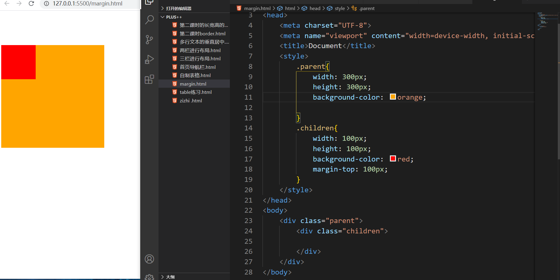
解决margin塌陷的问题:即一个大的div盒子,里面同样放置了一个小的div元素,当设置里面小的div的margin-top值为100px
这是就会出现margin塌陷的问题,此时的中间小的div盒子并不会相对于外层大的div盒子设置margin-top为100px,而是会导致外层的大的div盒子的整体的margin-top为100px
-
解决方式:
-
给parent元素加上border 这里可以巧妙的设置parent的border-top: 1px solid transparent
-
让parent元素变成BFC 参考上面 例如 display:inline-block/table-cell flaot:left/right opsition:absolute/fixed
-
-
浮动元素覆盖的问题
<!DOCTYPE html>
<html lang="en">
<head>
    <meta charset="UTF-8">
    <meta name="viewport" content="width=device-width, initial-scale=1.0">
    <title>Document</title>
    <style>
        .demo1{
            float: left;
             100px;
            height: 100px;
            background-color: purple;
        }
        .demo2{
             300px;
            height: 300px;
            background-color: orange;
            /* display: inline-block; */
            /* display: table-cell; */
            /* position: fixed; */
            /* overflow: auto/hidden/scroll; */
        }
    </style>
</head>
<body>
    <div class="demo1">hahahaha</div>
    <div class="demo2">
        开始的位置
        fs djifods iud
        fdsjfio djifods
        fhudsi
        hfiods io
        fdsjiof djifodsfjsdoifhudshg sd
        fsdjnigf sdgfgdfsgsrdf
        gfdshu dsiugsdggg
    </div>
</body>
</html>

-
解决方式
/* display: inline-block; /
/ display: table-cell; /
/ position: fixed; /
/ overflow: auto/hidden/scroll; */