/* Track */
::-webkit-scrollbar-track {
-webkit-box-shadow: inset 0 0 6px rgba(0,0,0,0.3);
-webkit-border-radius: 5px;
border-radius: 5px;
}
/* Handle */
::-webkit-scrollbar-thumb {
-webkit-border-radius:5px;
border-radius: 6px;
background: rgba(158, 79, 104, 0.8);
-webkit-box-shadow: inset 0 0 6px rgba(0,0,0,0.5);
}
::-webkit-scrollbar-thumb:window-inactive {
background: rgba(158, 79, 104, 0.8);
}
/*取消A默认点击背景色*/
a,a:hover,a:active,a:visited,a:link,a:focus{
-webkit-tap-highlight-color:rgba(0,0,0,0);
-webkit-tap-highlight-color: transparent;
outline:none;
background: none;
text-decoration: none;
}
//css限制显示行数
display: -webkit-box;
display: -moz-box;
/*white-space: pre-wrap; */
word-wrap: break-word;
overflow: hidden;
text-overflow: ellipsis;
-webkit-box-orient: vertical;
-webkit-line-clamp:8;
文字竖布局
writing-mode: tb-rl;
-webkit-writing-mode:vertical-rl;
writing-mode: vertical-rl;
移动端1px解决方案
.user-header .user-tags .tags-list{
  position: relative;
  border-radius: 40rpx;
  height: 60rpx;
  line-height: 60rpx;
  box-sizing: border-box;
  padding: 0 40rpx;
  background: #fdcf47;
  color: #49381d;
  font-size: 26rpx;
  margin:0 10rpx;
}
.user-header .user-tags .tags-list::before{
    display: block;
    content: "";
    pointer-events: none; /* 防止点击触发 */
    box-sizing: border-box;
    position: absolute;
    width: 200%;
    height: 200%;
    left: 0;
    top: 0;
    border-radius: 54rpx;
    border:1px solid #49381d;
    -webkit-transform:scale(0.5);
    -webkit-transform-origin: 0 0;
    transform:scale(0.5);
    transform-origin: 0 0;
}
按钮hover样式
 hover后
<div class="btn"></div>

/*css 样式*/
.btn{
      width: 150px;
      height: 50px;
      background: red linear-gradient(to right,rgba(0,255,0,0),rgba(0,255,0,0.7));
      transition: background-color 0.5s;
}
.btn:hover{
     background-color: rebeccapurple;
}
文字叠加效果

<div class="mix">
     <span data-text="css纹理叠加"></span>
    css纹理叠加
 </div>

    /*css 样式*/

    .mix{
            font-size: 80px;
            font-family: '微软雅黑';
            background-image: url("58db48fa0edb9.jpg");
            -webkit-text-fill-color: transparent;
        -webkit-background-clip: text;
        }
        .mix>span{
            position: absolute;
            background-image: linear-gradient(to right,#f00,#f00);
            mix-blend-mode: overlay;
            -webkit-text-fill-color: transparent;

        -webkit-background-clip: text;
} .mix>span::before{ content:attr(data-text); }
文字渐变
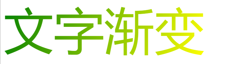
<div class="font-color">文字渐变</div>

/*css 样式*/

        .font-color{
            display: inline-block;
            color: #f00;
            font-size: 10em;
            background-image: -webkit-gradient(linear,0 0,100% 100%,from(green),to(yellow));
            -webkit-text-fill-color: transparent;
-webkit-background-clip: text;
}
流光字体
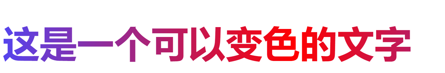
<div class="font-animate">
    <h2>这是一个可以变色的文字</h2>
</div>

/*css 样式*/

       .font-animate{
            font-size: 5em;
            background-image: -webkit-linear-gradient(left,#f00,#54e 25%, #f00 50%,#54e 75%,#f00);
            -webkit-text-fill-color: transparent;
            background-size: 200% 100%;
            animation: fontAnimate 4s infinite linear;
-webkit-background-clip: text;
} @keyframes fontAnimate{ 0%{ background-position: 0 0; } 100%{ background-position: -100% 0; } }
按轨迹运动(path)
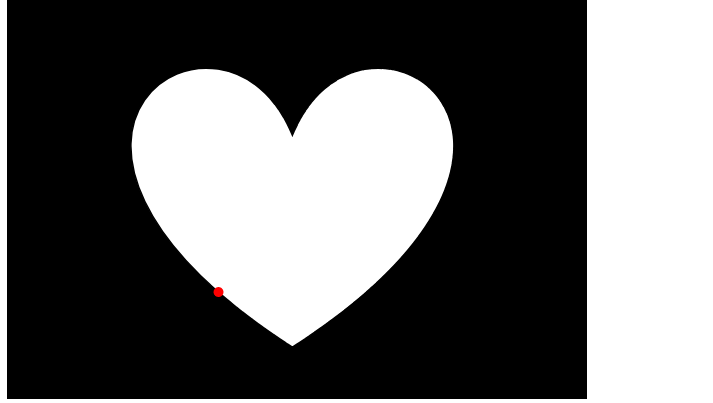
<div>
    <div class="circle"></div>
    <svg width="580" height="400" xmlns="http://www.w3.org/2000/svg">
     <!-- Created with Method Draw - http://github.com/duopixel/Method-Draw/ -->
     <g>
      <title>background</title>
      <rect fill="#000" id="canvas_background" height="402" width="582" y="-1" x="-1"/>
      <g display="none" overflow="visible" y="0" x="0" height="100%" width="100%" id="canvasGrid">
       <rect fill="url(#gridpattern)" stroke-width="0" y="0" x="0" height="100%" width="100%"/>
      </g>
     </g>
     <g>
      <title>Layer 1</title>
      <path id="svg_1" d="m285.38772,136.28634c66.58567,-164.79148 327.47049,0 0,211.87475c-327.47049,-211.87475 -66.58567,-376.66623 0,-211.87475z" stroke-width="1.5" stroke="#000" fill="#fff"/>
     </g>
    </svg>
</div>


/*css 样式*/

       .circle{
            position: absolute;
            width: 10px;
            height: 10px;
            background:red;
            border-radius: 50%;
            motion-path:path("m285.38772,136.28634c66.58567,-164.79148 327.47049,0 0,211.87475c-327.47049,-211.87475 -66.58567,-376.66623 0,-211.87475z");
            offset-path:path("m285.38772,136.28634c66.58567,-164.79148 327.47049,0 0,211.87475c-327.47049,-211.87475 -66.58567,-376.66623 0,-211.87475z");
            animation: move 6s linear infinite;
        }
        @keyframes move{
            100%{
               motion-offset:100%;
            }
            100%{
               offset-distance:100%;
            }
        }