环形效果是不是相当的诱人,首先看几个例子:
1、colorful-clock --- 漂亮
2、CSS3+js实现多彩炫酷旋转圆环时钟效果 --- very good
3、Percentage Loader --- 帅
colorful-clock效果图如下: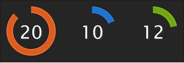
有没有更刺激的,接下来见证奇迹的时刻,如下图(精致):
在此之前,在回顾下前两个例子:
1、时钟效果_raphael.js
2、幸运大抽奖
实现原理:
第一步:构造圆环
r.customAttributes.arc = function(value, total, R) {
    var alpha = 360 / total * value,
        a = (90 - alpha) * Math.PI / 180,
        x = 150 + R * Math.cos(a),
        y = 150 - R * Math.sin(a),
        path;
    if (total == value) {
        path = [
            ["M", 150, 150 - R],
            ["A", R, R, 0, 1, 1, 149.99, 150 - R]
        ];
    } else {
        path = [
            ["M", 150, 150 - R],
            ["A", R, R, 0, +(alpha > 180), 1, x, y]
        ];
    }
    bpath = path;
    return {
        path: path
    };
};
r.path().attr({
    arc: [100, 100, rad],
    'stroke-width': 20,
    'stroke': "#cecece"
});
第二步:环形动起来和事件绑定
function updateVal(value, total, R, hand, id) {
    if (init) {
        hand.animate({
            arc: [value, total, R]
        }, 900, ">");
    } else {
        if (!value || value == total) {
            value = total;
            hand.animate({
                arc: [value, total, R]
            }, 750, "bounce", function() {
                hand.attr({
                    arc: [0, total, R]
                });
            });
        } else {
            hand.animate({
                arc: [value, total, R]
            }, 750, "elastic");
        }
    }
};
z.mouseover(function() {
    this.animate({
        'stroke-width': 36,
        opacity: 0.75
    }, 600, 'elastic');
}).mouseout(function() {
    this.stop().animate({
        'stroke-width': 26,
        opacity: 1
    }, speed * 4, 'elastic');
});
第三步:倒计时
function dinit() {
    if (tmptime > 0) {
        ds = parseInt(tmptime % 60);
        dm = parseInt(tmptime / 60) % 60;
        dh = parseInt(tmptime / 3600) % 24;

        txt.remove();
        txt = r.text(150, 150, dh + ":" + dm + ":" + ds).attr({
            font: "100 36px Arial",
            fill: opts.color
        });
    }
};

function playing() {
    dstop = setInterval(function() {
        tmptime--;
        if (tmptime <= 1) { !! opts.endSucc && opts.endSucc();
            clearInterval(dstop);
        } else {
            dinit();
        }
    }, 1000);
};
搞定,大功告成。感兴趣的可以动手试试,写更fashion的效果,期待你的见证。
参考:
polar-clock
CSS3+JS动态圆形图例jquery代码
DEMO: