border除了自己的本职工作外,我们还可以利用他的某些特性来制作一些简单实用的小图标
可以作为菜单图标的三道杠、添加东西的加号小图标、可以表示方向等多功能的三角形小图标、叉叉勾勾表示对错的小图标
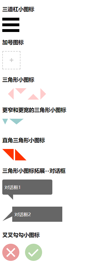


<!doctype html>
<html lang="en">
<head>
    <meta charset="UTF-8">
    <title>css小图标</title>
    <style type="text/css">
    i{
        display: inline-block;
    }
    /*三道杠*/
    .icon-threeline{
        width: 60px;
        height: 10px;/*双线边框和实线变宽的间距*/
        border-top: 30px double #000;/*双线边框*/
        border-bottom: 10px solid #000;/*实线变宽*/
    }
    /*加号图标*/
    .icon-add{
        width: 60px;
        height: 60px;
       color: #ccc;
       border: 2px dashed;
       position: relative;
       overflow: hidden;
       -webkit-transition: color 0.25s;
       -moz-transition: color 0.25s;
       -ms-transition: color 0.25s;
       -o-transition: color 0.25s;
       transition: color 0.25s;
    }
    .icon-add:before,.icon-add:after{
        content: "";
        position: absolute;
        left: 50%;
        top: 50%;
    }
    .icon-add:before{
        width: 3px;
        border-top: 13px solid;
        margin:-6.5px 0 0 -1.5px;
        /* -1.5px--> 3px;width的一半
        -6.5px-->border-top: 13px; border厚度的一半*/
    }
    .icon-add:after{
        height: 3px;
        border-left: 13px solid;
        margin: -1.5px 0 0 -6.5px;
    }
    .icon-add:hover{
        color: #99cccc;
        -webkit-transition: color .25s;
        -moz-transition: color .25s;
        -ms-transition: color .25s;
        -o-transition: color .25s;
        transition: color .25s;
    }
    /*三角形*/
    .icon-triangle-down{
        width: 0;
        border: 20px solid;
        border-color:#ffcccc transparent transparent;
    }
    .icon-triangle-up{
        width: 0;
        border: 20px solid;
        border-color:transparent transparent #ffcccc;
    }
    .icon-triangle-left{
        width: 0;
        border: 20px solid;
        border-color:transparent #ffcccc transparent transparent;
    }
    .icon-triangle-right{
        width: 0;
        border: 20px solid;
        border-color:transparent transparent transparent #ffcccc;
    }
    /*更窄和更宽的三角形*/
    .icon-triangle-01{
        width: 0;
        border-style: solid;
        border-width: 20px 10px;
        border-color: #99cccc transparent transparent;
    }
    .icon-triangle-02{
        width: 0;
        border-style: solid;
        border-width: 20px 25px;
        border-color: #99cccc transparent transparent;
    }
    /*直角三角形*/
    .icon-triangle-03{
        width: 0;
        border-style: solid;
        border-width: 20px;
        border-color: #f30 #f30 transparent transparent;
    }
    .icon-triangle-04{
        width: 0;
        border-style: solid;
        border-width: 20px;
        border-color: transparent transparent #f30 #f30;
    }
    /*三角形拓展--对话框*/
    .box{
        max-width: 160px;
        padding: 0px 8px;
        color: #fff;
        background-color: #666666;
        border-radius: 5px;
    }
    .box p,.box2 p{
        display: inline-block;
    }
    .box2{
        display: inline-block;
        width: 160px;
        padding: 0px 8px;
        color: #fff;
        background-color: #666666;
        position: relative;
        left: -15px;
        top: -15px;
    }
    .icon-triangle-05{
        width: 0;
        border-style: solid;
        border-width: 9px;
        border-color: #666 #666 transparent transparent;
        margin-left: 20px;
    }
    .icon-triangle-06{
        margin-top: 50px;
        width: 0;
        border-style: solid;
        border-width: 9px 25px;
        border-color: #666 #666 transparent transparent;
        -webkit-transform: rotate(-45deg);
        -moz-transform: rotate(-45deg);
        -ms-transform: rotate(-45deg);
        -o-transform: rotate(-45deg);
        transform: rotate(-45deg);
    }
    /*叉叉图标*/
    .icon-no{
        width: 60px;
        height: 60px;
        position: relative;
        color: #ccc;
        background-color: #ea9999;
        border-radius: 50%;
    }
    .icon-no:after,.icon-no:before{
        content: "";
        height: 5px;
        border-left: 40px solid #fff;
        position: absolute;
        top:50%;
        left: 50%;
        margin: -2.5px 0 0 -20px;
    }
    .icon-no:after{
        -webkit-transform: rotate(45deg);
        -moz-transform: rotate(45deg);
        -ms-transform: rotate(45deg);
        -o-transform: rotate(45deg);
        transform: rotate(45deg);
    }
    .icon-no:before{
        -webkit-transform: rotate(135deg);
        -moz-transform: rotate(135deg);
        -ms-transform: rotate(135deg);
        -o-transform: rotate(135deg);
        transform: rotate(135deg);
    }
    /*勾勾图标*/
    .icon-ok{
        margin-left: 20px;
        width: 60px;
        height: 60px;
        position: relative;
        color: #ccc;
        background-color: #b6d7a8;
        border-radius: 50%;
    }
    .icon-ok:after,.icon-ok:before{
        content: "";
        position: absolute;
        top: 50%;
        left: 50%;
    }
    .icon-ok:after{
        height: 5px;
        border-left: 30px solid #fff;
        margin:-2.5px 0 0 -10px;
        -webkit-transform: rotate(135deg);
        -moz-transform: rotate(135deg);
        -ms-transform: rotate(135deg);
        -o-transform: rotate(135deg);
        transform: rotate(135deg);
    }
    .icon-ok:before{
        height: 5px;
        border-left: 18px solid #fff;
        margin: 5px 0 0 -20px;
        -webkit-transform: rotate(45deg);
        -moz-transform: rotate(45deg);
        -ms-transform: rotate(45deg);
        -o-transform: rotate(45deg);
        transform: rotate(45deg);
    }
    </style>
</head>
<body>
<div>
    <h3>三道杠小图标</h3>
    <i class="icon-threeline"></i>

    <h3>加号图标</h3>
    <i class="icon-add"></i>

    <h3>三角形小图标</h3>
    <i class="icon-triangle-left"></i>
    <i class="icon-triangle-down"></i>
    <i class="icon-triangle-up"></i>
    <i class="icon-triangle-right"></i>

    <h3>更窄和更宽的三角形小图标</h3>
    <i class="icon-triangle-01"></i>
    <i class="icon-triangle-02"></i>

    <h3>直角三角形小图标</h3>
    <i class="icon-triangle-03"></i>
    <i class="icon-triangle-04"></i>

    <h3>三角形小图标拓展--对话框</h3>
    <div><div class="box"><p>对话框1</p></div><i class="icon-triangle-05"></i></div>
    <div><i class="icon-triangle-06"></i><div class="box2"><p>对话框2</p></div></div>

    <h3>叉叉勾勾小图标</h3>
    <i class="icon-no"></i><i class="icon-ok"></i>
</div>

</body>
</html>