Android原生输入框的焦点效果一直都让人看起来很舒服,所以今天就用web技术来实现。
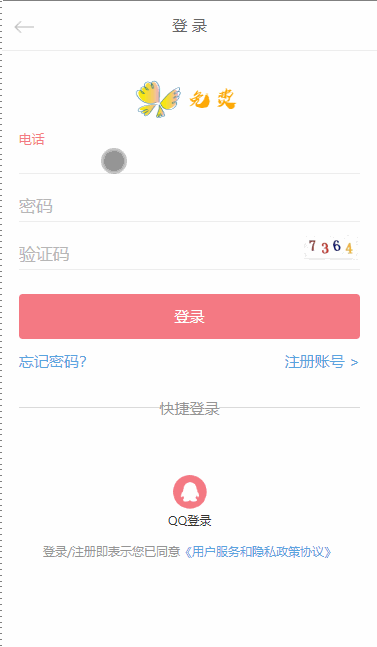
先看一下效果图:
原理很简单:
就是在input框上加一层label,然后通过判断input框是否获得焦点,当当前input获取焦点后,给绑定它的label添加上移样式(active),
然后input失去焦点之后,判断该input是否有输入内容,如果没有内容,则溢出相应label的样式(active),如果有,则保留改样式(active)。
相信大家都应该理解了吧!

先说说在HTML页面部分,每个input绑定相应的label:
 <div class="login-wrap">
        <ul class="login-form login-form-logo">
            <li>
                <label for="phone">电话</label>
                <input id="phone" type="text" class="text clearinput">
            </li>
            <li>
                <label for="password">密码</label>
                <input id="password" type="password" class="text">
            </li>
            <li style="display:-webkit-box;">
                <label for="txtVcode">验证码</label>
                <input id="txtVcode" type="text" class="text">
                <img id="vcode" onclick="login.FreshVcode()" class="images-code" src="../images/code.jpg">
            </li>
        </ul>

    </div>
之后是css部分:当input未获取焦点之前,
.login-wrap {
  margin: 0 0.45rem;
}
.login-form {
  margin: 0 0 0.65rem;
}
.login-form li {
  border-bottom: 1px solid #eee;
  height: 1.2rem;
  line-height: 1.2rem;
  overflow: hidden;
  margin: 0.05rem 0 0;
  display: -webkit-box;
  position: relative;
}
.login-form li label {
  color: #bbb;
  font-size: 0.45rem;
  position: absolute;
  top: 65%;
  -webkit-transform: translateY(-50%);
          transform: translateY(-50%);
  -webkit-transform-origin: top left;
          transform-origin: top left;
  -webkit-transition: margin 0.15s ease, padding 0.15s ease, -webkit-transform 0.15s ease;
  transition: margin 0.15s ease, padding 0.15s ease, -webkit-transform 0.15s ease;
  transition: margin 0.15s ease, padding 0.15s ease, transform 0.15s ease;
  transition: margin 0.15s ease, padding 0.15s ease, transform 0.15s ease, -webkit-transform 0.15s ease;
  z-index: 1;
}
.login-form li .text {
  background: none;
  border: none;
  height: 1rem;
  display: block;
  -webkit-box-flex: 1;
  font-size: 0.4rem;
  color: #333;
  margin-top: 0.3rem;
}
当input获取焦点之后,给其父类添加active样式即可
.login-form .active label {
  -webkit-transform: translateY(calc(-60% - 0.75em)) scale(0.75);
          transform: translateY(calc(-60% - 0.75em)) scale(0.75);
  color: #f47983;
}
然后是Js部分(基于jQuery实现),jQuery实现起来比较简单,两行代码就可以解决了,原生JS的话,交给大家去思考实现了。

$('input').focus(function() {
      $(this).parent().addClass('active');
    });
    $('input').blur(function() {
      if(!$(this).val()){
        $(this).parent().removeClass('active');
      }
    });