一、基本使用
首先要定义动画的名字,然后通过name属性应用。duration表示这个动画效果持续的时间。如果不指定animation-duration 属性,则动画不会发生,因为默认值是 0s(0秒)。
定义的动画主要是由动画序列组成。比如做一个div块,让他在页面加载的时候x轴从0px移到1000px,代码如下:
<div class="box"></div>
@keyframes move {
  0% {
    transform: translateX(0px);
  }
  100% {
    transform: translateX(1000px);
  }
}
.box{
  width: 200px;
  height: 200px;
  background: pink;
  animation-name: move;
  animation-duration: 2s;
}
二、动画序列
上面的百分比,也可以换成from和to。from表示0%,to表示100%,这就是keyframe,动画序列。
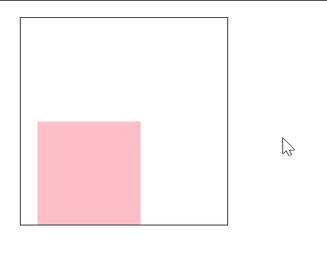
做一个简单的动画,让一个方块不的顺时针移动,当鼠标放到方块上时, 方块停止移动,鼠标离开,再移动。
难点:鼠标经过暂停,使用 animation-play-state: paused属性
效果图:
代码:
.container .animation{
   200px;
  height: 200px;
  border: 1px solid #000;
  @keyframes action {
    0% {
      transform:translate(0,0);
    }
    25%{
      transform: translate(100px, 0px);
    }
    50% {
      transform: translate(100px, 100px);
    }
    75%{
      transform: translate(0, 100px);
    }
    100%{
      transform: translate(0, 0);
    }
  }
  .box{
     100px;
    height: 100px;
    background: pink;
    animation: action 2s ease 0s infinite forwards;
  }
  .box:hover {
    animation-play-state: paused;
  }
}
三、动画简写顺序
animation: name duration timing-function delay iteration-count direction fill-mode;
注意:
(1)animation-duration 属性定义需要多长时间才能完成动画。如果未指定 animation-duration 属性,则动画不会发生,因为默认值是 0s(0秒)。(2)animation-direction 属性指定是向前播放、向后播放还是交替播放动画。

(3)animation-fill-mode : none | forwards | backwards | both;

四、实际应用-做一个大数据地点光圈图
效果图:
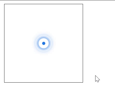
难点:
代码:
  <div class="animation">
      <div class="mark"></div>
      <div class="ripple1"></div>
      <div class="ripple2"></div>
      <div class="ripple3"></div>
    </div>
.container .animation{
  position: relative;
  width: 200px;
  height: 200px;
  border: 1px solid #000;
  .mark {
    position: absolute;
    top: 50%;
    left: 50%;
    transform: translate(-50%, -50%);
    width: 8px;
    height: 8px;
    background:  #2277e4;
    border-radius: 50%;
  }
  div[class^="ripple"]{
    position: absolute;
    top:50%;
    left: 50%;
    transform: translate(-50%, -50%);
    width: 20px;
    height: 20px;
    border-radius: 50%;
    box-shadow: 0 0 10px  #2277e4;
    animation: rippleMove 1.2s linear 0s infinite;
  }
  .ripple2{
    animation-delay: 0.6s !important;

  } .ripple3{
    animation-delay: 1.1s !important;
  }
  @keyframes rippleMove{
    75%{
      width: 40px;
      height: 40px;
      opacity: 0.4;
    }
    100% {
      width: 50px;
      height: 50px;
      opacity: 0.1;
    }
  }
}