垂直居中
方法一
这个方法把div 的显示方式设置为表格,因此我们可以使用表格的 vertical-align属性。
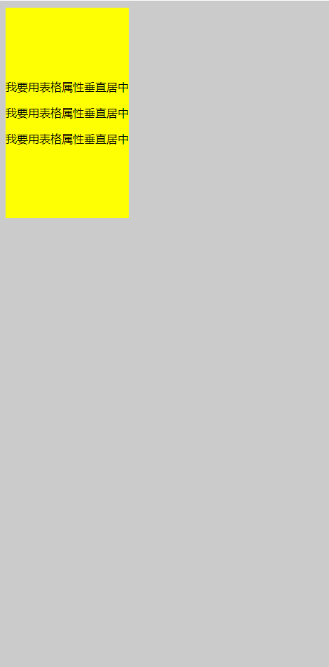
<!DOCTYPE html>
<html lang="en">
<head>
    <meta charset="UTF-8">
    <meta name="viewport" content="width=device-width, initial-scale=1.0">
    <meta http-equiv="X-UA-Compatible" content="ie=edge">
    <title>垂直居中</title>
    <style type="text/css">
    body{
        background:#ccc;
    }

        #wrapper {
            display: table;    /*here*/
            background:blue;
        }

        #container {
            display: table-cell;       /*here*/
            vertical-align: middle;    /*here*/
            background: yellow;
            height:300px;
        }
    </style>
</head>
<body>
    <div id="wrapper">
        <div id="container">
            <p>我要用表格属性垂直居中</p>
            <p>我要用表格属性垂直居中</p>
            <p>我要用表格属性垂直居中</p>
        </div>
    </div>
</body>
</html>
实现如图:
能在本身里垂直居中;
优点:
container 可以动态改变高度(不需在 CSS 中定义)。当 wrapper 里没有足够空间时,container 不会被截断
缺点:
Internet Explorer(甚至 IE8 )中无效,许多嵌套标签(其实还好)。
方法二
这个方法使用绝对定位的 div,top 设置为 50%, margin-top 设置为负的 content 高度。这意味着对象必须在 CSS 中指定固定的高度。
因为有固定高度,或许你想给 content 指定 overflow:auto,这样如果 content 太多的话,就会出现滚动条,以免content 溢出。
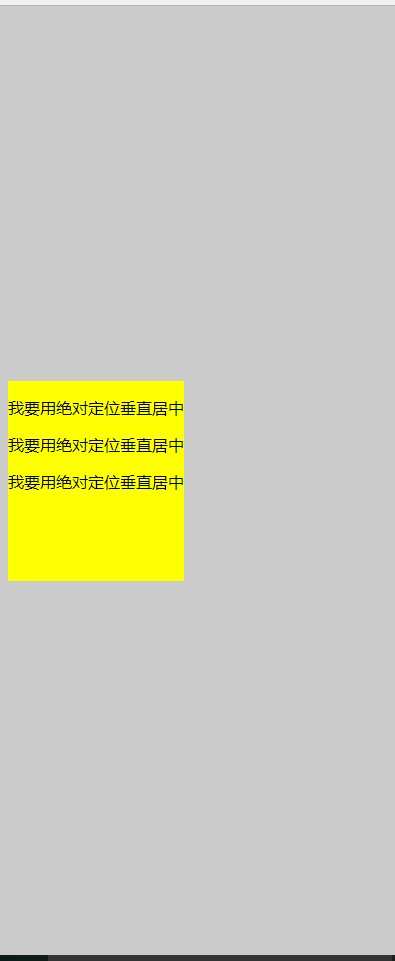
<!DOCTYPE html>
<html lang="en">
<head>
    <meta charset="UTF-8">
     <title>垂直居中</title>
    <style type="text/css">
    body{
        background: #ccc;
    }
     #container {
    position: absolute;
    top: 50%;
    height: 200px;
    margin-top: -100px; /* negative half of the height */
    background: yellow;
}
    </style>
</head>

<body>
        <div id="container">
            <p>我要用绝对定位垂直居中</p>
            <p>我要用绝对定位垂直居中</p>
            <p>我要用绝对定位垂直居中</p>
        </div>
</body>
</html>
效果图:

相对于父元素垂直居中;
优点:
- 适用于所有浏览器
- 不需要嵌套标签
缺点:
- 没有足够空间时,
content会消失(类似div在body内,当用户缩小浏览器窗口,滚动条不出现的情况)
方法三
这个方法使用了一个 position:absolute,有固定宽度和高度的 div。这个 div 被设置为 top:0; bottom:0;。但是因为它有固定高度,其实并不能和上下都间距为 0,因此 margin:auto;会使它居中。使用 margin:auto;使块级元素垂直居中是很简单的
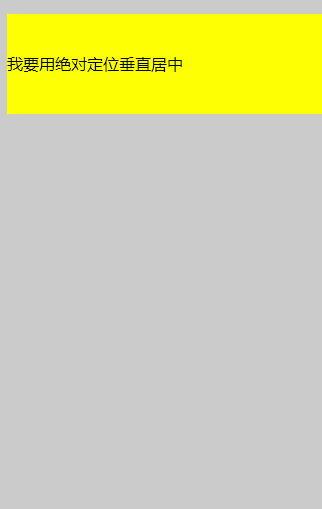
<!DOCTYPE html>
<html lang="en">
<head>
    <meta charset="UTF-8">
    <title>垂直居中</title>
    <style type="text/css">
        body{
            background: #ccc;
        }
     #container {
        position: absolute;
        top: 0;
        bottom: 0;
        margin: auto;
        height: 200px;
        background: yellow;
        /* 70%;*/
    }
</style>
</head>

<body>
    <div id="container">
        <p>我要用绝对定位垂直居中</p>
        <p>我要用绝对定位垂直居中</p>
        <p>我要用绝对定位垂直居中</p>
    </div>
</body>
</html>
效果图:
方法四:将单行文本垂直居中
这个方法只能将单行文本置中。只需要简单地把 line-height 设置为那个对象的 height 值就可以使文本居中了。
<!DOCTYPE html>
<html lang="en">
<head>
    <meta charset="UTF-8">
    <title>垂直居中</title>
    <style type="text/css">
        body{
            background: #ccc;
        }
     #container {
        height: 100px;
        line-height: 100px;
        background: yellow;
        /* 70%;*/
    }
</style>
</head>

<body>
    <div id="container">
        <p>我要用绝对定位垂直居中</p>
    </div>
</body>
</html>
效果图:
水平居中
方法一:行内元素水平居中
只需要把行内元素包裹在一个属性display为block的父层元素中,并且把父层元素添加如下属性即可:
.parent {
    text-align:center;
}
示例:
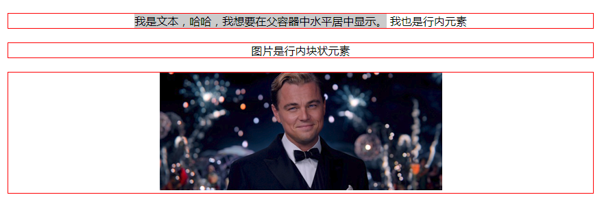
<!DOCTYPE HTML>
<html>
<head>
<meta charset="utf-8">
<title>定宽行内元素水平居中</title>
<style>
div{
    border:1px solid red;
    margin:20px;
}
div.txtCenter,div.imgCenter{
    text-align:center;
}

</style>
</head>

<body>
<div class="txtCenter"><span style='background: #ccc;'>我是文本,哈哈,我想要在父容器中水平居中显示。</span>
<span>我也是行内元素</span>
</div>
<div class="imgCenter"><span>图片是行内块状元素</span></div>
<div class="imgCenter"><img src="http://img.mukewang.com/52da54ed0001ecfa04120172.jpg" /></div>
</body>
</html>
效果图:
方法二:定宽块状元素水平居中
满足定宽和块状两个条件的元素是可以通过设置“左右margin”值为“auto”来实现居中的
.item {
    margin: 10px auto;
}
示例:
<!DOCTYPE HTML>
<html>
<head>
<meta http-equiv="Content-Type" content="text/html; charset=utf-8">
<title>定宽块状元素水平居中</title>
<style>
body{
    background: #ccc;
}
div{
    border:1px solid red;
    width:200px;
    margin:20px auto;
}

</style>
</head>

<body>
<div>我是定宽块状元素,我要水平居中显示。</div>
</body>
</html>
效果图:

方法三:不定宽块状元素水平居中(多个块状元素水平居中)
将元素的display属性设置为inline-block,并且把父元素的text-align属性设置为center即可:
<!DOCTYPE HTML>
<html>
<head>
<meta charset="utf-8">
<title>不定宽块状元素水平居中</title>
<style>
.container{
    text-align:center;
    background: #ccc;
}
.container ul{
    list-style:none;
    margin:0;
    padding:0;
    display:inline-block;
}
.container li{
    margin-right:8px;
    display:inline-block;
}
</style>
</head>

<body>
<div class="container">
    <ul>
        <li><a href="#">1</a></li>
        <li><a href="#">2</a></li>
        <li><a href="#">3</a></li>
    </ul>
</div>
</body>
</html>
效果图:

方法三:不定宽块状元素水平居中
利用table标签的长度自适应性---即不定义其长度也不默认父元素body的长度(table其长度根据其内文本长度决定),因此可以看做一个定宽度块元素,然后再利用定宽度块状居中的margin的方法,使其水平居中。
.parent{
  display:table;
  margin:0 auto;
}
示例:
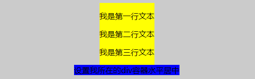
<!DOCTYPE HTML>
<html>
<head>
<meta charset="utf-8">
<title>不定宽块状元素水平居中</title>
<style>
.parent,.wrap{
  display:table;
  margin:0 auto;
}
.parent{
background:yellow;
}
.wrap{
    background:#ccc;
}
</style>
</head>

<body>
<div class='parent'>

        <p>我是第一行文本</p>
        <p>我是第二行文本</p>
        <p>我是第三行文本</p>
</div>

<div class="wrap">
  设置我所在的div容器水平居中
</div>
</body>
</html>
效果图:
方法四:不定宽块状元素水平居中
通过给父元素设置float,然后给父元素设置 position:relative 和 left:50%,子元素设置 position:relative 和 left: -50% 来实现水平居中。
.container{
    float:left;
    position:relative;
    left:50%
}
.container ul{
    position:relative;
    left:-50%;
}
示例:
<!DOCTYPE HTML>
<html>
<head>
<meta charset="utf-8">
<title>不定宽块状元素水平居中</title>
<style>
.container,.wrap{
    float:left;
  position:relative;
  left:50%
}


body{
  background: #ccc;
}
.container ul,.wrap-center{
  background:yellow;
  margin:0;
  padding:0;
  position:relative;
  left:-50%;
}
ul,li{
  list-style: none;
}
a{
  text-decoration:none;
}
.wrap{
    clear:both;
    }
</style>
</head>

<body>
<div class="container">
  <ul>
      <li><a href="#">1</a></li>
        <li><a href="#">2</a></li>
        <li><a href="#">3</a></li>
    </ul>
</div>

<!--下面是代码任务区-->
<div class="wrap">
    <div class="wrap-center">我们来学习一下这种方法。</div>
</div>
</body>
</html>
效果图: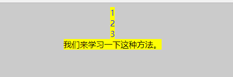
定宽定高块状元素垂直水平居中
方案一:
父元素设置为:position: relative;
子元素设置为:position: absolute;
距上50%,据左50%,然后减去元素自身宽度的距离就可以实现 top:50%;left:50%;margin:-height/2 0 0 -width/2;
<!DOCTYPE HTML>
<html>
<head>
<meta http-equiv="Content-Type" content="text/html; charset=utf-8">
<title>定宽块状元素水平居中</title>
<style>
body{
    background: #ccc;
}
div{
    position: absolute;
    top: 50%;
    left:50%;
    height: 200px;
    width:200px;
    margin: -100px 0  0 -100px; /* negative half of the height */
    border:1px solid red;
/*
    margin:0 auto;*/
}

</style>
</head>

<body>
<div>我是定宽块状元素,我要垂直水平居中显示。</div>
</body>
</html>

2.flex布局
<!DOCTYPE HTML>
<html>
<head>
<meta http-equiv="Content-Type" content="text/html; charset=utf-8">
<title>定宽块状元素水平居中</title>
<style>
body{
    background: #ccc;
}
div{

    height: 400px;
    width:400px;
    border:1px solid red;
    display:flex;
    justify-content: center;
    align-items: center;
}
p{
    height:100px;
    width:100px;
    border:1px solid blue;
}
</style>
</head>

<body>
<div><p>我是定宽块状元素,我要垂直水平居中显示。</p></div>
</body>
</html>

3.表格属性垂直水平居中
<!DOCTYPE html>
<html lang="en">
<head>
    <meta charset="UTF-8">
    <meta name="viewport" content="width=device-width, initial-scale=1.0">
    <meta http-equiv="X-UA-Compatible" content="ie=edge">
    <title>垂直居中</title>
    <style type="text/css">
    body{
        background:#ccc;
    }

        #wrapper {
            display: table;    /*here*/
            border:1px solid yellow;
        }

        #container {
            display: table-cell;       /*here*/
            vertical-align: middle;    /*here*/
            text-align: center;
            /*background: yellow;*/
            height:200px;
            width:300px;
            border:1px solid red;
        }
    </style>
</head>
<body>
    <div id="wrapper">
        <div id="container">
            <p>我要用表格属性垂直水平居中</p>
            <p>我要用表格属性垂直水平居中</p>
            <p>我要用表格属性垂直水平居中</p>
        </div>
    </div>
</body>
</html>
