作为Python用户,在进行数据可视化时可能用到的工具包括:matplotlib,seaborn,plotly,Vega-Lite以及Altair。其中Vega-Lite是基于JSON进行图形表达的独立语言标准,其余均为Python内的软件包。
matplotlib
这是Python中最基础也是最重要的作图软件包,为许多其他作图软件树立了标杆,实际上也提供了一种描述图形的语言。
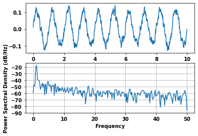
下面是matplotlib官方示例中绘制PSD(Power Spectral Density)的示例代码:
import matplotlib.pyplot as plt
import numpy as np
import matplotlib.mlab as mlab
import matplotlib.gridspec as gridspec

# Fixing random state for reproducibility
np.random.seed(19680801)

dt = 0.01
t = np.arange(0, 10, dt)
nse = np.random.randn(len(t))
r = np.exp(-t / 0.05)

cnse = np.convolve(nse, r) * dt
cnse = cnse[:len(t)]
s = 0.1 * np.sin(2 * np.pi * t) + cnse

plt.subplot(211)
plt.plot(t, s)
plt.subplot(212)
plt.psd(s, 512, 1 / dt)

plt.show()
绘制出的图像如下:
seaborn
seaborn 在 matplotlib 的基础上,进行了更高级的封装,使得作图更加方便快捷,且图形风格更“好看”。
很多图形,如果用matplotlib作图,需要声明坐标轴、重叠关系等细节事项,而使用seaborn常只需要应用默认的设置即可。
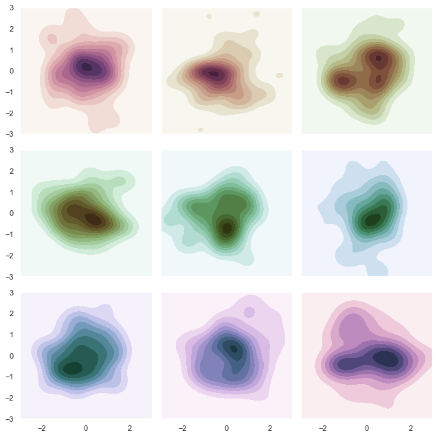
以下是seaborn绘制调色图的示例:
import numpy as np
import seaborn as sns
import matplotlib.pyplot as plt

sns.set(style="dark")
rs = np.random.RandomState(50)

# Set up the matplotlib figure
f, axes = plt.subplots(3, 3, figsize=(9, 9), sharex=True, sharey=True)

# Rotate the starting point around the cubehelix hue circle
for ax, s in zip(axes.flat, np.linspace(0, 3, 10)):

    # Create a cubehelix colormap to use with kdeplot
    cmap = sns.cubehelix_palette(start=s, light=1, as_cmap=True)

    # Generate and plot a random bivariate dataset
    x, y = rs.randn(2, 50)
    sns.kdeplot(x, y, cmap=cmap, shade=True, cut=5, ax=ax)
    ax.set(xlim=(-3, 3), ylim=(-3, 3))

f.tight_layout()
图片如下:
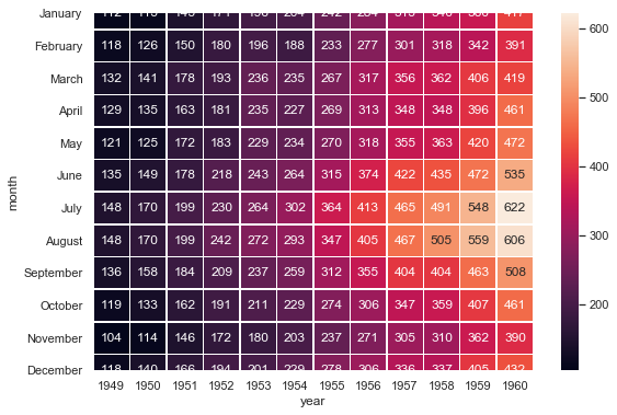
笔者也常用它画热力图:
import matplotlib.pyplot as plt
import seaborn as sns
sns.set()

# Load the example flights dataset and convert to long-form
flights_long = sns.load_dataset("flights")
flights = flights_long.pivot("month", "year", "passengers")

# Draw a heatmap with the numeric values in each cell
f, ax = plt.subplots(figsize=(9, 6))
sns.heatmap(flights, annot=True, fmt="d", linewidths=.5, ax=ax)
效果如下:
plotly
plotly的定位是图形库,在绘制复杂图形时缺少了matplotlib那样的准确表达能力。
plotly的优点包括且不限于:
- 可生成可交互图形和动画效果
- 其地图绘制功能可用性较强
- 生成的3D图形比较好看
不过它的麻烦之处在于,由于生成的是交互图形,一般需要在Jupyter Notebook中打开。
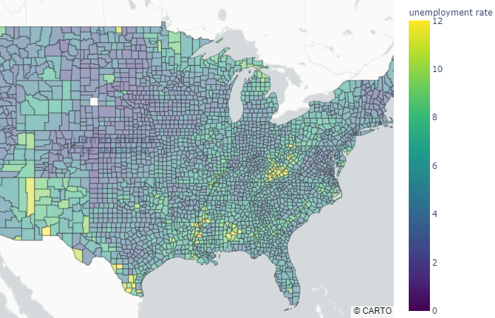
从官网撸下来一个地图绘图代码如下:
from urllib.request import urlopen
import json
with urlopen('https://raw.githubusercontent.com/plotly/datasets/master/geojson-counties-fips.json') as response:
    counties = json.load(response)

import pandas as pd
df = pd.read_csv("https://raw.githubusercontent.com/plotly/datasets/master/fips-unemp-16.csv",
                   dtype={"fips": str})

import plotly.express as px

fig = px.choropleth_mapbox(df, geojson=counties, locations='fips', color='unemp',
                           color_continuous_scale="Viridis",
                           range_color=(0, 12),
                           mapbox_style="carto-positron",
                           zoom=3, center = {"lat": 37.0902, "lon": -95.7129},
                           opacity=0.5,
                           labels={'unemp':'unemployment rate'}
                          )
fig.update_layout(margin={"r":0,"t":0,"l":0,"b":0})
fig.show()
图片效果如下:
3D作图的示例如下:
import plotly.graph_objects as go
import numpy as np

# Helix equation
t = np.linspace(0, 20, 100)
x, y, z = np.cos(t), np.sin(t), t

fig = go.Figure(data=[go.Scatter3d(
    x=x,
    y=y,
    z=z,
    mode='markers',
    marker=dict(
        size=12,
        color=z,                # set color to an array/list of desired values
        colorscale='Viridis',   # choose a colorscale
        opacity=0.8
    )
)])

# tight layout
fig.update_layout(margin=dict(l=0, r=0, b=0, t=0))
fig.show()
效果如下:

Vega-Lite和Altair
Vega是基于JSON语言的一套可交互图形描述及生成软件,Vega-Lite则是基于Vega进行的进一步语法封装。
Vega生成的图片示例:

由于Vega使用了独立的软件,故在Python中使用需要调用封装好的接口,即Altair。以上图片在Altair中实现的代码如下:
import altair as alt
from vega_datasets import data

source = data.iris()

alt.Chart(source).mark_circle().encode(
    alt.X('sepalLength', scale=alt.Scale(zero=False)),
    alt.Y('sepalWidth', scale=alt.Scale(zero=False, padding=1)),
    color='species',
    size='petalWidth'
)
由于同样是交互图形,所以Altair也要在Jupyter Notebook中调用。
其他软件包也很有趣
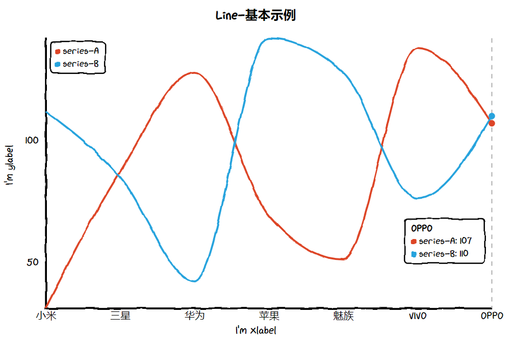
比方说,笔者在网络上发现了一个手绘风格的可视化包——cutecharts。
它生成的图片是这个样子:
好Q~