最终效果

其实主要难点在于最左边的小时钟
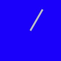
指针的实现方式很简单,就是通过绝对定位将指针移到中间,然后以下边中间的位置为圆心旋转即可。代码如下:
<!DOCTYPE html>
<html lang="en">
<head>
    <meta charset="UTF-8">
    <title></title>
    <style>
    .clock-wrapper {
        background-color: blue;
        height: 200px;
        width: 200px;
        position: relative;
    }
    .pointer {
        height: 80px;
        width: 6px;
        background-color: silver;
        position: absolute;
        top: 20px;
        left: 97px; /* 100 - 6/2 */
        transform: rotateZ(30deg);
        transform-origin: center bottom;
    }
    </style>
</head>
<body>
    <div class="clock-wrapper">
        <div class="pointer"></div>
    </div>
</body>
</html>
效果
秒针转起来的效果也很简单,通过定时器setInterval每隔一秒更新秒针的角度。
setInterval(() => {
            let secAngle = new Date().getSeconds() * 6
            let pointer = document.getElementsByClassName('pointer')[0]
            pointer.style.transform = `rotateZ(${secAngle}deg)`
        }, 1000)
现在就可以看到指针一跳一跳的了。但是呢,我希望指针平缓的走,那么可以设置CSS的 transition 属性
transition: all linear 1s;
安静的等待1s 会发现,当秒针从59到60的时候,会反向旋转。因为此时角度是变小的,360->0,所以考虑当指针刚好走一圈的那一秒,去除 transition 属性。
这样虽然不会倒转了,但是那一秒还是会蹦一下。
于是又想到每100ms更新一次,这样到360度时蹦的那一下就不明显了。感觉没有直接解决问题,是绕开了。。
这样一个会围绕圆心转的指针就做完了。代码如下:
<!DOCTYPE html>
<html lang="en">
<head>
    <meta charset="UTF-8">
    <title></title>
    <style>
    .clock-wrapper {
        background-color: blue;
        height: 200px;
        width: 200px;
        position: relative;
    }
    .pointer {
        height: 80px;
        width: 6px;
        background-color: silver;
        position: absolute;
        top: 20px;
        left: 97px; /* 100 - 6/2 */
        transform-origin: center bottom;
    }
    </style>
</head>
<body>
    <div class="clock-wrapper">
        <div class="pointer"></div>
    </div>
    <script>
        function getAngle() {
            let date = new Date()
            let secAngle = date.getSeconds() * 6 + date.getMilliseconds() * 6 / 1000;
            return secAngle;
        }
        window.onload = () => {
            let pointer = document.getElementsByClassName('pointer')[0];
            pointer.style.transform = `rotateZ(${getAngle()}deg)`;
            let timer = setInterval(() => {
                let secAngle = getAngle();
                pointer.style.transform = `rotateZ(${getAngle()}deg)`;
                if (!secAngle) {
                    pointer.style.transition = null;
                } else {
                    pointer.style.transition = 'all linear 100ms';
                }
            }, 100);
        }
    </script>
</body>
</html>
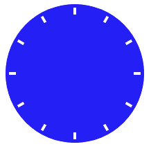
现在的问题是 表盘的刻度。实现12个小竖线,然后分别旋转。虽然我没有less不可以使用for循环,但是react可以循环啊……定位还是绝对定位,和指针一样。
<!DOCTYPE html>
<html>
<head>
  <meta charset="UTF-8" />
  <title>Hello World</title>
  <script src="https://unpkg.com/react@16/umd/react.development.js"></script>
  <script src="https://unpkg.com/react-dom@16/umd/react-dom.development.js"></script>
  <script src="https://unpkg.com/babel-standalone@6.15.0/babel.min.js"></script>
  <style>
  .clock-wrapper {
    background-color: blue;
    height: 200px;
    width: 200px;
    border-radius: 100px;
    position: relative;
  }
  .grad {
    height: 10px;
    width: 4px;
    background-color: #fff;
    position: absolute;
    left: 98px;
    top: 5px;
    transform-origin: center 95px;
  }
  </style>
</head>
<body>
<div id="root"></div>
<script type="text/babel">
  class Clock extends React.Component {
    render() {
      let hourArr = [...new Array(12).keys()]
      let grad = hourArr.map((item) => {
        return <div key={item} className="grad" style={{transform: `rotateZ(${item*30}deg)`}}></div>
      })

      return (
        <div className="clock-wrapper">
          {grad}
        </div>
      )
    }
  }

  ReactDOM.render(
    <Clock />,
    document.getElementById('root')
  );

</script>
</body>
</html>
效果:
这样完全没有难点了(本来就没有好吧……
完整代码如下:
<!DOCTYPE html>
<html>
<head>
  <meta charset="UTF-8" />
  <title>Hello World</title>
  <script src="https://unpkg.com/react@16/umd/react.development.js"></script>
  <script src="https://unpkg.com/react-dom@16/umd/react-dom.development.js"></script>
  <script src="https://unpkg.com/babel-standalone@6.15.0/babel.min.js"></script>
  <style>
    .deTime {
      position: relative;
      height: 50px;
      width: 300px;
      padding: 5px;
      background: linear-gradient(to bottom, #0071ff, #00b1ff);
      display: flex;
      font-family: TrebuchetMS,Rotobo,"Microsoft YaHei",sans-serif;
    }

    .deTime .container {
      position: relative;
      height: 50px;
      width: 50px;
      border-radius: 150px;
      box-shadow: #353535 0px 0px 1px 0px;
      background: radial-gradient(#0040ff, #6adbff);
    }

    .deTime .second {
      height: 20px;
      width: 1px;
      top: 5px;
      left: 24px;
      background-color: #ff6363;
    }

    .deTime .minute {
      height: 16px;
      width: 2px;
      top: 9px;
      left: 24px;
      background-color: #8e8e8e;
    }

    .deTime .hour {
      height: 12px;
      width: 2px;
      top: 13px;
      left: 24px;
      background-color: #8e8e8e;
    }

    .deTime .second, .deTime .minute, .deTime .hour {
      position: absolute;
      transform-origin: center bottom;
      box-shadow: 0px 0px 2px 0px #000;
    }

    .deTime .center {
      width: 2px;
      height: 2px;
      border-radius: 1px;
      background-color: #ffffff;
      box-shadow: 0px 0px 3px 1px #8c8c8c;
      position: absolute;
      top: 24px;
      left: 24px;
    }

    .deTime .time {
      line-height: 50px;
      font-size: 36px;
      color: #fff;
      margin-left: 15px;
    }

    .deTime .time span {
      font-size: 22px;
    }

    .deTime .date {
      font-size: 13px;
      color: #fff;
      display: flex;
      flex-flow: column;
      margin-left: 15px;
      padding: 6px 0;
    }

    .deTime .date > div {
      flex-basis: 50%;
    }

    .grad {
      height: 2px;
      width: 1px;
      background-color: #fff;
      position: absolute;
      left: 25px;
      top: 1px;
      transform-origin: center 24px;
    }
  </style>
</head>
<body>
<div id="root"></div>
<script type="text/babel">
  class DeTime extends React.Component {
  TRANSITION = '100ms linear';
  NUMBER_TRANSLATION = ['日', '一', '二', '三', '四', '五', '六'];

  constructor() {
    super()
    this.state = {
      hourAngle: 0,
      minAngle: 0,
      secAngle: 0,
      transition: this.TRANSITION
    }
  }

  updateTime() {
    let date = new Date()

    let secAngle = (date.getSeconds() + date.getMilliseconds() / 1000) * 6;
    let minAngle = date.getMinutes() * 6 + secAngle / 60;
    let hourAngle = (date.getHours() % 12) * 30 + minAngle / 12;

    let transition = this.TRANSITION
    //  当秒针走到 0 的时候 角度其实是变小了 所以会倒着转 需要暂时删除 transition
    if (this.state.secAngle > secAngle) transition = null;

    this.setState({
      hourAngle: hourAngle,
      minAngle: minAngle,
      secAngle: secAngle,
      transition: transition
    })
  }

  componentWillMount() {
    this.updateTime();

    this.timer = setInterval(() => { this.updateTime() }, 100);
  }

  componentWillUnmount() {
    this.timer && clearTimeout(this.timer);
  }

  leadingZero(number) {
    return number < 10 ? '0' + number : number
  }


  render() {
    let hourArr = [...new Array(12).keys()]
    let grad = hourArr.map((item) => {
      return <div key={item} className="grad" style={{transform: `rotateZ(${item*30}deg)`}}></div>
    })
    let state = this.state
    let now = new Date()

    return (
      <div className="deTime">
        <div className="container">
          {grad}
          <div className="minute" style={{transform:  'rotateZ('+state.minAngle+'deg)'}}></div>
          <div className="hour" style={{transform:  'rotateZ('+state.hourAngle+'deg)'}}></div>
          <div className="second" style={{transition: state.transition, transform:  'rotateZ('+state.secAngle+'deg)'}}></div>
          <div className="center"></div>
        </div>
        <div className="time">
          {this.leadingZero(now.getHours())}:{this.leadingZero(now.getHours())}<span> {this.leadingZero(now.getSeconds())}</span>
        </div>
        <div className="date">
          <div>星期{this.NUMBER_TRANSLATION[now.getDay()]}</div>
          <div>{now.getFullYear()}年{now.getMonth()}月{now.getDate()}日</div>
        </div>
      </div>
    )
  }
}

  ReactDOM.render(
    <DeTime/>,
    document.getElementById('root')
  );

</script>
</body>
</html>