MultiLevelMultiSelectCombo (Silverlight)
Tharindu Nishad Patikirikorala, 14 Aug 2013 CPOL

5.00 (1 vote)
Rate:
vote 1vote 2vote 3vote 4vote 5
The MultiLevelMultiSelectCombo is an extension of the Silverlight combo box having capabilities to display hierarchical data and enable selection of multiple items.
 Is your email address OK? You are signed up for our newsletters but your email address is either unconfirmed, or has not been reconfirmed in a long time. Please click here to have a confirmation email sent so we can confirm your email address and start sending you newsletters again. Alternatively, you can update your subscriptions.
Introduction
The default combo box control that comes with Silverlight enables us to show a single level and there is no way to select multiple items from that list. This article presents a ComboBox control that can be used to display a set of selections based on hierarchal data and select multiple items from it, hence called asMultiLevelMultiSelectCombo.
Features and Settings
Let us look at the features of MultiLevelMultiSelectCombo.
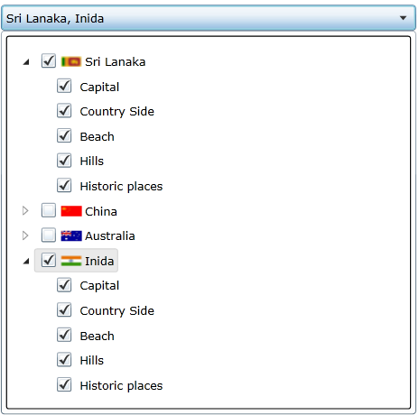
- Multilevel mode: the multiple selection capability with multiple levels.
- SelectAll mode: the multiple selection capability with multiple levels including select all option.
- Image mode: the multiple selection capability with multiple levels including images for each item.
- Enum mode: given an enum type, displays multi selection capabilities.
Implementation
This is a control designed to enable multiple selections, but still operate as a combo box control. In this implementation, the user control is designed with a combination of a combo box having aComboBox.ItemTemplate of the tree view. Tree view is suitable to display hierarchical data. AHierarchicalDataTemplate is used to display the required data and check boxes are used to enable the selection of multiple items form that hierarchy as follows:
 Collapse | Copy Code
<sdk:hierarchicaldatatemplate x:key="TreeViewTemplate" itemssource="{Binding Path=ChildItemList}">
        <grid horizontalalignment="Stretch">
            <grid.columndefinitions>
                <columndefinition width="Auto">
                <columndefinition width="Auto">
                <columndefinition width="Auto">
            </columndefinition></columndefinition>
            </columndefinition></grid.columndefinitions>

            <checkbox grid.column="1" horizontalcontentalignment="Stretch"
                      ischecked="{Binding IsChecked, Mode=TwoWay}"
                      verticalalignment="Center" margin="3,0,0,0">
                <stackpanel orientation="Horizontal">
                <img source="{Binding Image}"
                  horizontalalignment="Center" margin="0" />
                <textblock horizontalalignment="Stretch"
                  text="{Binding Display}" margin="3,0,0,0"
                  verticalalignment="Center">
                </textblock></stackpanel>
            </checkbox>
        </grid>
    </sdk:hierarchicaldatatemplate>

<combobox height="25" name="ItemListCombo">
    <combobox.itemcontainerstyle>
        <style targettype="ComboBoxItem">
            <Setter Property="HorizontalContentAlignment" Value="Stretch"/>
        </style>
    </combobox.itemcontainerstyle>
    <combobox.itemtemplate>
        <datatemplate>
            <sdk:treeview itemssource="{Binding Path=Tag,ElementName=ItemListCombo}"
               itemtemplate="{StaticResource TreeViewTemplate}"
               horizontalalignment="Stretch" horizontalcontentalignment="Stretch">
        </sdk:treeview></datatemplate>
    </combobox.itemtemplate>
</combobox>
Note that the combo box data source only has one item, which becomes the source to the tree view in that item.
Now, in order to expose custom properties for this control such as hierarchical data list and other configuration properties, DependencyProperties have been declared for each.
Collapse | Copy Code
public static readonly DependencyProperty ItemListProperty = DependencyProperty.Register("ItemList",
     typeof(List<MultiSelectComboItem>), typeof(MultiLevelMultiSelectComboBox),
     new PropertyMetadata((s, e) => ((MultiLevelMultiSelectComboBox)s).SetItemsSource()));

public List<MultiSelectComboItem> ItemList
{
    get { return (List<MultiSelectComboItem>)GetValue(ItemListProperty); }
    set { SetValue(ItemListProperty, value); }
}
Among the properties are:
ItemList: This is the desired hierarchical data to be displayed. Each item of this list should be of typeMultiSelectComboItem. It is important to note that when an item is checked, to trigger selections up and down the hierarchy, theParentandChildItemListproperties have to be assigned properly in eachMultiSelectComboItemincluded in theItemList. At the top most level, leaveParentas null and at the lowest level, leave theItemListas null (see the sample project).In the case of binding Enums, the user does not have to prepare a
MultiSelectComboItemlist. Instead, theEnumToMultiItemListConvertercan be used as follows, which will convert an Enum to aMultiSelectComboItemlist as follows.EnumCountryis an Enum Country exposed as a binding property in the DataContext. Collapse | Copy CodeItemList="{Binding Path=EnumCountry, Converter={StaticResource EnumToMultiItemListConverter}}"SetSelectAll: If true, this property includes the Select All item in the list.SelectedList: Returns theMultiSelectComboItemlist with the selected items and their hierarchy. Use a LINQ query to list all selected items at different levels.
Use Cases
In this section, a XAML code snippet is presented in order to explain how to use this control.
Collapse | Copy Code
 xmlns:control="clr-namespace:MultiLevelMultiSelectCombo"
<control:MultiLevelMultiSelectComboBox SelectedItemList="{Binding SelectedList, Mode=TwoWay}"
  ItemList="{Binding Path=ComboAreaList,Mode=OneTime}"
  Width="400" SetSelectAll="True"/>
http://www.codeproject.com/Tips/612864/MultiLevelMultiSelectCombo-Silverlight