css3圆角,建议IE10以上
如果border-radius 单位是百分比,则参考为自身宽高,因此当宽高不一致时,圆角为不规则形状
如果border-radius 为50%,则为椭圆;当宽高一致时,则为正圆
单独设置每个圆角:
四个值: border-radius:左上角 右上角 右下角 左下角
三个值: border-radius:左上角 右上角+左下角 右下角
两个值: border-radius:左上角+右下角 右上角+左下角
兼容浏览器前缀
谷歌 -webkit-
火狐 -moz-
IE -ms-
欧朋 -o-
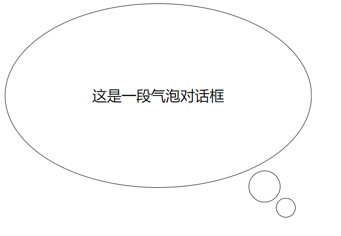
气泡对话框
<!DOCTYPE html>
<html lang="en" manifest="index.manifest">
<head>
<meta charset="UTF-8">
<title>Document</title>
<style>
    div{
        width:500px;
        height:300px;
        border:1px solid #000;
        position: relative;
        font-size:24px;
        line-height: 300px;
        text-align:center;
        -webkit-border-radius:50%;
           -moz-border-radius:50%;
            -ms-border-radius:50%;
             -o-border-radius:50%;
                border-radius:50%;
    }
    div::before,
    div::after{
        content:'';
        display: block;
        position: absolute;
        border:1px solid #000;
        -webkit-border-radius:50%;
           -moz-border-radius:50%;
            -ms-border-radius:50%;
             -o-border-radius:50%;
                border-radius:50%;
    }
    div::before{
        width:50px;
        height:50px;
        right:50px;
        bottom:-25px;
    }
    div::after{
        width:30px;
        height:30px;
        right:25px;
        bottom:-50px;
    }
</style>
</head>
<body>
    <div>这是一段气泡对话框</div>
</body>
</html>
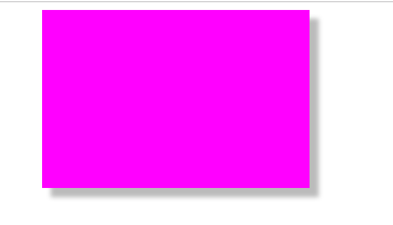
box-shadow:水平偏移 垂直偏移 模糊 扩展 颜色 位置
<!DOCTYPE html>
<html lang="en" manifest="index.manifest">
<head>
<meta charset="UTF-8">
<title>Document</title>
<style>
    div{
        width: 300px;
        height: 200px;
        background-color: #f0f;
        margin:0 auto;
        box-shadow:10px 10px 5px 0 #bbb;
    }
</style>
</head>
<body>
    <div></div>
</body>
</html>
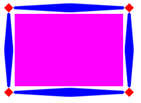
border-image 欧朋浏览器和IE浏览器不兼容
首先准备border.png

演示效果1:
图片铺满整个边框
<!DOCTYPE html>
<html lang="en" manifest="index.manifest">
<head>
<meta charset="UTF-8">
<title>Document</title>
<style>
    div{
        width: 300px;
        height: 200px;
        background-color: #f0f;
        margin:0 auto;
        border:30px solid black;
        border-image:url(source/border.png) 30 30 round;
    }
</style>
</head>
<body>
    <div></div>
</body>
</html>
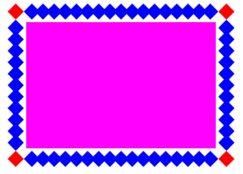
演示效果2:
图片被拉伸来铺满边框
<!DOCTYPE html>
<html lang="en" manifest="index.manifest">
<head>
<meta charset="UTF-8">
<title>Document</title>
<style>
    div{
        width: 300px;
        height: 200px;
        background-color: #f0f;
        margin:0 auto;
        border:30px solid black;
        border-image:url(source/border.png) 30 30 stretch;
    }
</style>
</head>
<body>
    <div></div>
</body>
</html>