今天做有意思的3d旋转爱心,借此来复习一下css中的相关内容,先上一张成品照片
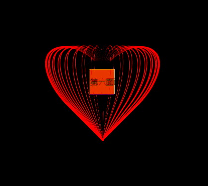
中间是一个正方体,你可以将正方体的各个面上加上照片
要做这个3d旋转爱心,首先要解决的就是如何画出外边的线条,这里用到了css中的border-radius,我们都知道border-radius是用来设置四个角的,写过border的人都知道border可以带四个参数分别设置四个边框(上左下右的顺序),同样的,border-radius也可以带四个参数,并且以顺时针的方向解析,上左,上右,下右,下左。
border的参数:border-radius: 参数1 参数2 参数3 参数4 / 参数5 参数6 参数7 参数8。没错,border有8个参数前面4个参数为四个圆角的水平半径,后面四个值是四个圆角的垂直半径如图:
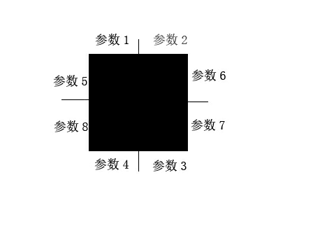
但是平常我们都不写 / 后面的垂直半径,这时就默认垂直半径和水平半径对应相等
当border-radius只有2个参数时 :第一个参数就是左上和右下角的,第二个参数就是右上和左下角的,
当border-radius有3个参数时:第一个参数就是左上,第二个参数就是右上和左下的,第三个参数就是右下的。
总之,它是从左上开始,按顺时针分配数值,若有些角没有赋值,则和赋其对角相同值。
<body>
    <div class="left"></div>
    <div class="right"></div>
</body>
<style>
        body {
            background-color: orange;
        }
        .left {
            position: absolute;
            left:548px;
            top: 200px;
            width: 100px;
            height: 200px;
            margin: auto;
            border: 4px solid red;
            border-radius:50% 50% 0 0 / 50% 40% 0 0;
            border-right: 0;
            border-bottom: 0;
            transform: rotate(-40deg);
        }
        .right {
            position: absolute;
            left:600px;
            top: 200px;
            width: 100px;
            height: 200px;
            margin: auto;
            border: 4px solid red;
            border-radius: 50% 50% 0/ 40% 50% 0;
            border-left: 0;
            border-bottom: 0;
            transform: rotate(40deg);
        }
    </style>
上面这段代码画出的是下图

这个图是通过对两个div的边框border,和圆角border-raidus的设置,然后旋转一定角度,通过定位拼接到一起。
接下来就是3d旋转爱心了
HTML代码:
<div class="box">
    <div class="cube">
        <div>第一面</div>
        <div>第二面</div>
        <div>第三面</div>
        <div>第四面</div>
        <div>第五面</div>
        <div>第六面</div>
    </div>
</div>
css代码:
<style>
        body {
            background-color: #000;

        }
        /*给装载爱心的盒子设计样式让其能居中显示*/
        .box {
            position: absolute;
            left:0;
            top: 0;
            bottom: 0;
            right: 0;
            margin: auto;
            width: 300px;
            height: 300px;
            transform-style: preserve-3d;        /*添加3d效果*/
            animation: 10s rot linear infinite; /*添加动画*/
        }
        /*为遵循子绝父向给heart套一个相对定位的div*/
        heart3d {
            position: relative;
        }
        /*设置 心 线条*/
        .heart {
            position: absolute;
            left:90px;
            top: 0;
            width: 100px;
            height: 200px;
            border: 2px solid red;
            border-radius: 50% 50% 0/ 40% 50% 0;
            border-left: 0;
            border-bottom: 0;
        }
        /*设定关键帧*/
        @keyframes rot {
            0% {
                transform: rotateX(360deg) rotateY(360deg);
            }
        }

        /*设计正六边形的样式*/
        .cube {
            transform-style: preserve-3d;
            position: relative;
            width: 50px;
            height: 50px;
            transform: translate(115px) translateY(100px) translateZ(20px);
        }
        .cube div {
            position: absolute;
            width: 50px;
            height: 50px;
            text-align: center;
            line-height: 50px;
            opacity: 0.7;
        }
        .cube div:nth-child(1) {
            background-color: red;
        }
        .cube div:nth-child(2) {
            left: 0;
            top: -50px;
            background-color: orange;
            transform-origin: bottom;
            transform: rotateX(90deg);
        }
        .cube div:nth-child(3) {
            left: 0;
            top: 50px;
            background-color: blue;
            transform-origin: top;
            transform: rotateX(-90deg);
        }
        .cube div:nth-child(4) {
            left: -50px;
            top: 0;
            background-color: green;
            transform-origin: right;
            transform: rotateY(-90deg);
        }
        .cube div:nth-child(5) {
            left: 50px;
            top: 0;
            background-color: pink;
            transform-origin: left;
            transform: rotateY(90deg);
        }
        .cube div:nth-child(6) {
            left: 0;
            top: 0;
            background-color: yellow;
            transform: translateZ(-50px);
        }
    </style>
js代码:
<script>
    var heart3d = document.getElementsByClassName('heart3d')[0]; //找到承载这些心形线条的div
    for(var i=0; i<36; i+=1){    //循环生成36个线条,并且每次都旋转一下,然后添加到heart3d中。
        var heart = document.createElement("div");
        heart.className = 'heart';
        heart.style.transform = "rotateY("+i*10+"deg) rotateZ(45deg) translateX(50px)"
        heart3d.appendChild(heart);

    }
</script>
这样我们就成功做出了一个旋转的3d爱心。
我们知道在标准文档流中,我们想要让一个元素居中,可以通过设置宽度,然后通过margin:0 auto;(前面的0可以设置) 来实现。但是在定位中绝对定位和固定定位都脱离标准文档流了,这时居中有个办法就是,将left top right bottom 都设为0 ,然后margin:auto.就可以了,这时无论浏览器宽高怎么变都会自动居中。