因为刚开始写博客,只想着把知识点记录在这,也想给你们一些参考,在布局上有些没有思考太多;回过头来看,实在是不忍直视,对不住之前阅读的100+,既然昨天的事无法挽回,那就从现在开始从新整改吧!也希望大家看了,能对你们有所帮助
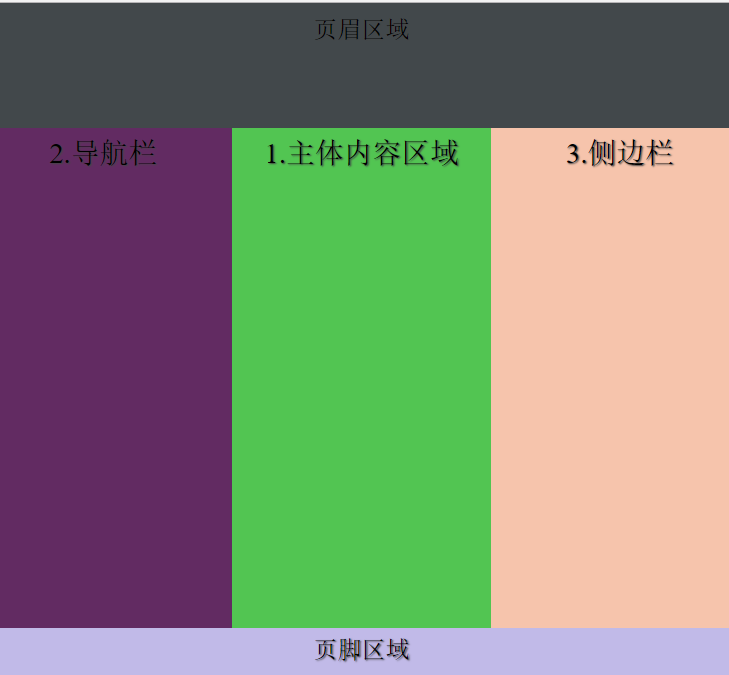
1.先给大家看看效果图,好让大家有点兴趣
2.大家再来看代码,是不是有点干劲了。
<!doctype html>
<meta charset='utf-8' content='text/html' />
<head>
<title>应用网页模板</title>
<style content='text/css'>
*  {
 margin:0px;
 padding:0px;
 -moz-box-sizing:border-box;
 -webkit-box-sizing:border-box;
 box-sizing:border-box;
 }
html,body  {
 width:100%;
 background:#fff;
   }
body {
 min-width:100%;
  }
header,section,nav,article,aside,footer {
 display:block;
 text-align:center;
 text-shadow:1px 1px 1px #444;
 font-size:1.2em;
          }
header {
 background-color:hsla(200,10%,20%,0.9);
 min-height:100px;
 min-width:100%;
 padding:10px 20px;
  }
footer {
 background-color:hsla(250,50%,80%,0.9);
 min-width:100%;
 padding:1%;
 min-height:60px;
  }
section {
 min-width:100%;
 min-height:400px;
  }
section nav {
 background-color:hsla(300,60%,20%,.9);
 padding:1%;
 width:220px;
 }
section article {
 background-color:hsla(120,50%,50%,.9);
 padding:1%;
  }
section aside {
 background-color:hsla(20,80%,80%,.9);
 padding:1%;
 width:220px;
  }
body {
 display:flex;
 display:-ms-flex;
 -ms-flex-flow:column wrap;
 flex-flow:column wrap;
  }
section {
 display:-ms-flex;
 display:flex;
 -ms-flex:1;
 flex:1;
 -ms-flex-flow:row wrap;
 flex-flow:row wrap;
 -ms-flex-align:stretch;
 align-items:stretch;
  }
nav {
 flex:1;
 -ms-flex-order:0;
 order:0;
 }
article {
 -ms-flex:1;
 flex:1;
 -ms-flex-order:2;
 order:2;
  }
aside {
 flex:1;
 -ms-flex-order:3;
 order:3;
  }
</style>

</head>

<body>
<header>页眉区域</header>
<section>
 <article>1.主体内容区域</article>
    <nav>2.导航栏</nav>
    <aside>3.侧边栏</aside>
</section>
<footer>页脚区域</footer>
</body>
3.下面就是不同代码的解释,多研究研究,其实就没什么难的,都是从简单开始演变的。
1.-moz-box;    老版本:firefox 19-
2.-webkit-box;  老版本:ios 6-,safari 3.1-3.6
3.-ms-flexbox;  混合版本:IE10
4.-webkit-flex;  新版本:Chrome
5.flex;      标准规范Opera 12.1,Firefox 20+

box-sizing:border-box; 并排放置2个带边框的框
display:block;     让对象成为块级元素
background-color:hsla(220,50%,50%,.9)
 1.h: number; 色调 number对应相应的颜色
 2.s:0-100%; 饱和度
 3.l: 0-100%; 亮度
 4.a: 0-1;   alpha透明度
padding:10px 10px 10px 10px;
 内边距:顺时针 上 右 下 左
margin:10px 10px 10px 10px;
 外边距:顺时针 上 右 下 左
flex是flex-growflex-shrinkflex-basis的缩写
 1.默认值0 1 auto
 2.flex:none;
  1.flex-grow:0;   扩展空间
  2.flex-shrink:0;  收缩空间
  3.flex-basis:auto; 伸缩比率
 3.flex:auto;
  1.flex-grow:1;
  2.flex-shrink:1;
  3.flex-basis:auto;
 4.flex:1;
  1.flex-grow:1;
  2.flex-shrink:1;
  3.flex-basis:0%;
在伸缩和布局中设置长度和宽度:min-width;min-height;
orient:
 horizontal; 水平排列div元素的子元素
 vertical;  垂直排列
direction:
 normal   伸缩和对象的子元素正常排列
 reverse   反向排列
lines:
 multiple;   当一横排元素满的时候,换行显示
 single;    当一横排元素满的时候,不换行显示
flow:     设置或检索弹性盒模型对象的子元素排列方式
 row;    x,主轴方向排列
 column;     y,横轴方向排列
 wrap;    换行
 nowrap;   不换行
align:      对齐
 stretch;  伸展
ordinal-group:规定框中的子元素的显示次序
 0;     默认,值越低越靠前
order:    设置或检索弹性盒模型对象的子元素出现顺序
 0;     默认,值越低越靠前

注释:
html    <!--some-->
css     /*some*/
javascrip //
python  #