实现0.5px边框方法
方案一:利用渐变(原理:高度1px,背景渐变,一半有颜色,一半透明)
CSS部分
.container {
       500px;
      margin: 0px auto;
}

.border-gradient {
      position: relative;
      padding: 10px;
}

.border-gradient:after {
      content: "";
      position: absolute;
      left: 0;
      bottom: 0;
       100%;
      height: 1px;
      background-image: linear-gradient(90deg, #f00 50%, transparent 50%);
}
html部分
<div class="container">
     <h3>方案一:渐变</h3>
	<div class="border-gradient">
	      原理:高度1px,背景渐变,一半有颜色,一半透明。
	</div>
</div>
页面效果展示

CSS部分
.container {
	 500px;
	margin: 0px auto;
}

.border-scale {
	position: relative;
	padding: 10px;
}

.border-scale:after {
	content: "";
	position: absolute;
	left: 0;
	bottom: 0;
	 100%;
	height: 1px;
	background-color: #f00;
	/* 如果不用 background-color, 使用 border-top:1px solid #f00; 效果是一样的*/
	-webkit-transform: scaleY(.5);
	transform: scaleY(.5);
}
html部分
<div class="container">
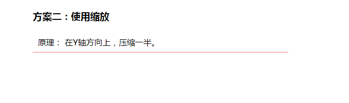
<h3>方案二:使用缩放</h3>
<div class="border-scale">
原理: 在Y轴方向上,压缩一半。
</div>
</div>
页面效果展示