zoukankan      html  css  js  c++  java
  • 三栏布局

    本篇为学习网络资料后做的笔记。资料来源(原文第 6 点):https://juejin.im/post/6844903828278493197

    目录:

    1. flex 方式

    2. 绝对定位方式

    3. 浮动方式

    4. 双飞翼布局、圣杯布局

    一、flex 方式

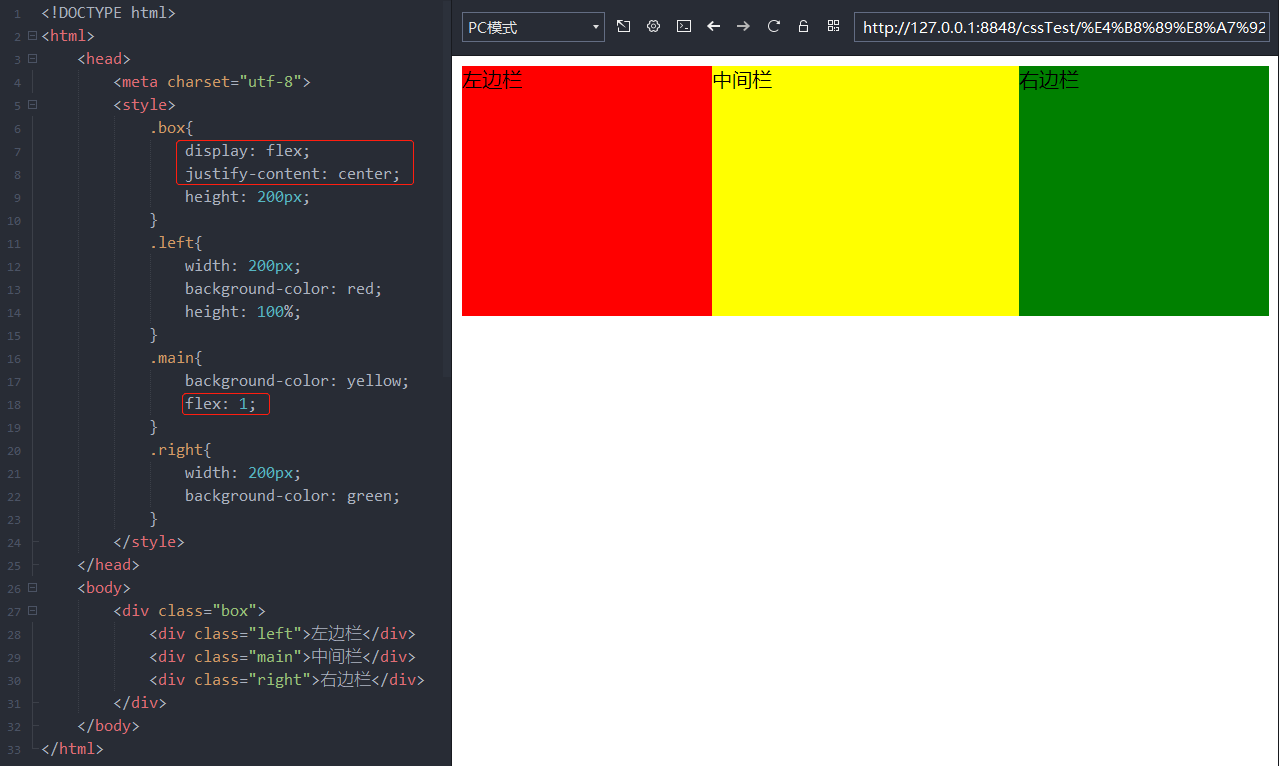
    实现方式:在父盒子中设置为伸缩布局,让行级标签 div 从左往右排列,主轴方向默认为从左往右,设置主轴对齐方式为居中对齐2。给左边栏跟右边栏设置宽度,给中间蓝设置属性 flex 值为1,那么,中间栏的宽度=整个页面的宽度-左边栏宽度-右边栏宽度 (flex 复合属性相关笔记:https://www.cnblogs.com/xiaoxuStudy/p/13410802.html)。

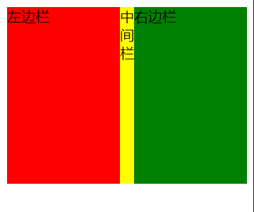
    <!DOCTYPE html>
    <html>
        <head>
            <meta charset="utf-8">
            <style>
                .box{
                    display: flex;
                    justify-content: center;
                    height: 200px;
                }
                .left{
                    width: 200px;
                    background-color: red;
                    height: 100%;
                }
                .main{
                    background-color: yellow;
                    flex: 1;
                }
                .right{
                    width: 200px;
                    background-color: green;
                }
            </style>
        </head>
        <body>
            <div class="box">
                <div class="left">左边栏</div>
                <div class="main">中间栏</div>
                <div class="right">右边栏</div>
            </div>
        </body>
    </html>
    代码

    如果缩小浏览器窗口宽度到一定程度,会变成这样:

    二、绝对定位方式

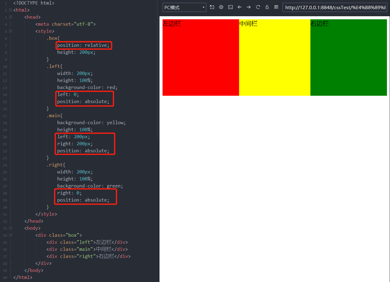
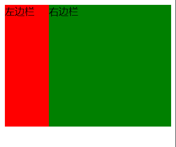
    <!DOCTYPE html>
    <html>
        <head>
            <meta charset="utf-8">
            <style>
                .box{
                    position: relative;
                    height: 200px;
                }
                .left{
                    width: 200px;
                    height: 100%;
                    background-color: red;
                    left: 0;
                    position: absolute;
                }
                .main{
                    background-color: yellow;
                    height: 100%;
                    left: 200px;
                    right: 200px;
                    position: absolute;
                }
                .right{
                    width: 200px;
                    height: 100%;
                    background-color: green;
                    right: 0;
                    position: absolute;
                }
            </style>
        </head>
        <body>
            <div class="box">
                <div class="left">左边栏</div>
                <div class="main">中间栏</div>
                <div class="right">右边栏</div>
            </div>
        </body>
    </html>
    代码

    如果缩小浏览器窗口宽度到一定程度,会变成这样:


    三、 浮动方式

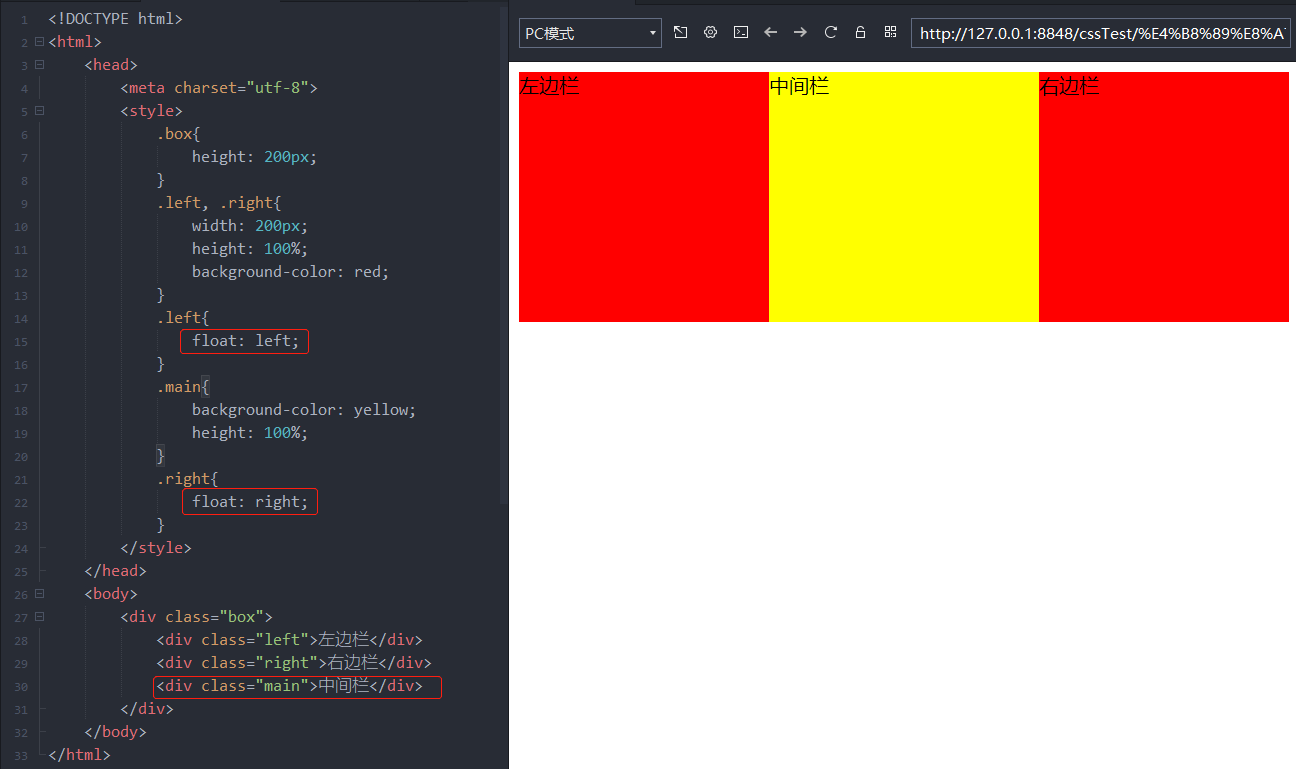
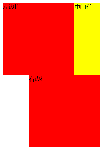
    <!DOCTYPE html>
    <html>
        <head>
            <meta charset="utf-8">
            <style>
                .box{
                    height: 200px;
                }
                .left, .right{
                    width: 200px;
                    height: 100%;
                    background-color: red;
                }
                .left{
                    float: left;
                }
                .main{
                    background-color: yellow;
                    height: 100%;
                }
                .right{
                    float: right;
                }
            </style>
        </head>
        <body>
            <div class="box">
                <div class="left">左边栏</div>
                <div class="right">右边栏</div>
                <div class="main">中间栏</div>
            </div>
        </body>
    </html>
    代码

    如果缩小浏览器窗口宽度到一定程度,会变成这样:

    四、双飞翼布局、圣杯布局

    单独写在另一篇笔记中了。

    地址:https://www.cnblogs.com/xiaoxuStudy/p/13412057.html

  • 相关阅读:
    React学习笔记
    士兵杀敌(一)
    网络爬虫Java实现抓取网页内容
    德莱联盟
    计算球体积
    在页面上 获取键盘事件
    一起玩转mysql
    腾讯云 做出的 不错的 动画 chrome小插件
    jquery MD5
    json to xml
  • 原文地址:https://www.cnblogs.com/xiaoxuStudy/p/13412920.html
Copyright © 2011-2022 走看看