设页面中有<div class=" planet "></div>,用来绘制一个行星和卫星图形。这个图形包括三部分:行星、卫星和卫星旋转的轨道。定义. planet的样式规则如下:
.planet
{
position:absolute;
top:80px;
left:80px;
height:100px;
100px;
border-radius:50%; border:1px solid #f00;
animation:rond 3s linear infinite;
}
.planet:before
{
content: "";
height:10px;
10px;
position:absolute;
background-color:#f00;
border-radius:50%;
top:50px;
left:-5px;
}
.planet:after
{
content: '';
height:60px;
60px;
background:#f00;
border-radius:50%;
position:absolute;
top:20px;
left:20px;
}
可在页面中显示如图1所示的图案。
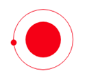
图1 行星和卫星
定义关键帧,使得卫星在轨道上绕行星旋转。编写的HTML文件如下。


<!DOCTYPE html>
<html>
<head>
<title>行星和卫星</title>
<style>
  .container
  {
     width:350px;
     height:350px;
     margin:100px auto;
     position:relative;
     border: 4px solid rgba(255, 0, 0, 0.9);
     border-radius: 10%;
  }
  .planet
 {
    position:absolute;
    top:80px;
    left:80px;
    height:100px;
    width:100px;
    border-radius:50%;  border:1px solid #f00;
    animation:rond 3s  linear infinite;
  }
  .planet:before
  {
    content: "";
    height:10px;
    width:10px;
    position:absolute;
    background-color:#f00;
    border-radius:50%;
    top:50px;
    left:-5px;
  }
  .planet:after
  {
    content: '';
    height:60px;
    width:60px;
    background:#f00;
    border-radius:50%;
    position:absolute;
    top:20px;
    left:20px;
  }
  @keyframes rond
  {
     0% {transform : rotate(0deg);}
     100% {transform : rotate(360deg);}
  }
</style>
</head>
<body>
<div class="container">
  <div class="planet"></div>
</div>
</body>
</html>
在浏览器中打开包含这段HTML代码的html文件,可以呈现出如图2所示的动画效果。
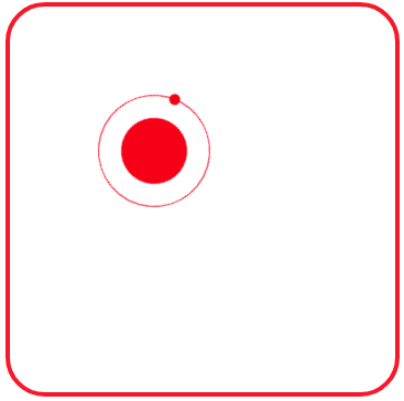
图2 绕行星旋转的卫星
在图2中有一颗红色的小卫星绕着红色的卫星旋转,再加入一个蓝色的小卫星绕着蓝色的行星旋转。可以编写如下的HTML文件。
<!DOCTYPE html>
<html>
<head>
<title>行星和卫星</title>
<style>
  .container
  {
     width:350px;
     height:350px;
     margin:100px auto;
     position:relative;
     border: 4px solid rgba(255, 0, 0, 0.9);
     border-radius: 10%;
  }
  .planet1
 {
    position:absolute;
    top:80px;
    left:80px;
    height:100px;
    width:100px;
    border-radius:50%;  border:1px solid #f00;
    animation:rond 3s  linear infinite;
  }
  .planet1:before
  {
    content: "";
    height:10px;
    width:10px;
    position:absolute;
    background-color:#f00;
    border-radius:50%;
    top:50px;
    left:-5px;
  }
  .planet1:after
  {
    content: '';
    height:60px;
    width:60px;
    background:#f00;
    border-radius:50%;
    position:absolute;
    top:20px;
    left:20px;
  }
  .planet2
 {
    position:absolute;
    top:180px;
    left:180px;
    height:80px;
    width:80px;
    border-radius:50%;  border:1px solid #00f;
    animation:rond 3s  linear infinite;
  }
  .planet2:before
  {
    content: "";
    height:10px;
    width:10px;
    position:absolute;
    background-color:#00f;
    border-radius:50%;
    top:40px;
    left:-5px;
  }
  .planet2:after
  {
    content: '';
    height:40px;
    width:40px;
    background:#00f;
    border-radius:50%;
    position:absolute;
    top:20px;
    left:20px;
  }
  @keyframes rond
  {
     0% {transform : rotate(0deg);}
     100% {transform : rotate(360deg);}
  }
</style>
</head>
<body>
<div class="container">
  <div class="planet1"></div>
  <div class="planet2"></div>
</div>
</body>
</html>
在浏览器中打开包含这段HTML代码的html文件,可以呈现出如图3所示的动画效果。
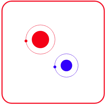
图3 绕各自轨道旋转的两颗卫星
上面的HTML文件中,为了绘制两颗行星,页面中定义了两个div:一个类名为planet1,另一个名为planet2。分别为两个类定义样式规则,这两个类的样式规则基本相同,复制后略作修改即可。
若在页面中搞多个绕各自轨道旋转的卫星怎么办呢?采用类似的方法(定义类名为planet3、planet4、…等层,再复制样式规则略作修改)虽然可以实现,但重复代码太多,导致HTML文件大小偏大。因此,采用自定义变量的方式更好些。
比较类.planet1和.planet2的样式规则定义,可以为一个绕轨道旋转的卫星抽象出5个属性:表示行星大小的--size、表示行星位置的--top和--left,表示卫星旋转速度的—speed、表示颜色的--color。
编写的HTML文件内容如下。
<!DOCTYPE html>
<html>
<head>
<title>行星和卫星</title>
<style>
  .container
  {
     width:350px;
     height:350px;
     margin:100px auto;
     position:relative;
     border: 4px solid rgba(255, 0, 0, 0.9);
     border-radius: 10%;
  }
  .planet
 {
    position:absolute;
    top:var(--top);
    left:var(--left);
    height:calc(var(--size) + 40px);
    width:calc(var(--size) + 40px);
    border-radius:50%;  border:1px solid var(--color);
    animation:rond var(--speed)  linear infinite;
  }
  .planet:before
  {
    content: "";
    height:10px;
    width:10px;
    position:absolute;
    background-color:var(--color);
    border-radius:50%;
    top:calc(var(--size) / 2 + 20px);
    left:-5px;
  }
  .planet:after
  {
    content: '';
    height:var(--size);
    width:var(--size);
    background:var(--color);
    border-radius:50%;
    position:absolute;
    top:20px;
    left:20px;
  }
  @keyframes rond
  {
     0% {transform : rotate(0deg);}
     100% {transform : rotate(360deg);}
  }
</style>
</head>
<body>
<div class="container">
  <div class="planet" style="--size:60px;--left:50px; --top: 30px; --color:#f00; --speed: 3s;"></div>
  <div class="planet" style="--size:60px;--left:200px; --top: 30px; --color:#f0f; --speed: 3s;"></div>
  <div class="planet" style="--size:40px;--left:25px; --top: 135px; --color:#ff0; --speed: 2.5s;"></div>
  <div class="planet" style="--size:40px;--left:135px; --top: 135px; --color:#0f0; --speed: 2.5s;"></div>
  <div class="planet" style="--size:40px;--left:245px; --top: 135px; --color:#0ff; --speed: 2.5s;"></div>
  <div class="planet" style="--size:60px;--left:50px; --top: 220px; --color:#00f; --speed: 3s;"></div>
  <div class="planet" style="--size:60px;--left:200px; --top: 220px; --color:#800080; --speed: 3s;"></div>
</div>
</body>
</html>
在浏览器中打开包含这段HTML代码的html文件,可以呈现出如图4所示的动画效果。
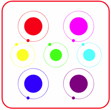
图4 绕各自轨道旋转的七颗卫星
通过这个例子,可以体会CSS中自定义变量的使用方法。